The challenge
Resources can be limited, and designing custom icons for all projects is not always necessary or possible. To take the initiative, I embarked on a side project to develop a custom icon set. I used this opportunity to dive deeper into icon design and to learn the benefits of them being pixel-perfect.
My role
As a self-initiated project, I researched pixel perfection, what it meant for an icon to be pixel-perfect, why pixel precision mattered, and how to create them.

I experimented with colours for the carrot, an underline for each icon, the direction of the pineapple arches, and the papaya's size.
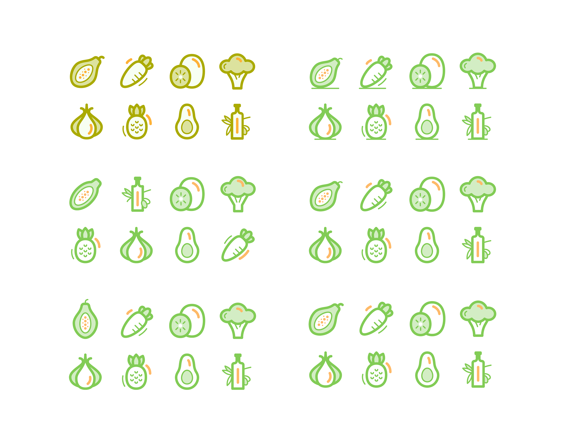
I explored a muted colour palette, the order of the icons to ensure a visual balance, the papaya's shape and whether it needed a stem.
The solution
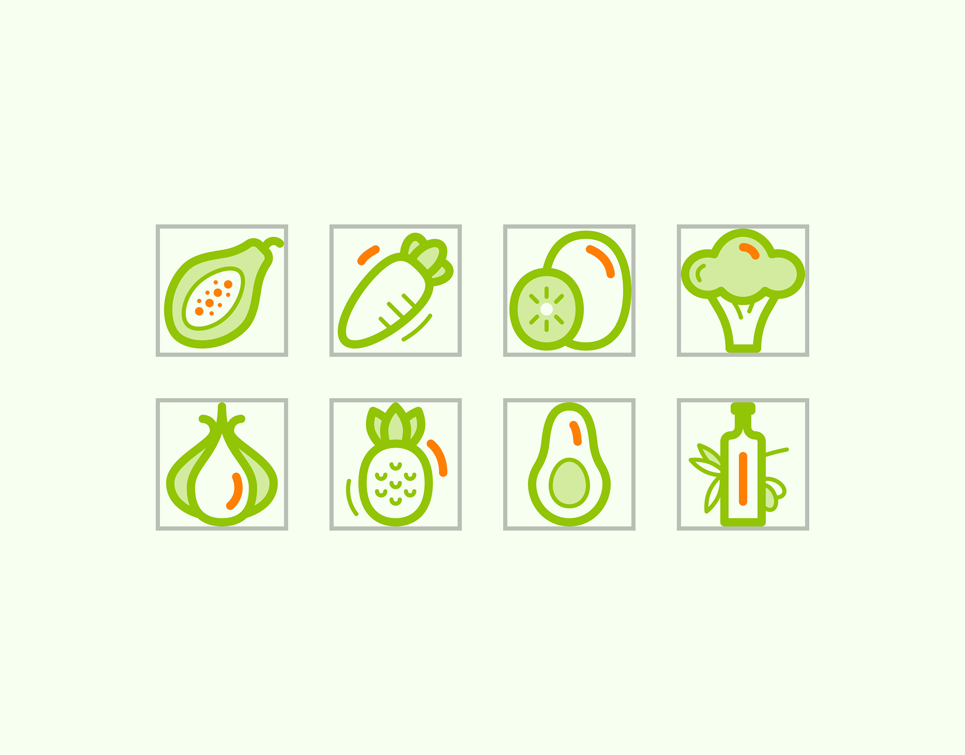
I illustrated a cohesive set of icons in a soft, rounded style inspired by my interest in superfoods. Curves can be challenging to get right, and there is no way of avoiding jagged lines when designing icons. I stuck to consistent pixel steps where possible to even out bumpy lines. It's a balance between conforming to exact pixels and conveying the correct meaning in the symbol when working with curves in icons. I aligned the icons to a grid, minimizing the need for anti-aliasing at reduced sizes, thus making them pixel-perfect. This level of attention to detail is essential for app user interfaces because pixel space is at a premium. Pixel-perfect icons are more clear and crisp when scaled to a smaller size.
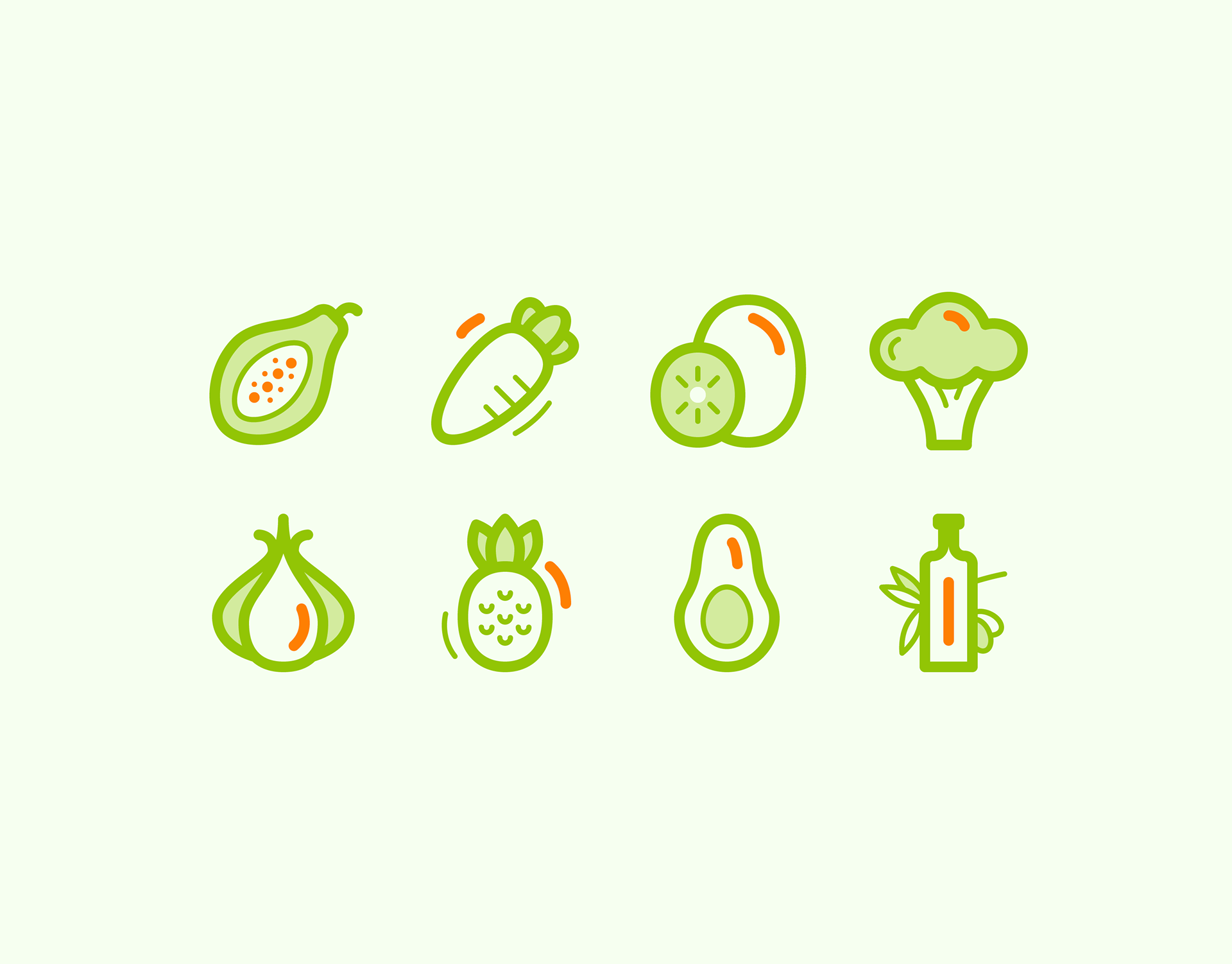
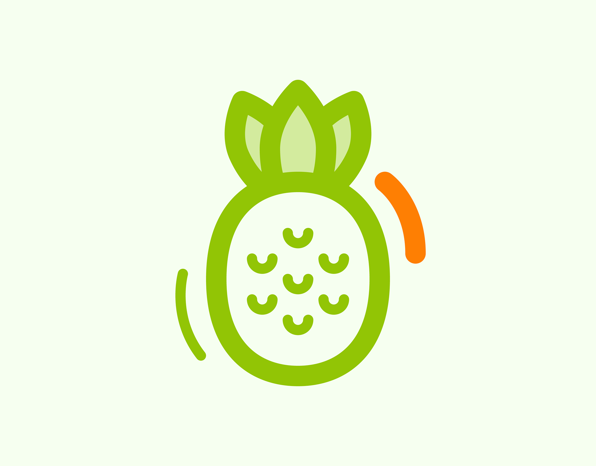
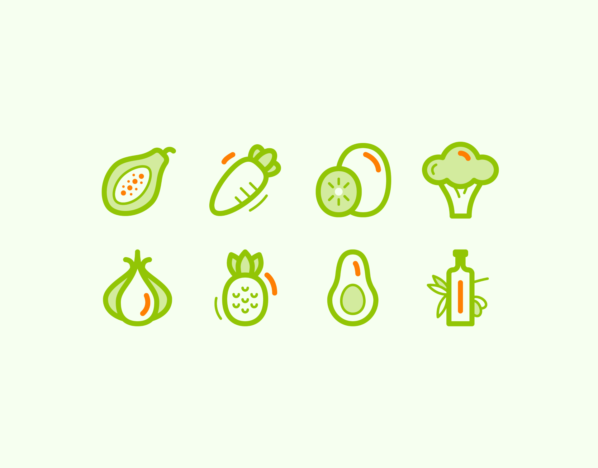
The set includes papaya, carrot, kiwi, broccoli, garlic, pineapple, avocado and olive oil icons.
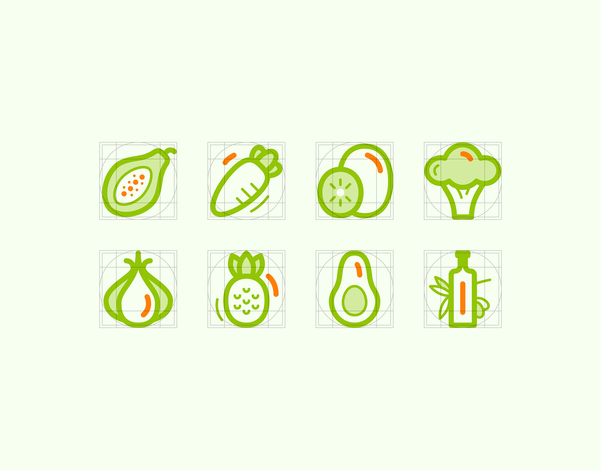
I created guidelines for tall, wide square and round shapes to ensure the subjects were optically balanced at the 64 px icon size.
To allow the icons to breathe, I added a 2 px padding.
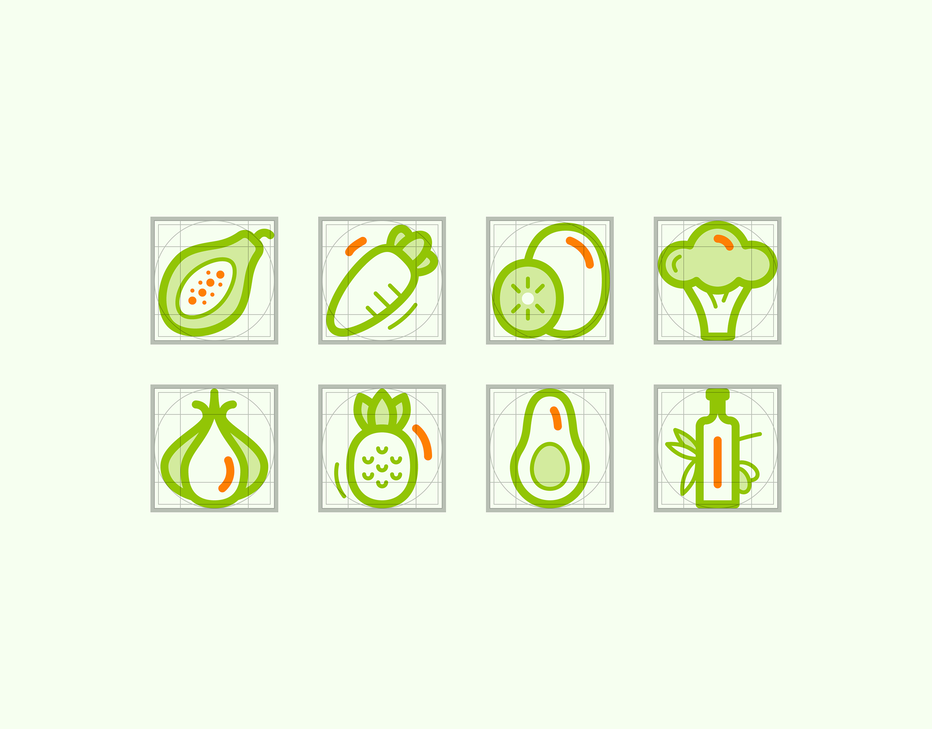
The padding for each icon in the set extends beyond the guidelines.
I created a looping animation to showcase the icon set.