The challenge
The challenge was to create a campaign identity for GP as the face of the fundraising effort for the Build A Safer Future capital campaign. The identity had to pair well with the existing GP branding and use the same colours and typeface. The goal was to expand upon the GP brand without competing with it.
My role
As the graphic designer, I created concepts for the logo, iterated on the design, developed extended brand elements for layout and designed signage and digital docs. I also wireframed the campaign web page in Adobe XD and exported assets for a WordPress developer to build on the existing GP website.

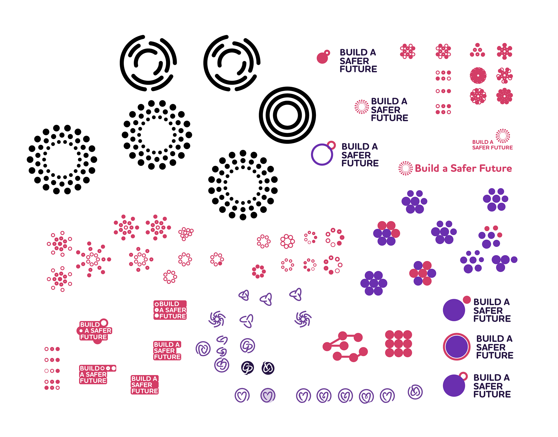
While exploring the campaign logomark, I focused on themes of building, connection and safety.

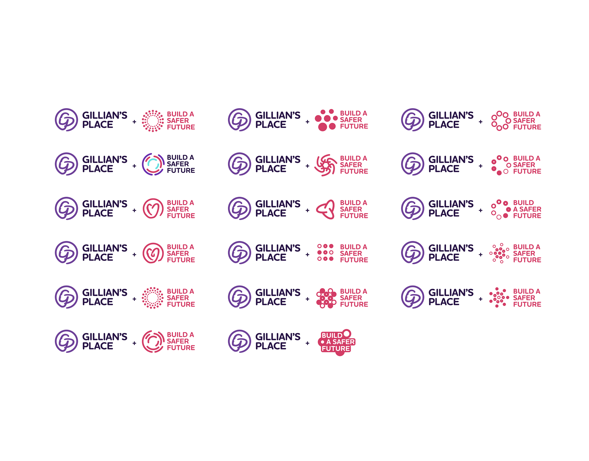
I displayed them in pairs to visualize how the campaign logo would function with the GP logo.

The process and inspiration of the campaign logo design and how it is derived from the GP logo to maintain brand recognition and consistency.

The solution
The solution was to see constraints as an opportunity to form a hierarchy in the brand and create cohesion. So, I allocated the brand colours differently than the main GP brand. I formed a distinction between the GP brand and the campaign identity while staying on-brand by choosing pink as the primary campaign colour. Features from the GP logomark, like the circle, stroke style design and breaks in line segments, inspired my creation of the campaign logomark. I chose a heart to symbolize safety in building a safer future and to tie the design to the name of the campaign. The heart, paired with the brand colour pink, solidified the meaning. The idea of squiggles and arrows connected the stroked line appearance of the logos to the round, playful, soft nature of the circles. The arrows provided direction for layout design by functioning as a leading line for the viewer's eye. The arrows pointed toward key facts and elements of each layout. By framing the challenge positively, I created an identity for the GP campaign that connected to the existing brand without building an entirely different look.

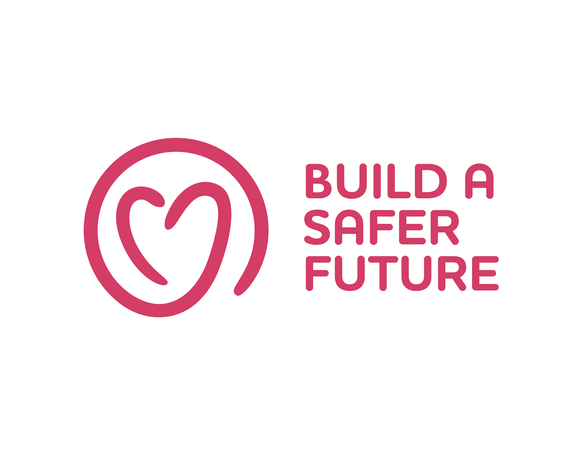
The Build A Safer Future campaign logo design.

Existing GP brand colours (left), the refined selection, and the modified allocation for the campaign identity (right).

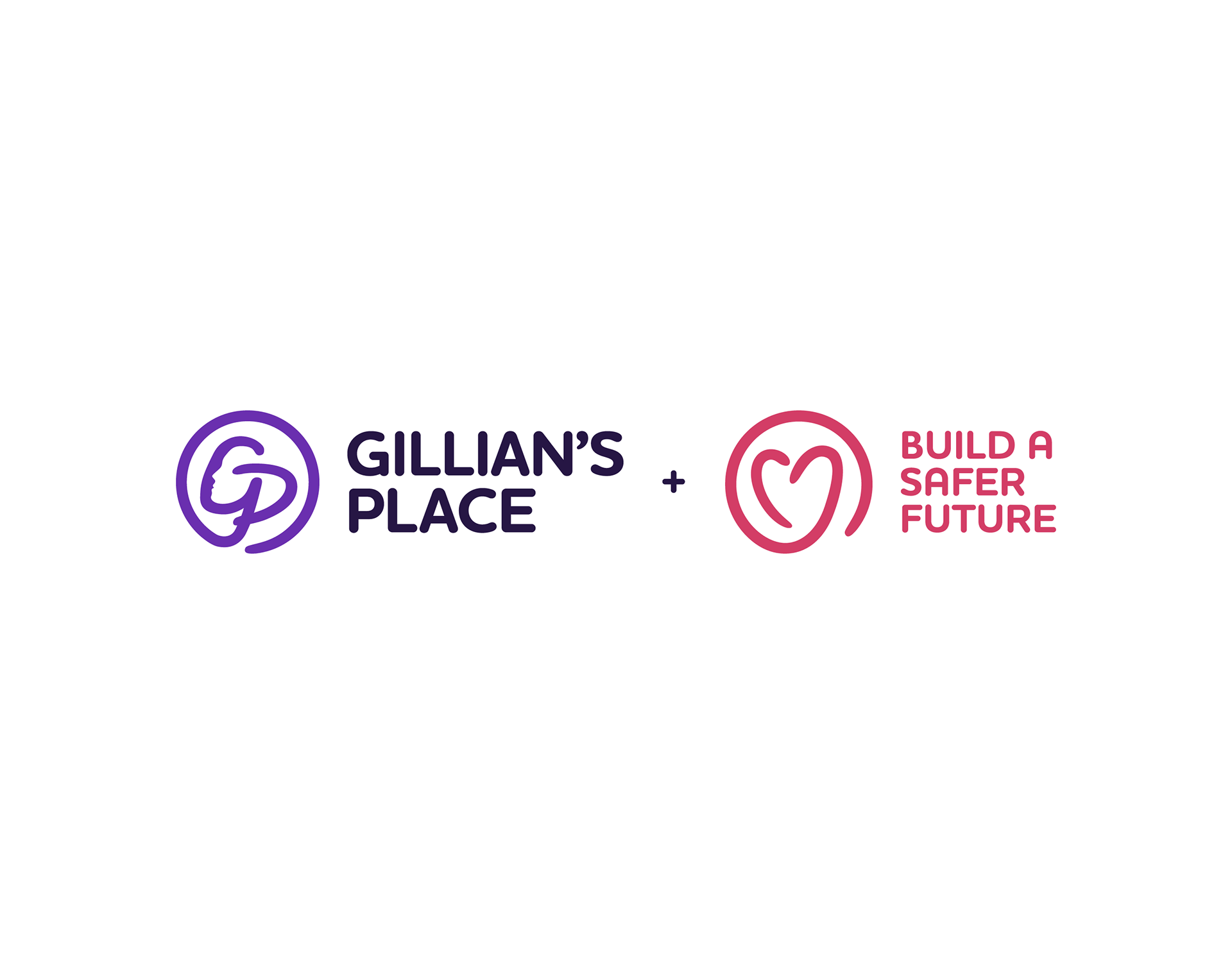
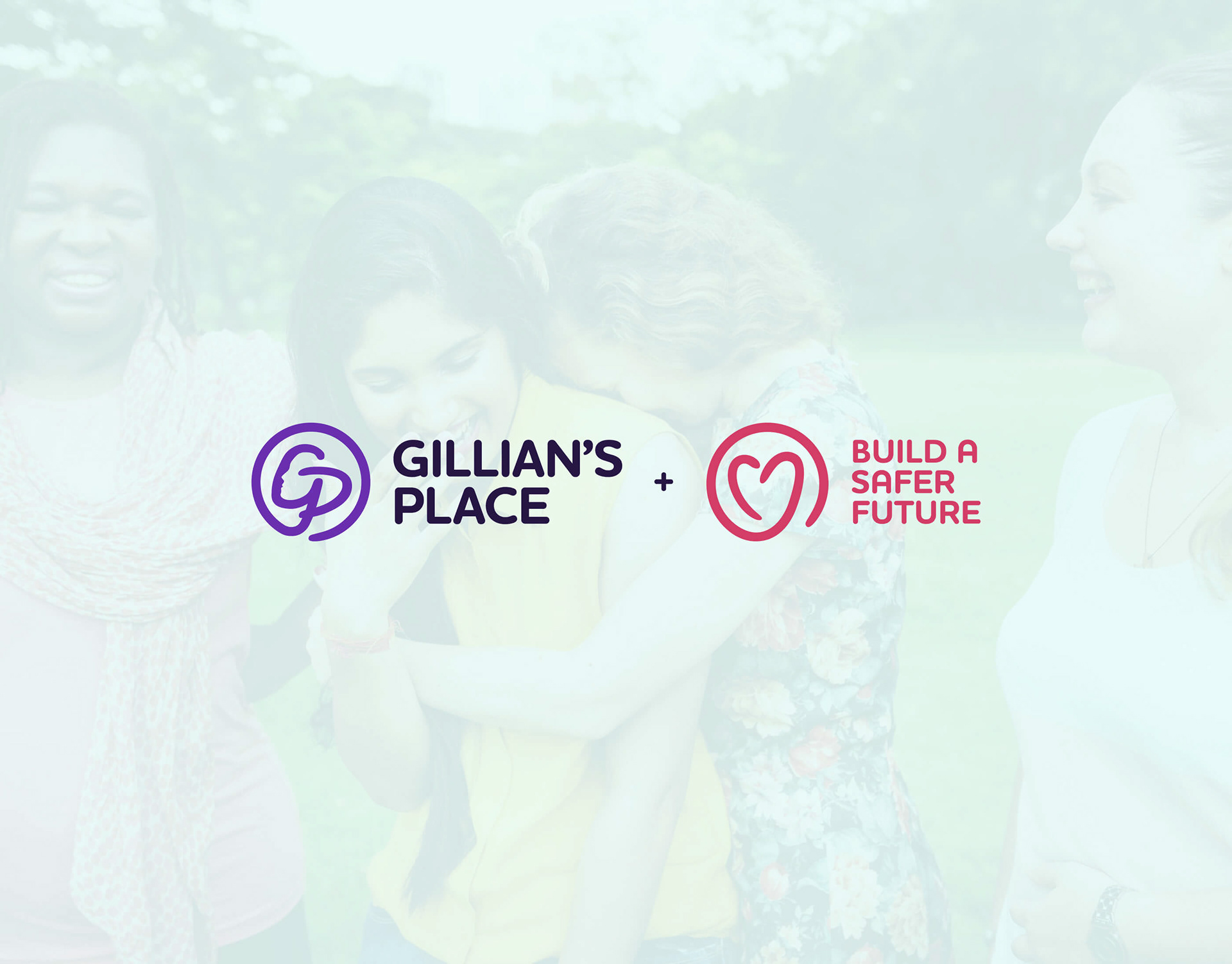
The Build A Safer Future campaign logo design paired with the GP logo.

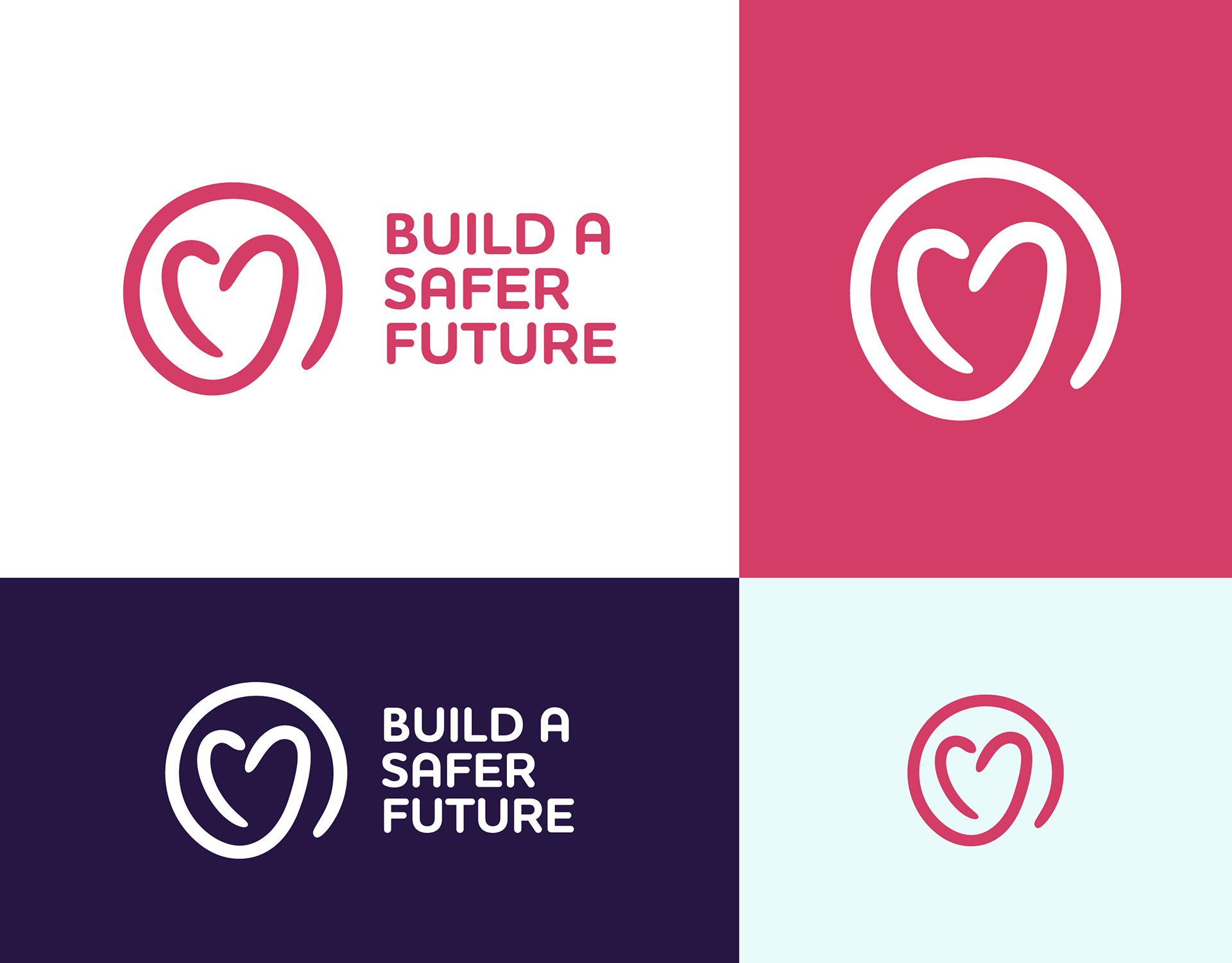
The Build A Safer Future campaign logo design variations.

I used circles and arrows as brand elements in the layout design of the campaign identity.

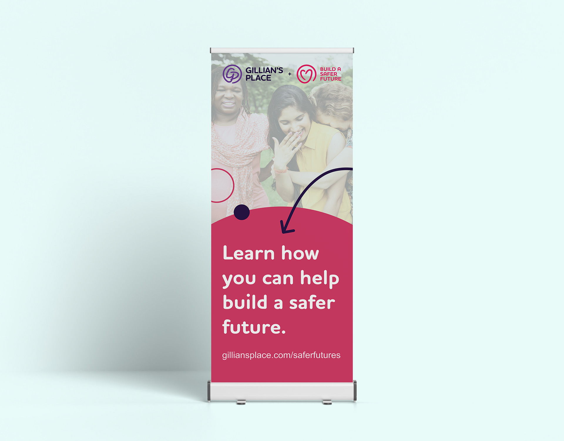
Pull-up banner design used for the Build A Safer Future campaign.

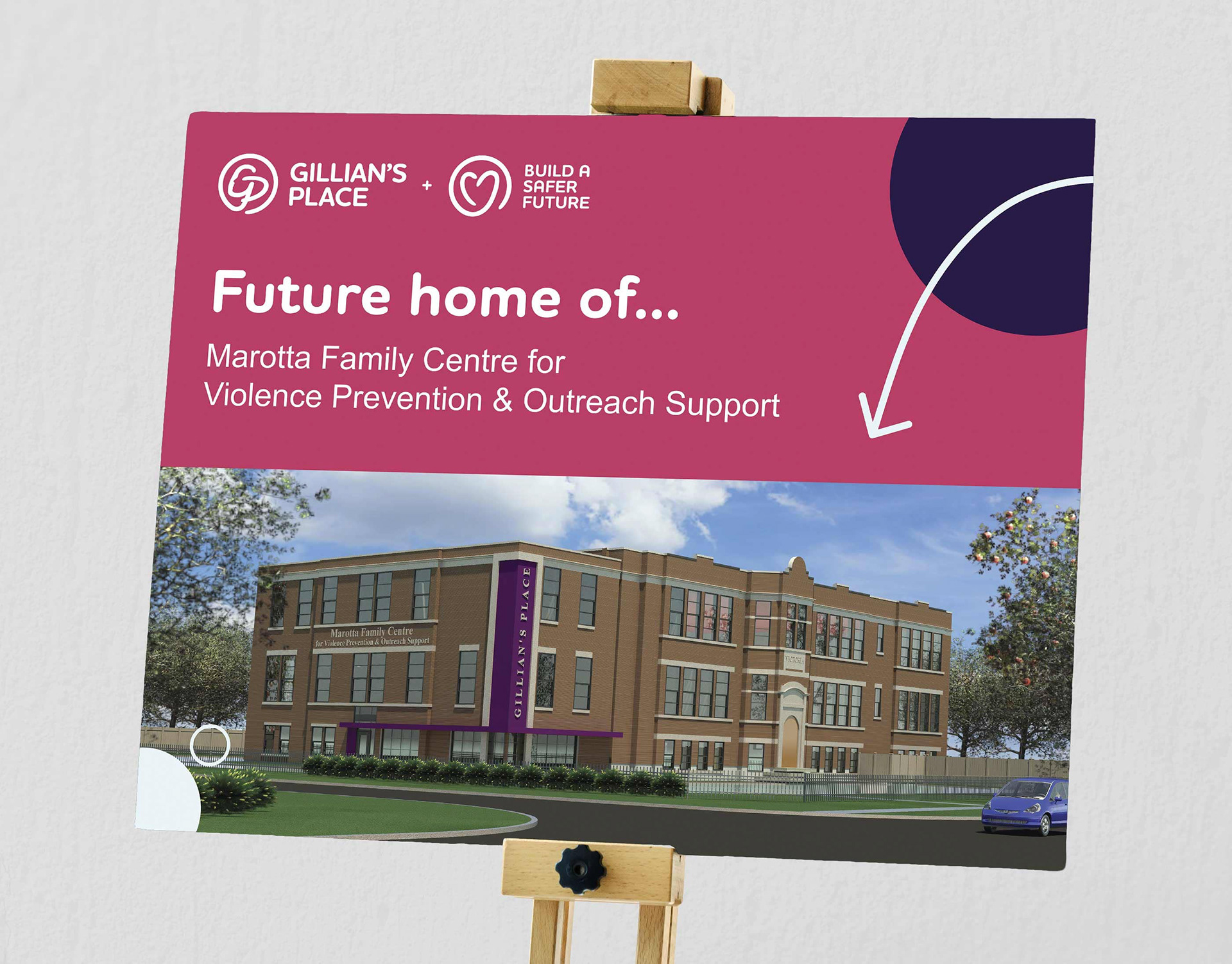
For fundraising events, I designed a signboard presentation that featured an architect rendering of the Marotta Family Centre.

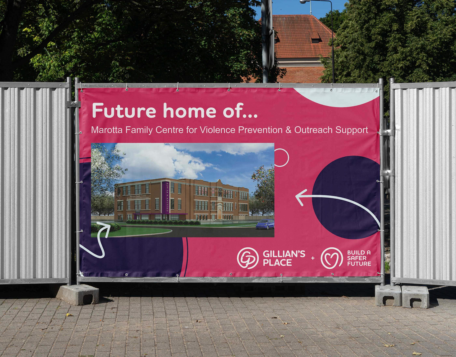
I applied the signboard design to an outdoor banner for the property of the future family centre.

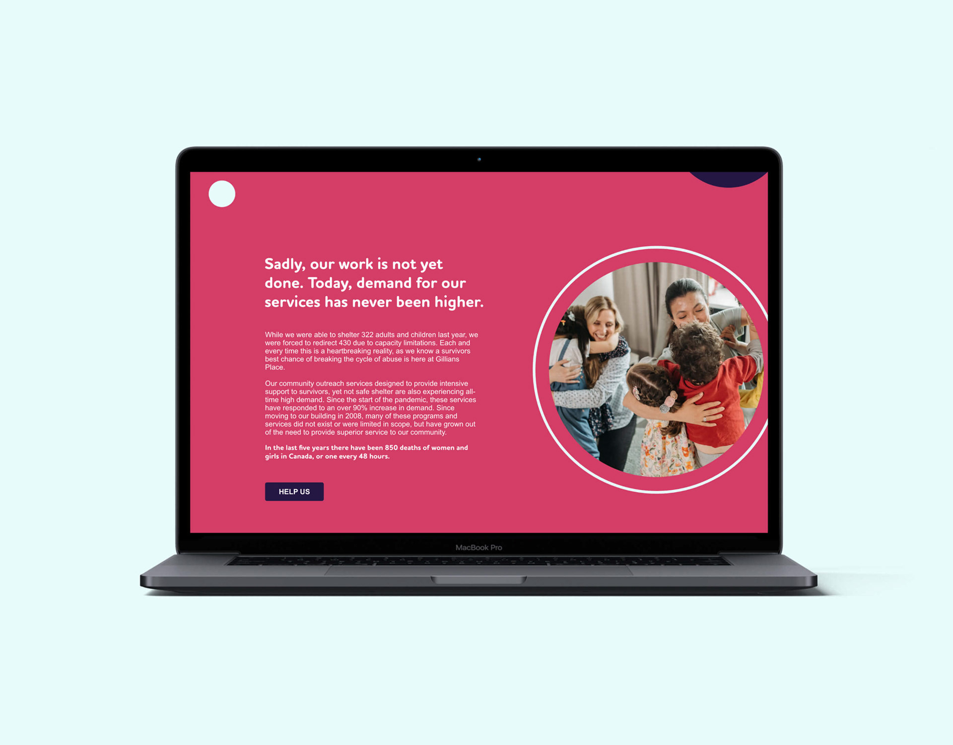
I wireframed the campaign web page with the new identity and handed off the files to be developed on the existing GP site.

Other projects

Back to Top