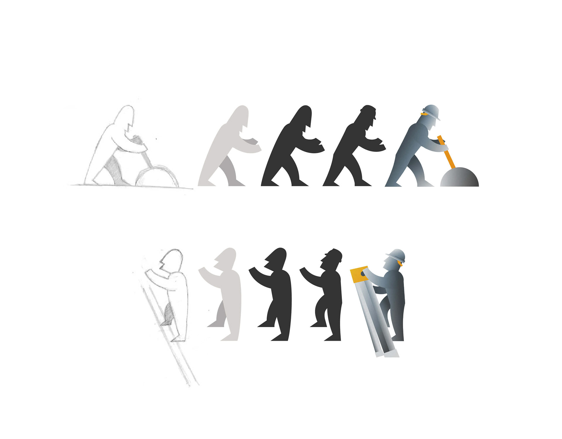
Maintenance worker sketches (left) with vector version (right).
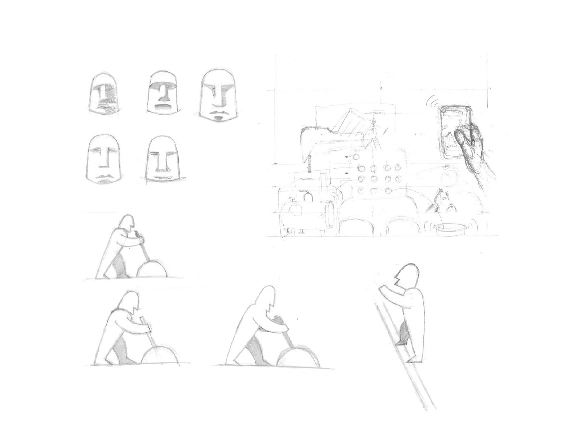
I sketched concepts of the maintenance man, maintenance workers and custom scene layout.
An early concept featured a comic superhero style.
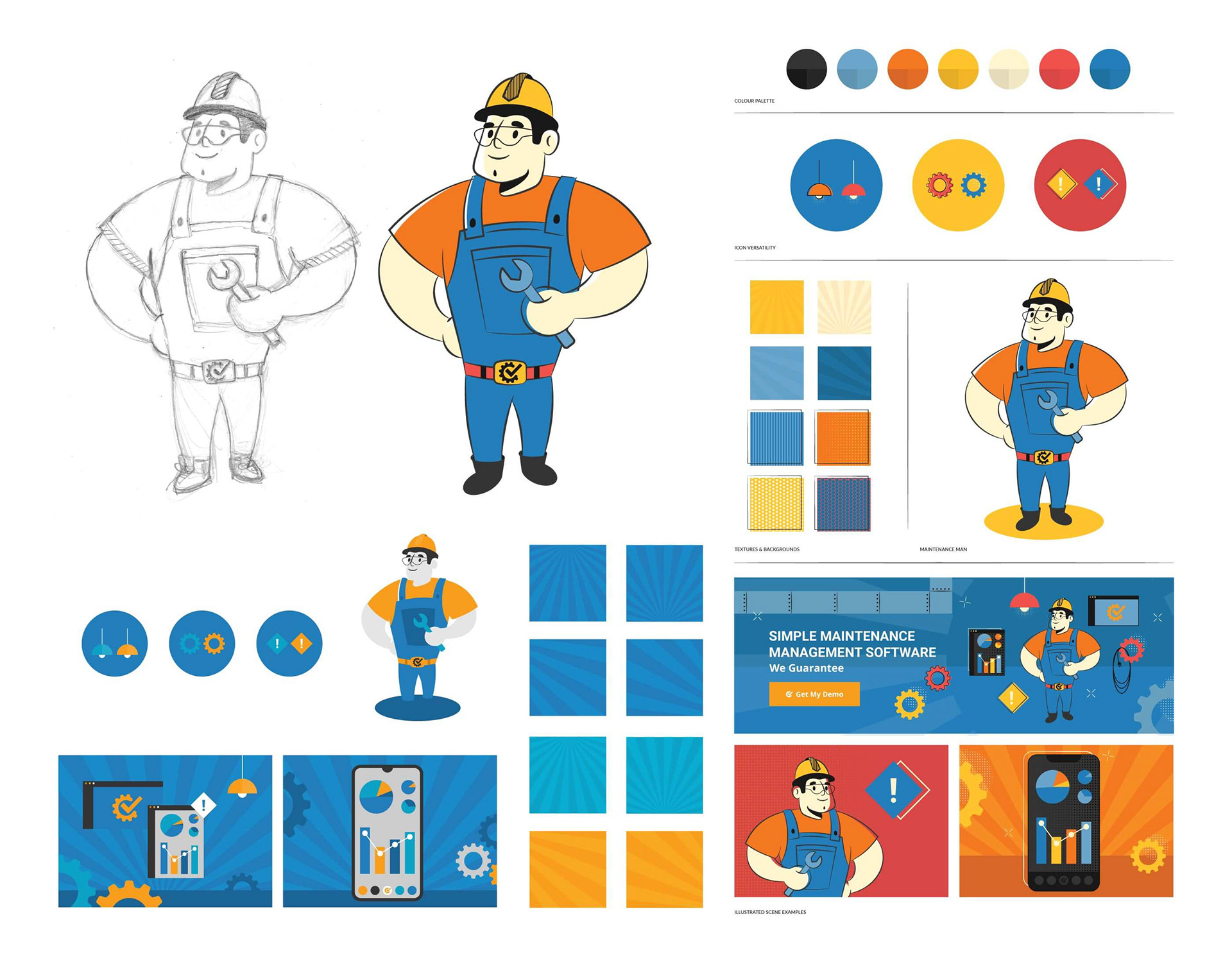
Later concepts dropped the extended colour red and kept to the blue and orange of the MC identity, focusing on industrial.
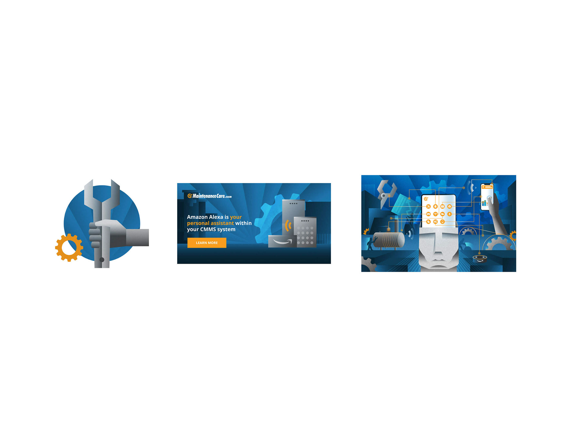
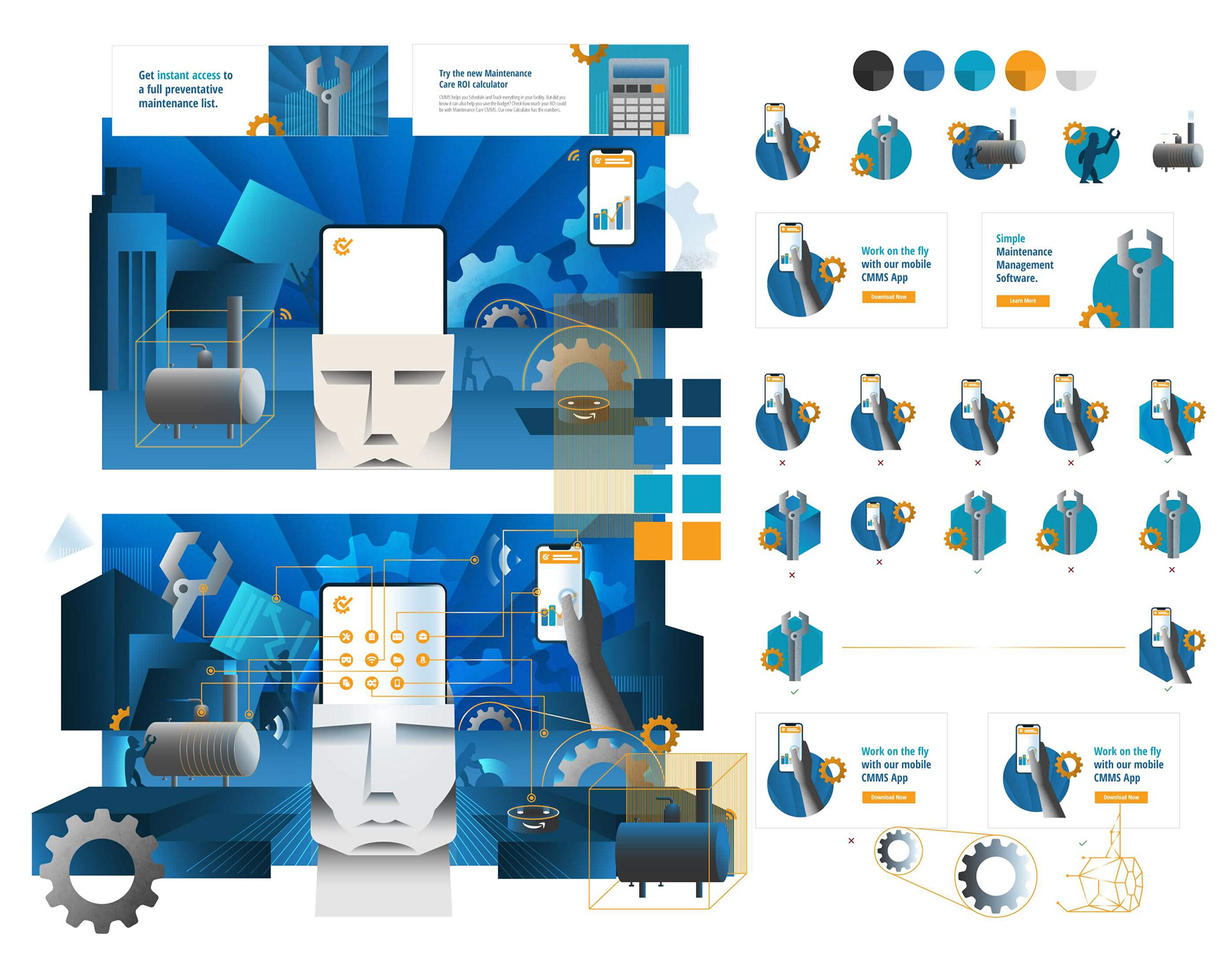
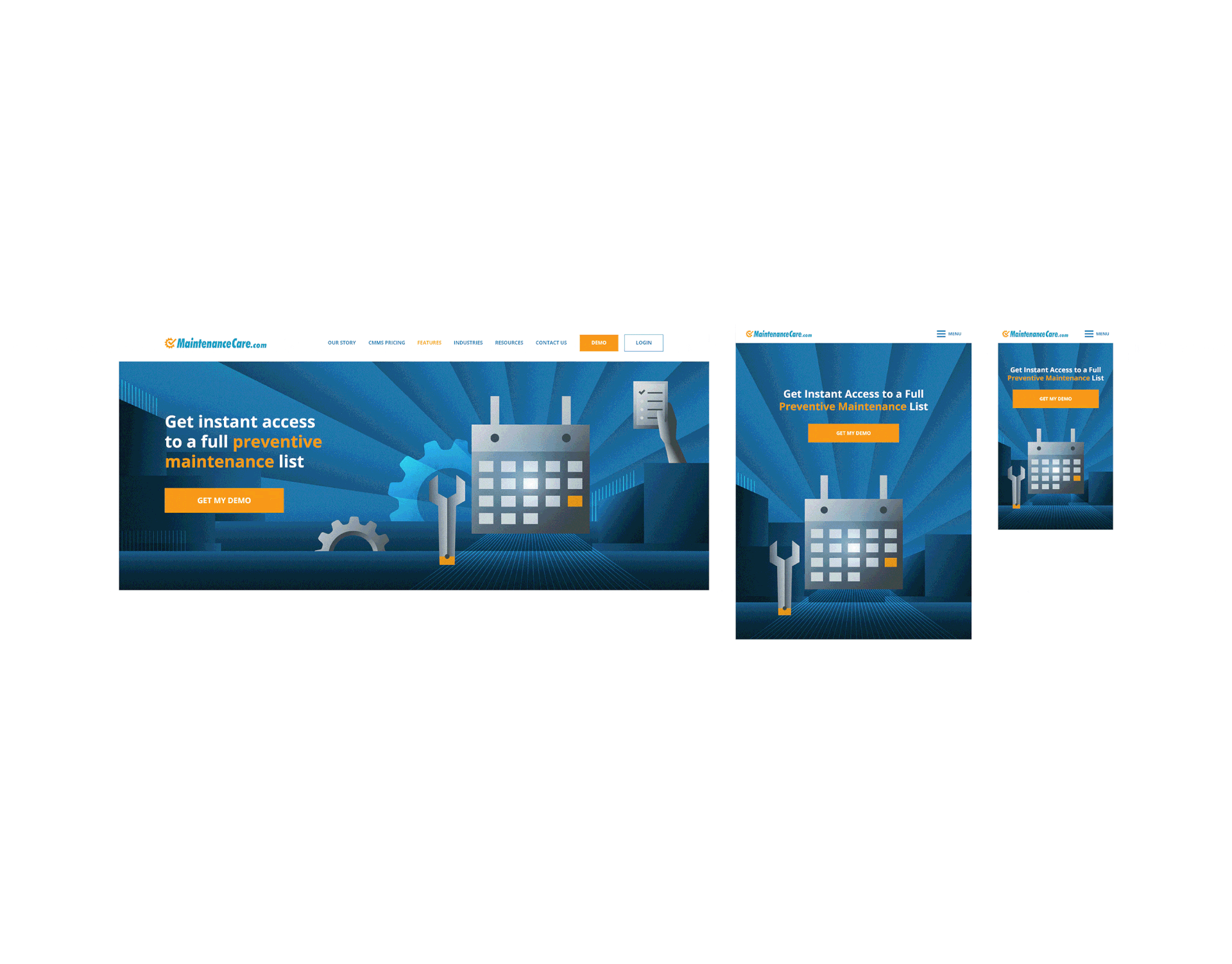
Tier 1 (left) was spot illustrations. Tier 2 (middle) worked for email newsletters, display ads, social media and digital docs. Tier 3 (right) was custom scenes made for landing page heroes and blog covers.
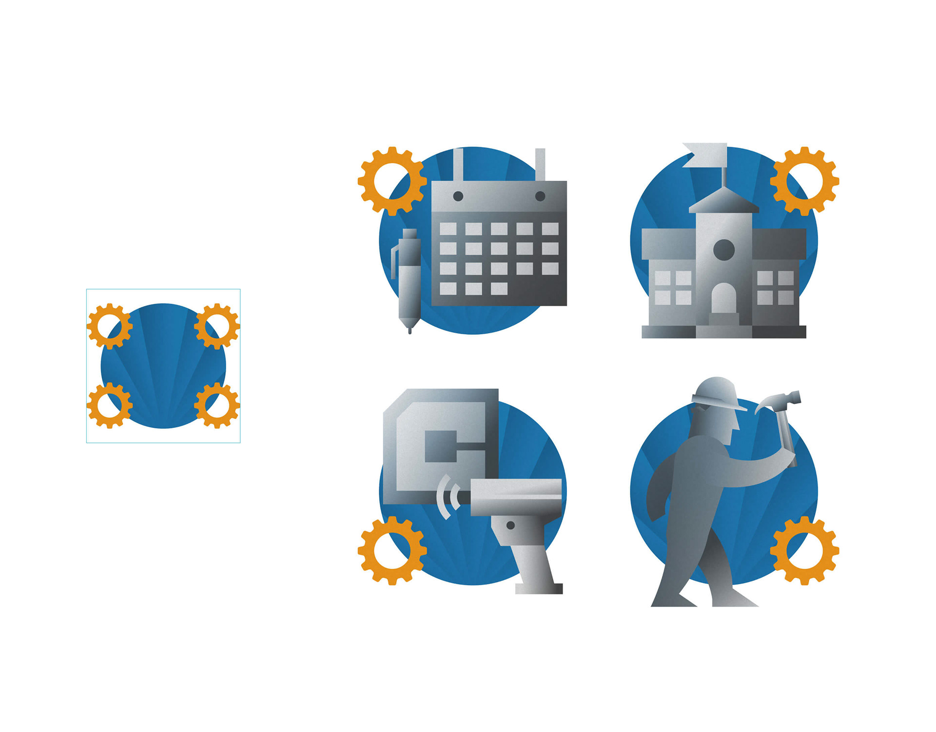
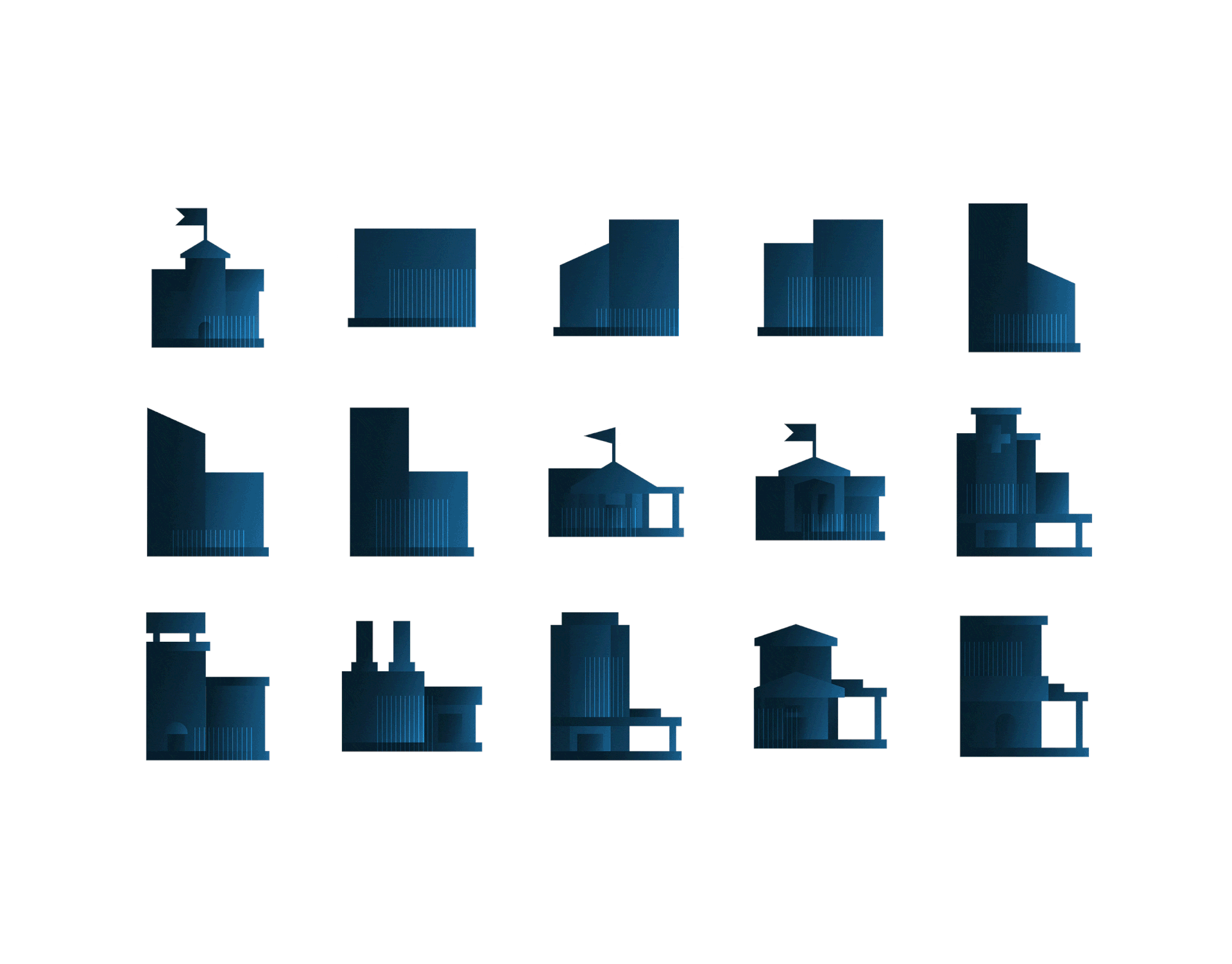
Tier 1 illustrations included the MC gear in the corner of the blue circle. The subject's position determined which quadrant the gear appeared in.
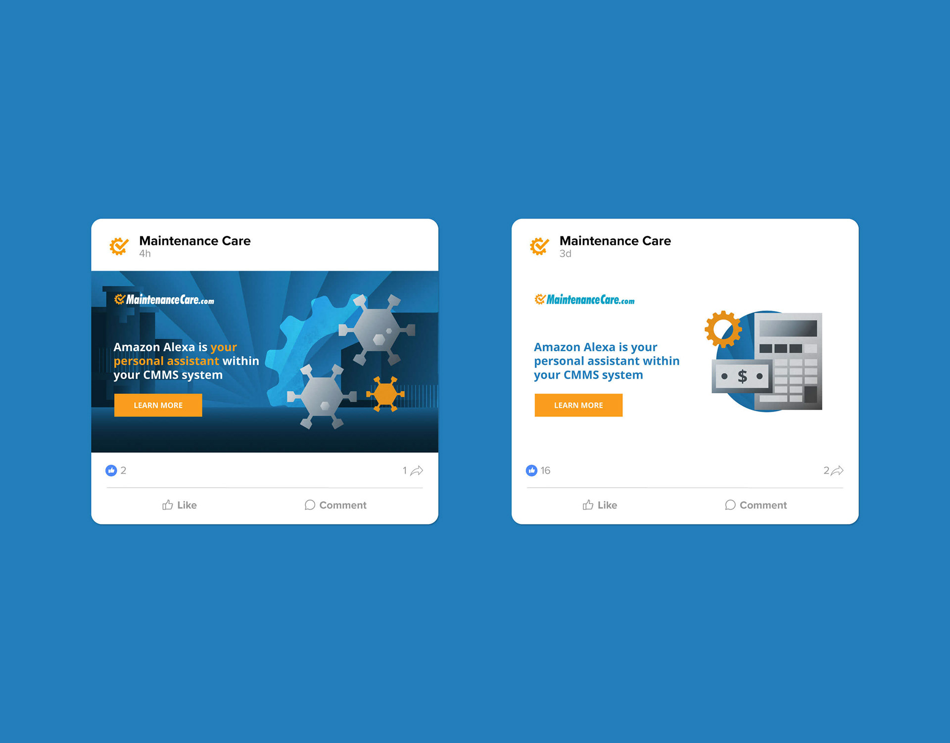
Social media post graphics were built using tier 2 illustrations.
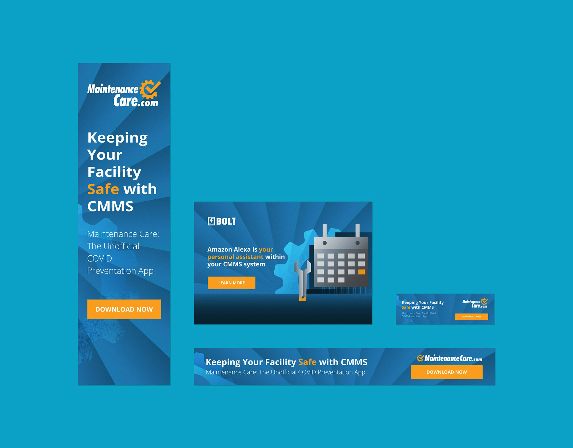
Display ads were also built using tier 2 illustrations.
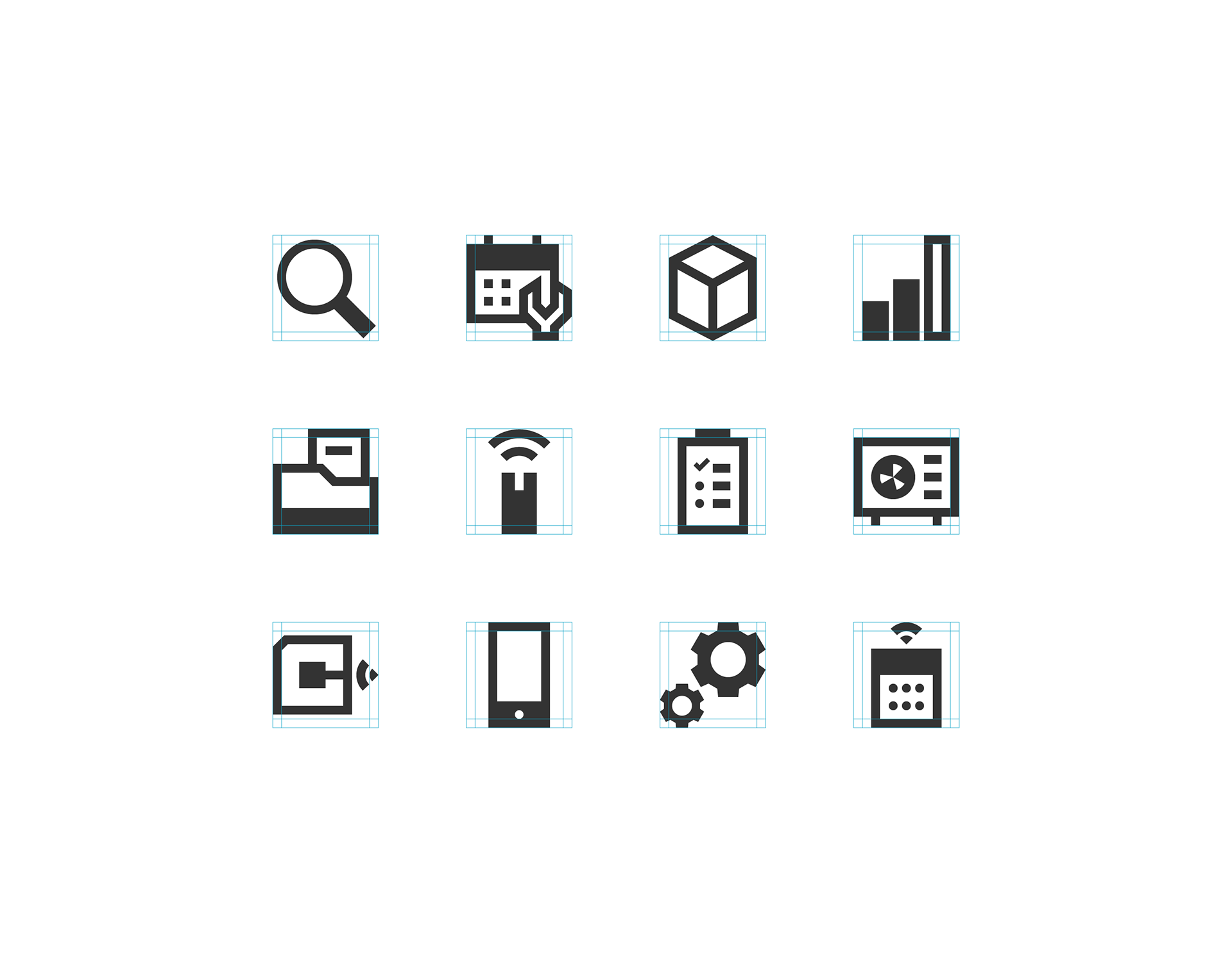
I redesigned the website menu icons to align with the illustrations. I used a grid with simple shapes to ensure consistency in the illustrated brand.
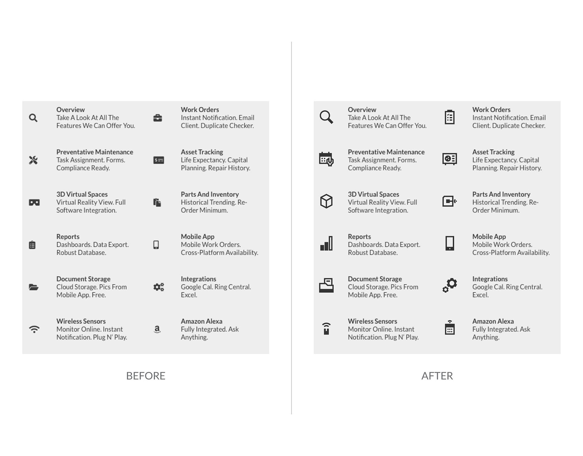
The before (left) and after (right) of the MC website icons.
By layering the tier 1 illustrations, I made creating social media post graphics easy.

I built the tier 2 illustrations in layers for a simple step-by-step process for making assets like email newsletter graphics.
The stepped process built complex tier 3 illustrations for landing page hero images.
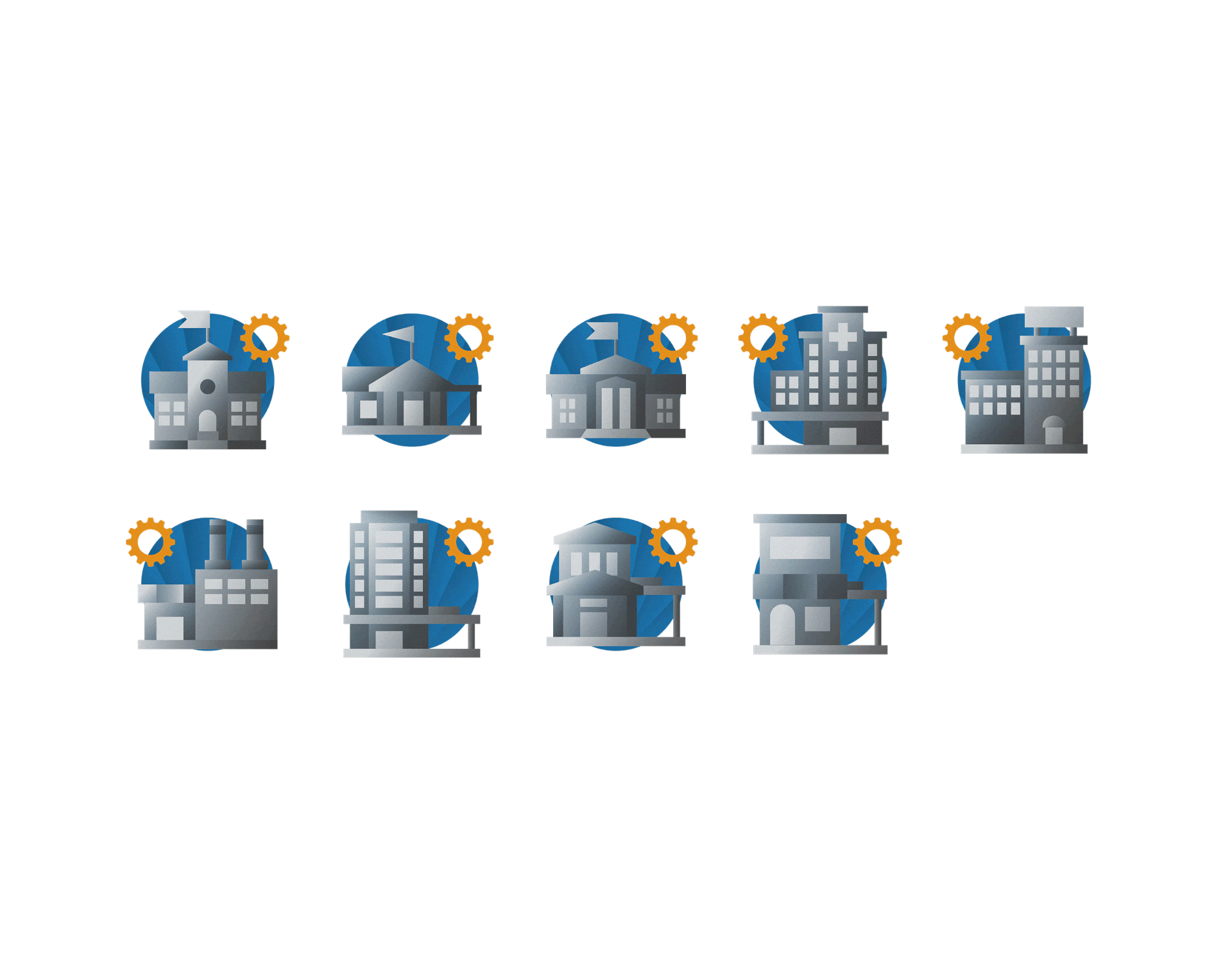
I created tier 1 icons for people, hands, features, industries, tools and safety categories.
Tier 2 icons featured an orange highlight because they would not be paired with the orange gear on top of the blue circles as they are in tier 1.
I created hero illustrations for the home, industry, features and general pages. They followed responsive design without compromising the subjects.