The challenge
The challenge was celebrating 100 years of KNP in one logo. I was also limited to only using Parks Canada brand colours. The design needed to include one-colour, two-colour, and full-colour variations. The centennial logo would be used for event branding and promo materials during the year.
My role
As the graphic designer, I researched KNP for recognizable landmarks to pick the scene for the logo design. Then, I sorted through reference imagery and sketched badge designs to fit the scene's orientation. During the concept stage, I experimented with negative space in the wordmark to include the number 100 inside the name Kootenay. Also, I tested badge shapes and colour palettes to find the appropriate expression.
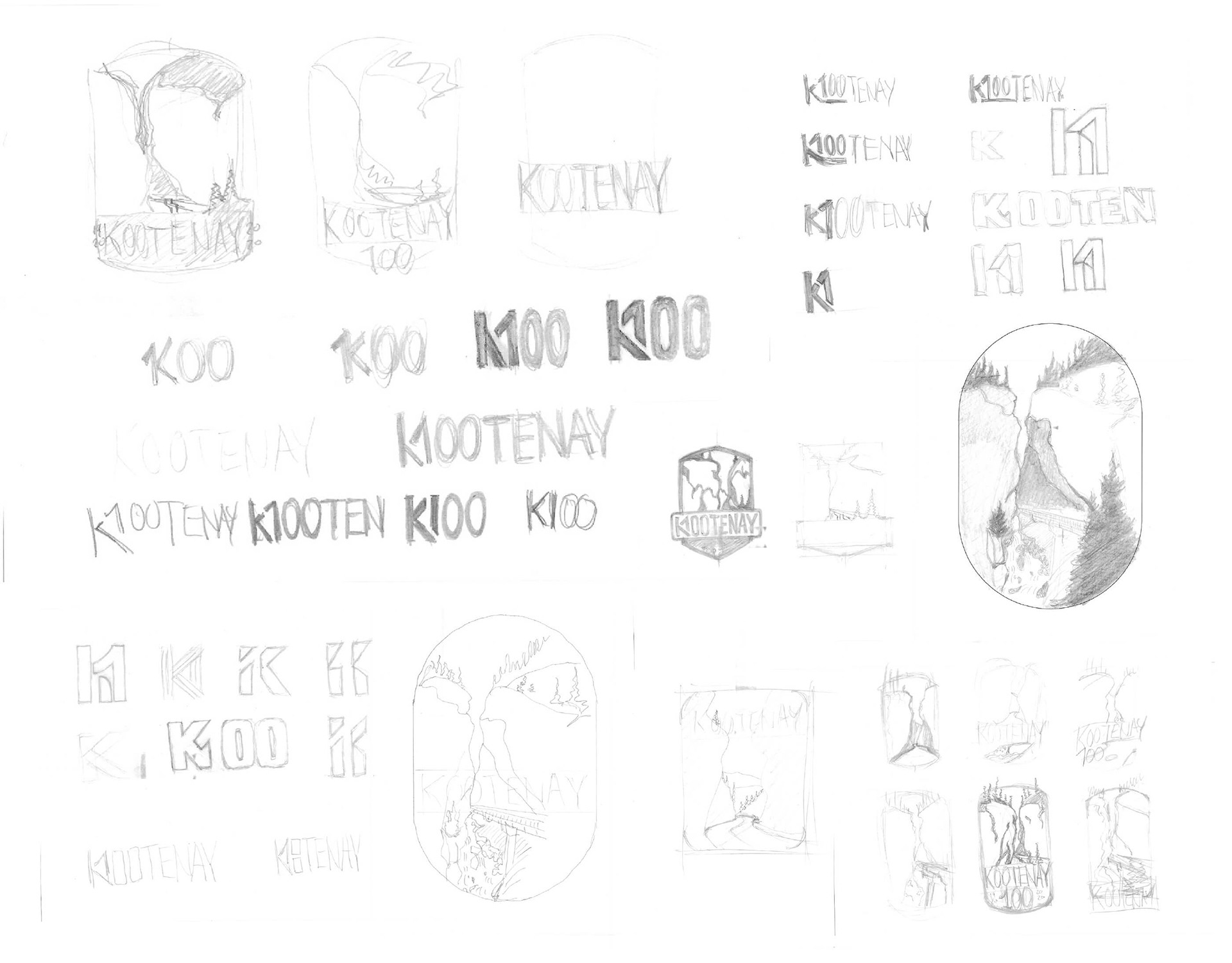
Concept sketches of the KNP centennial logo design.
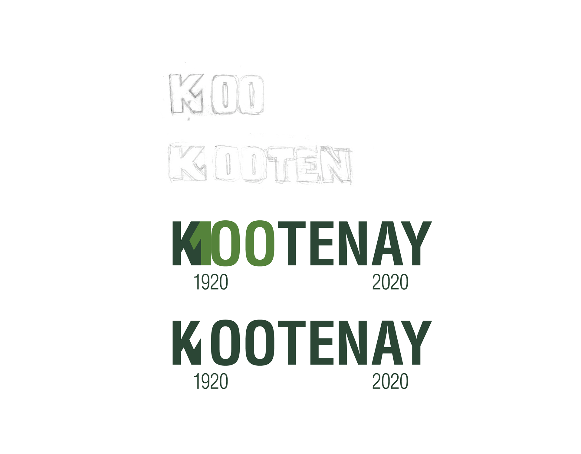
The construction of the negative space 100, hidden in the Kootenay wordmark to celebrate 100 years of KNP.
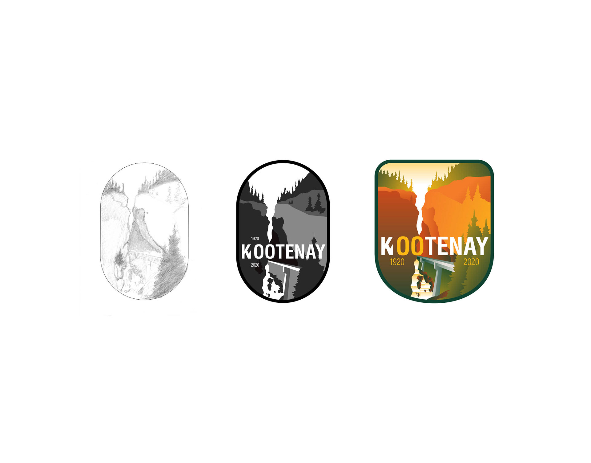
The evolution of the centennial badge design from sketch to digitization.
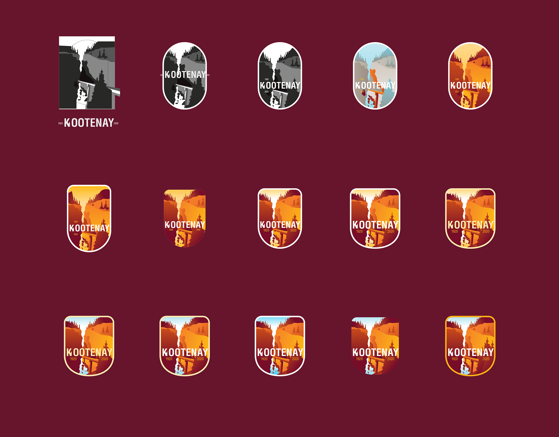
The progression of badge concepts for the centennial logo design.
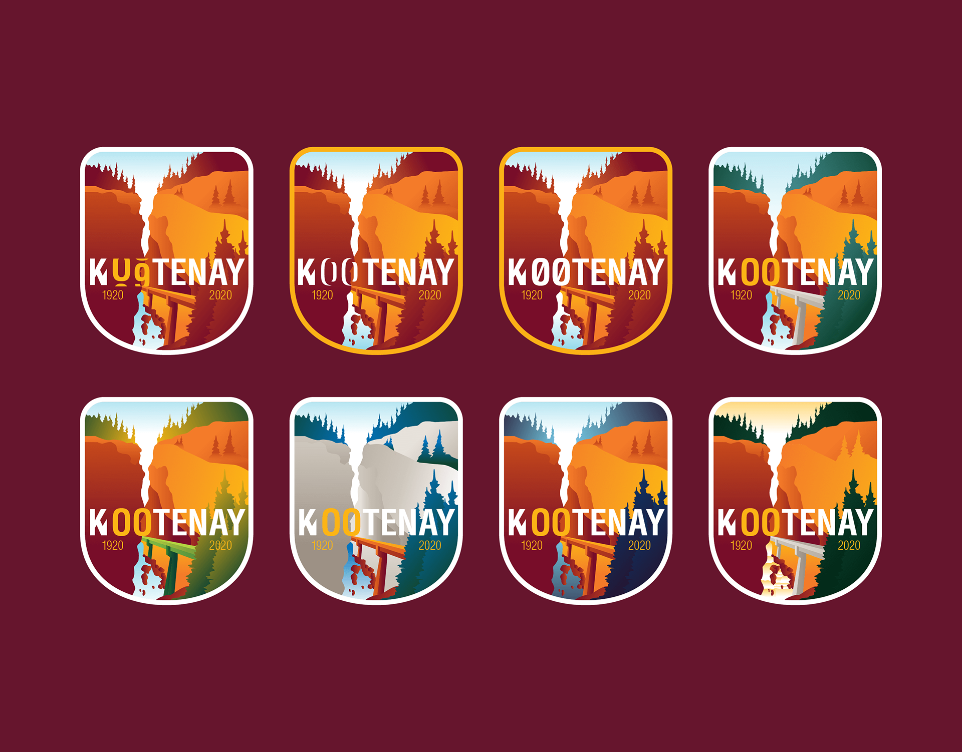
I was experimenting with wordmark design and colour palette for the centennial logo design.
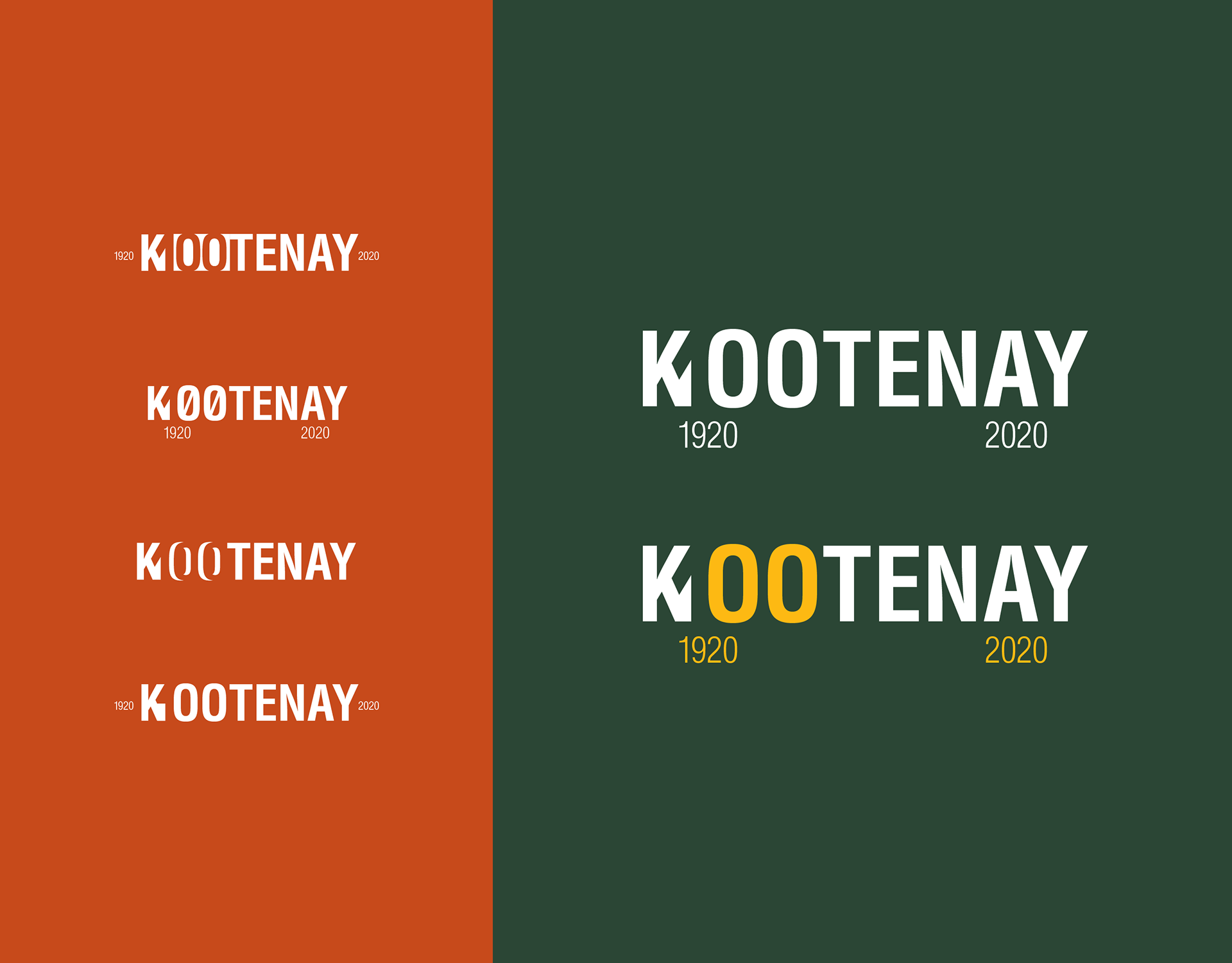
Wordmark variations that feature the number 100 in the design's negative space.
The solution
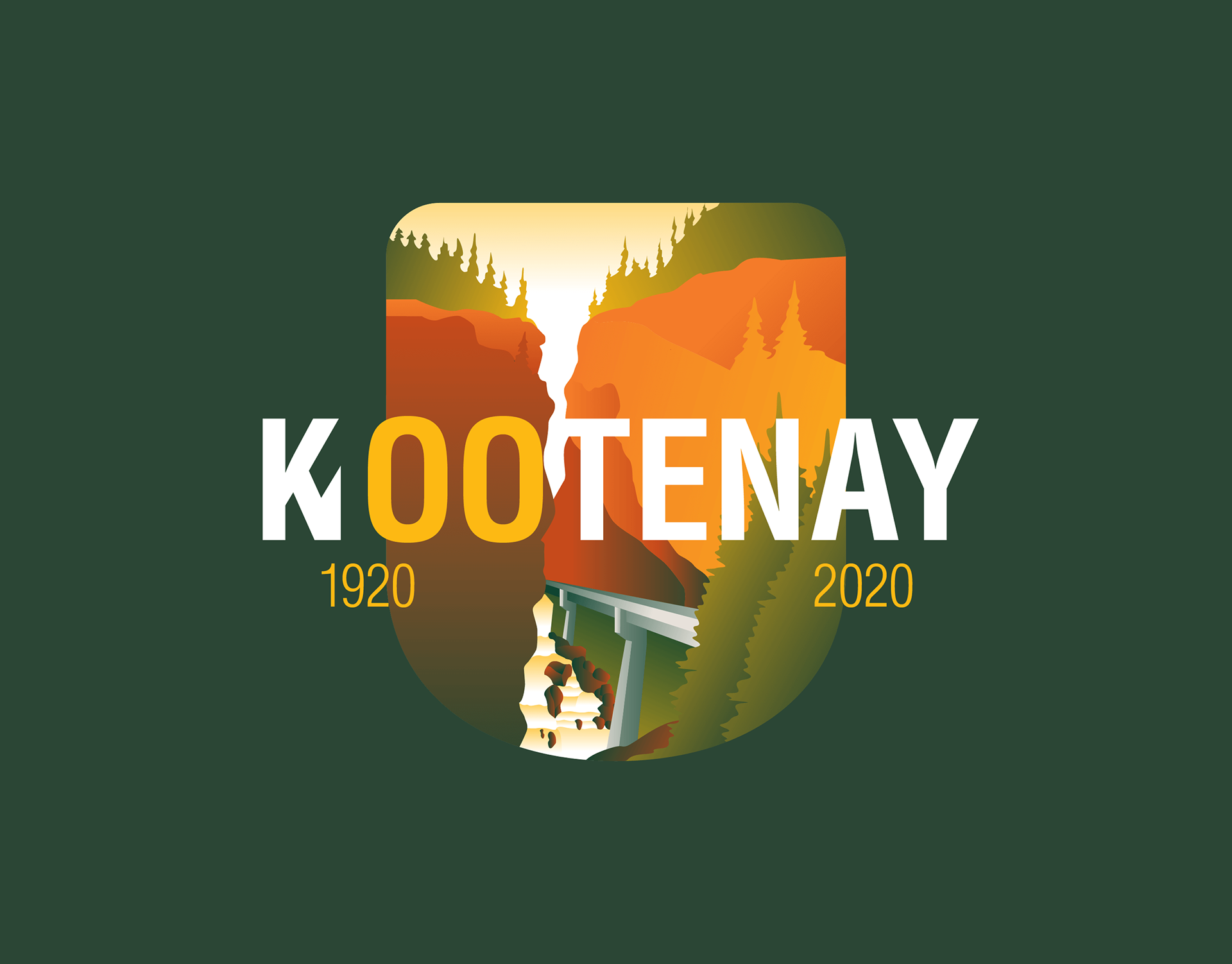
I created a crest-shaped badge design of Sinclair Canyon that used Parks Canada colours and worked in one-colour, full-colour, monochrome and greyscale. Inside the badge was a Kootenay wordmark with a hidden 100 to recognize the centennial celebration.
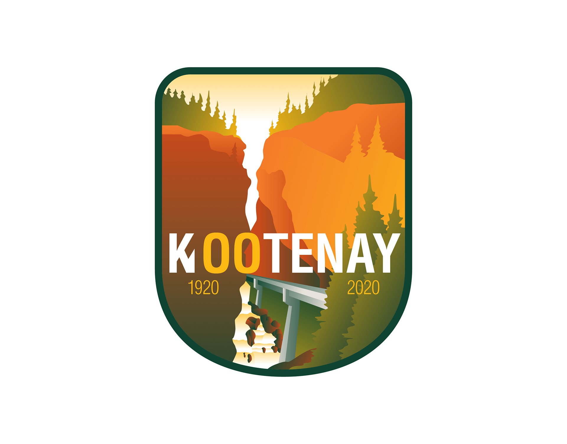
The KNP centennial logo design.
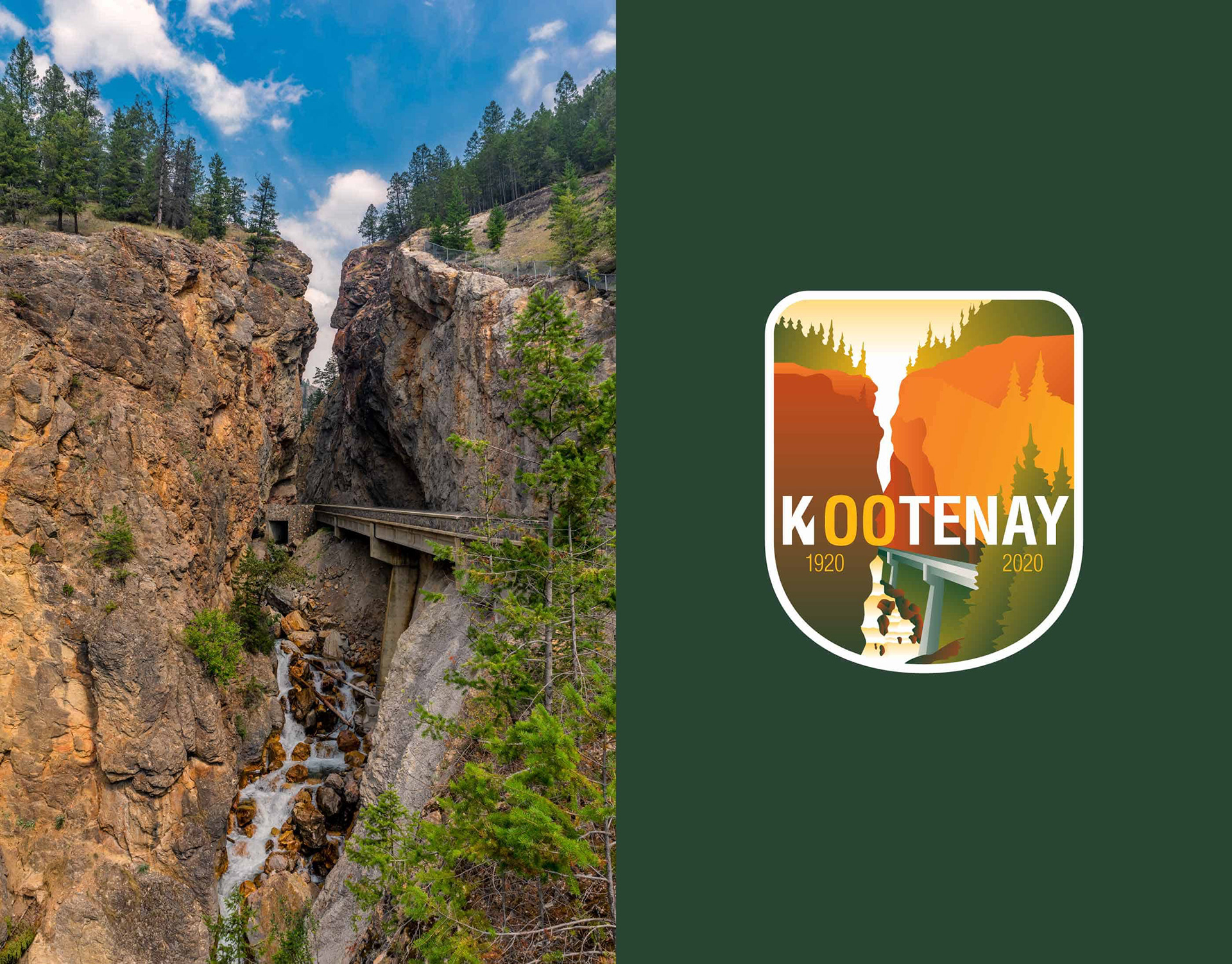
The featured location in the centennial badge design is Sinclair Canyon, Kootenay National Park.
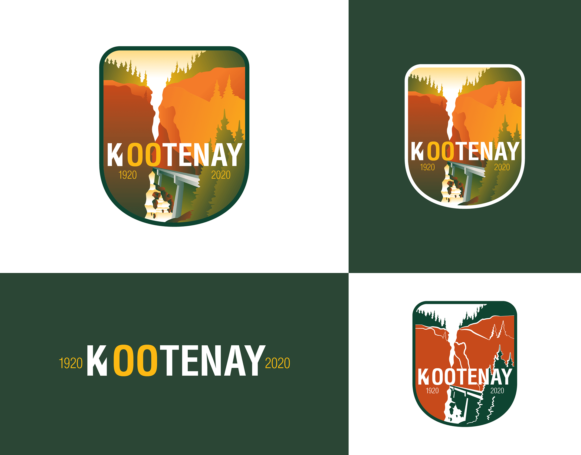
The KNP centennial logo design variations.
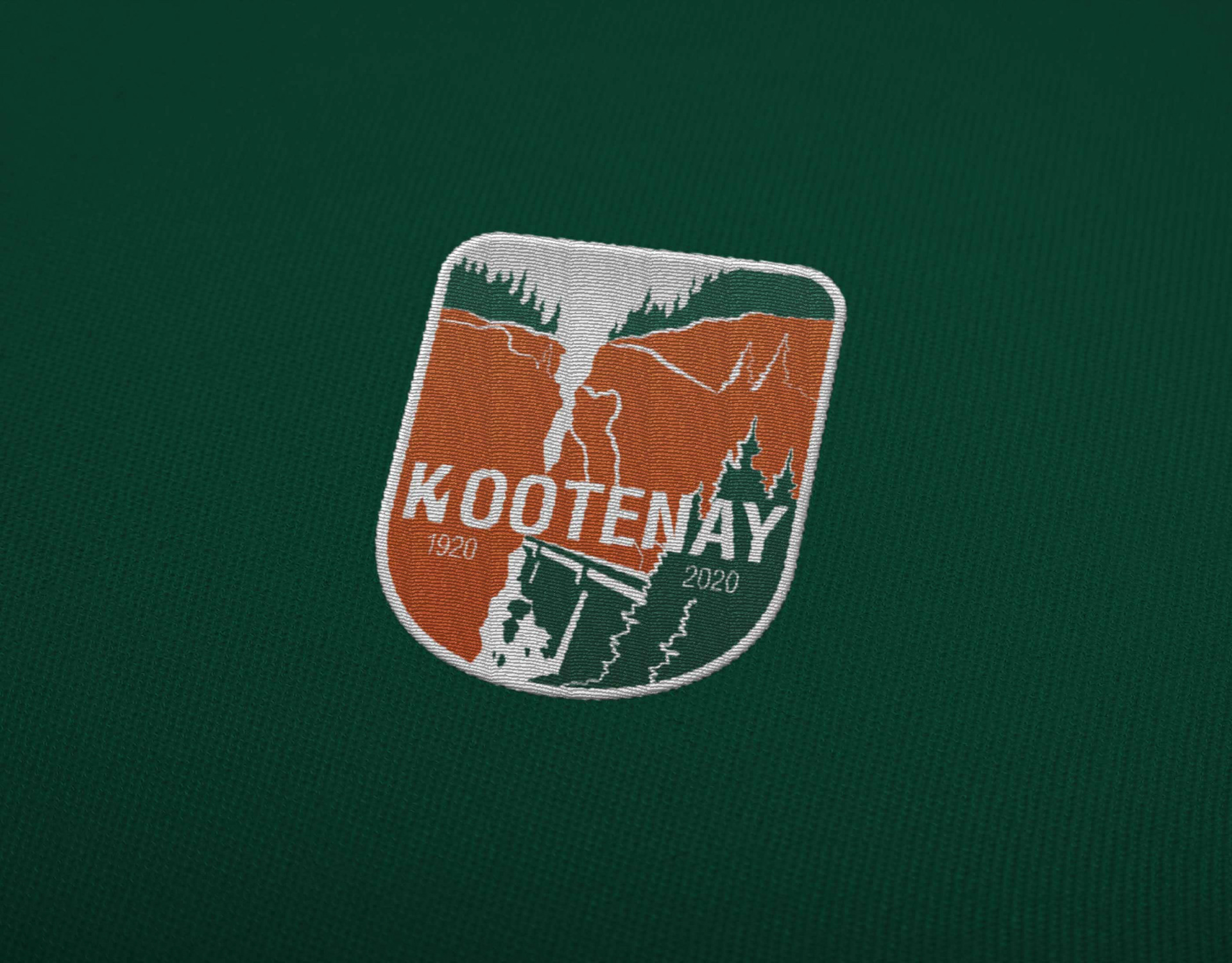
An embroidered version of the centennial logo design.
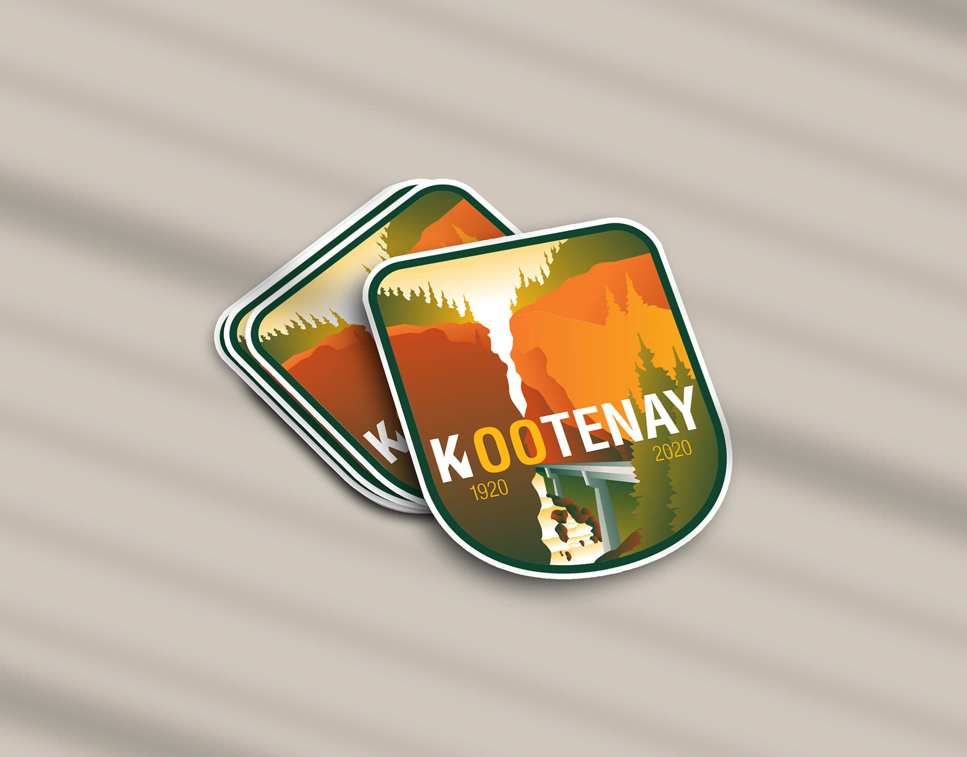
Stickers of the KNP centennial logo design.