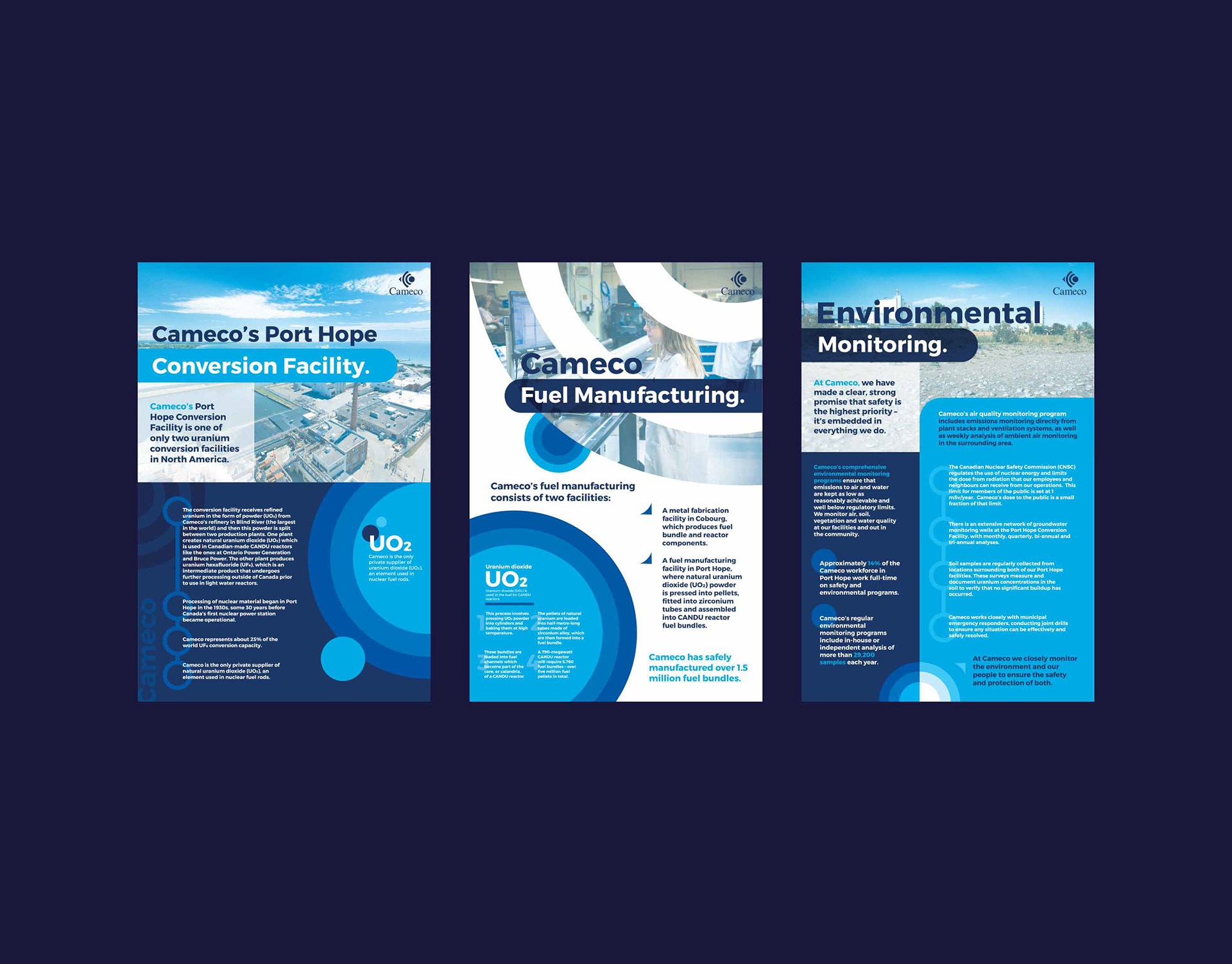
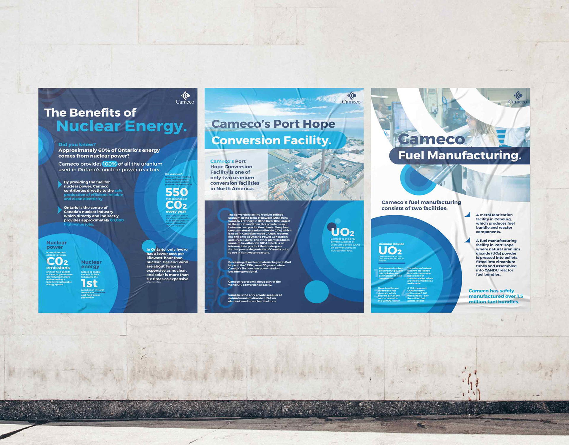
For a Cameco open-house event, I designed a series of posters that featured clean layouts and bold typography.
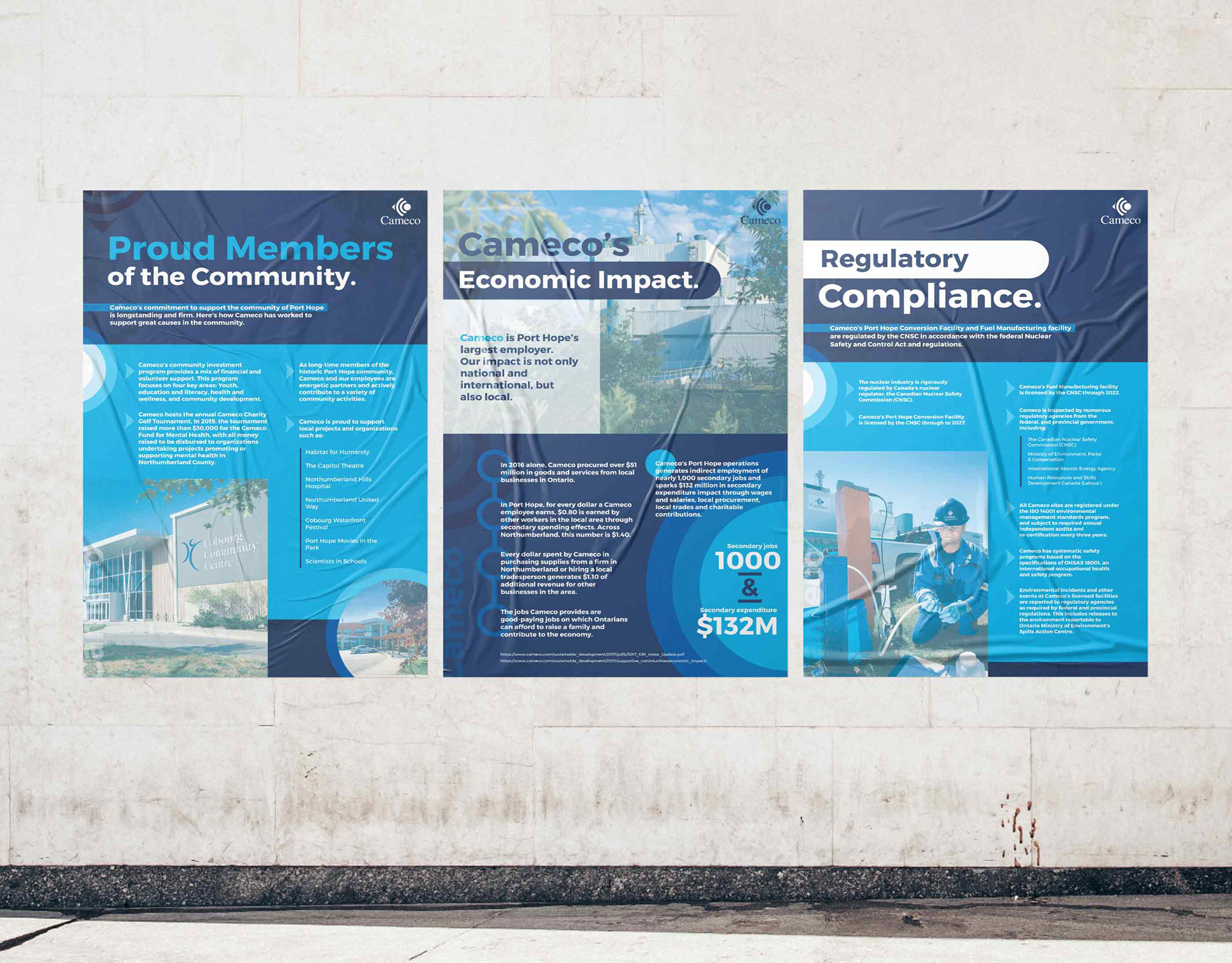
I created theme and variation throughout the posters, allowing for uneven lengths of copy and a variety of images.
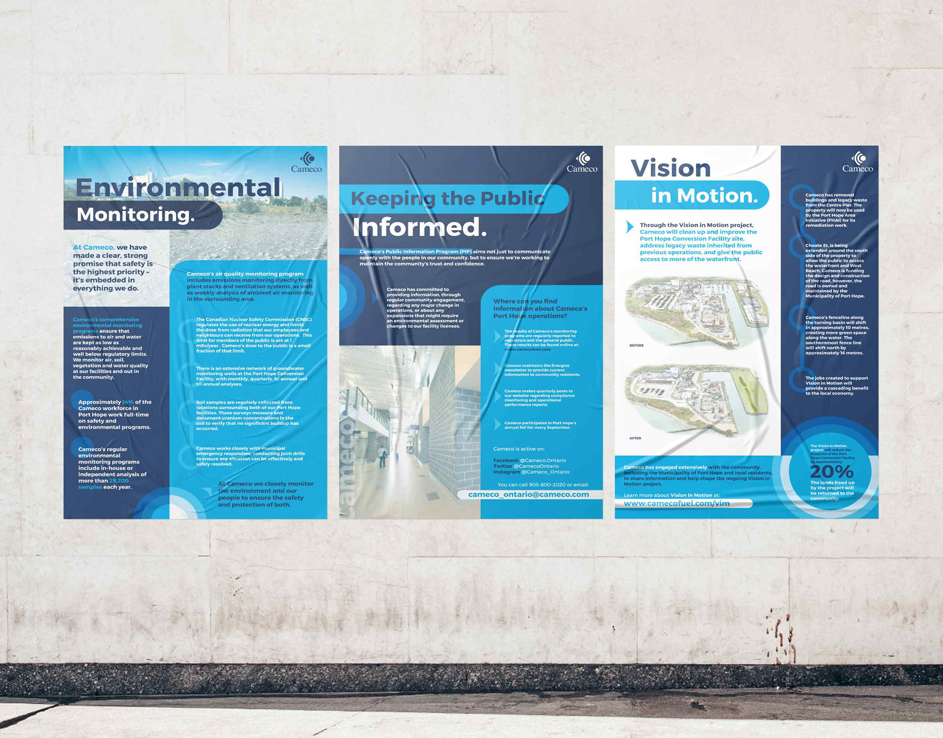
To mimic the characteristics of the Cameco logomark, I used round shapes and corners.
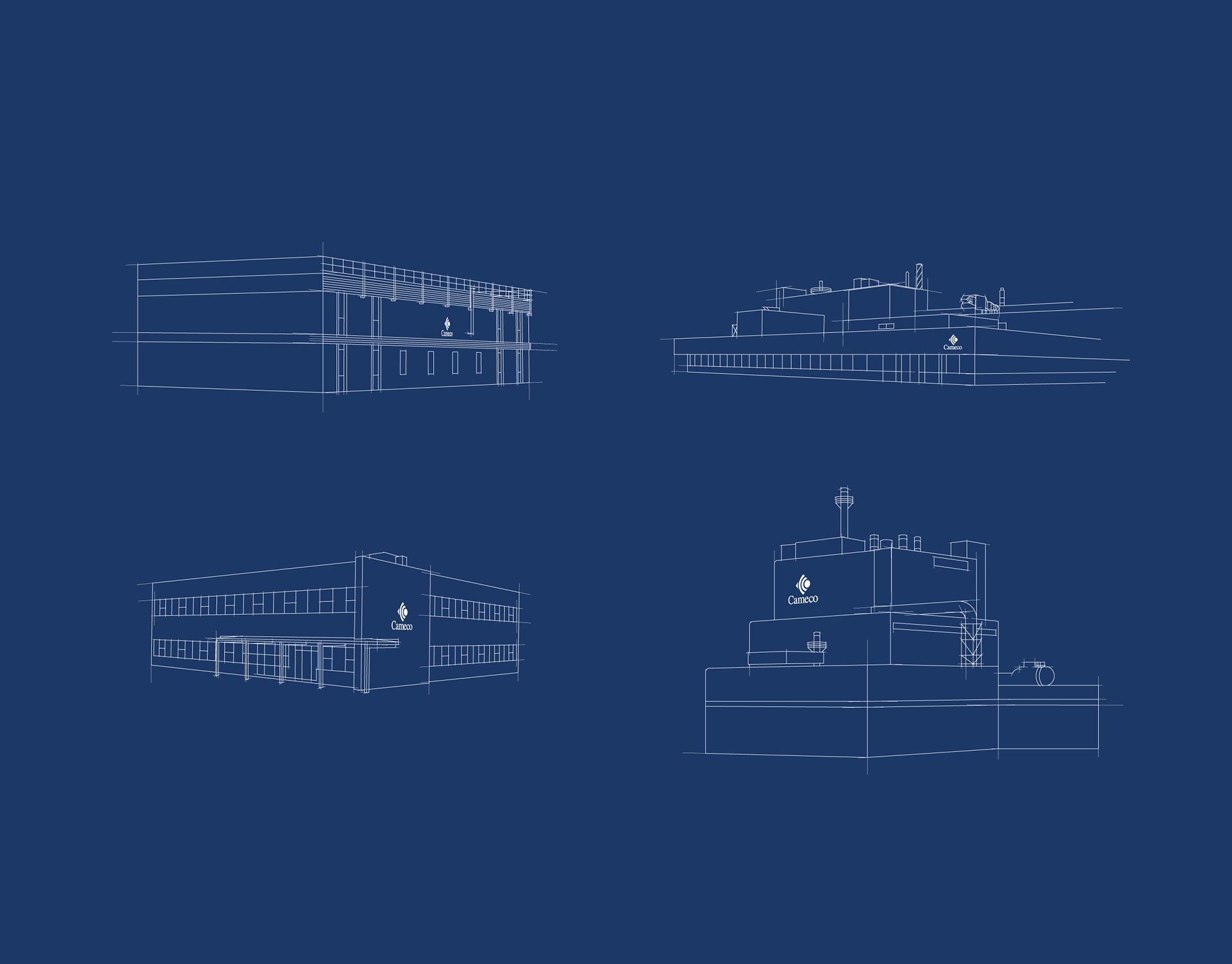
I drew the Cameco facilities in digital line art for presentations and graphics.
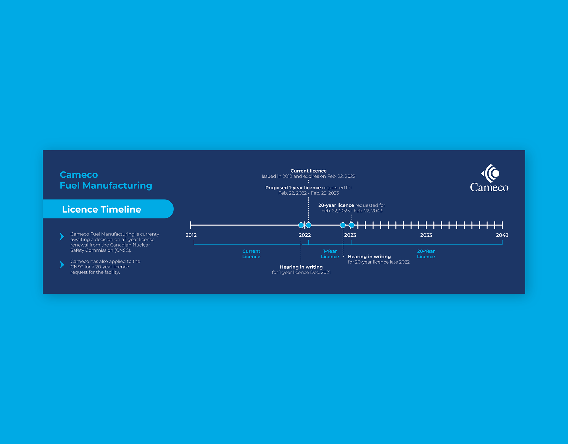
I made an infographic to visualize the Cameco licence timeline.
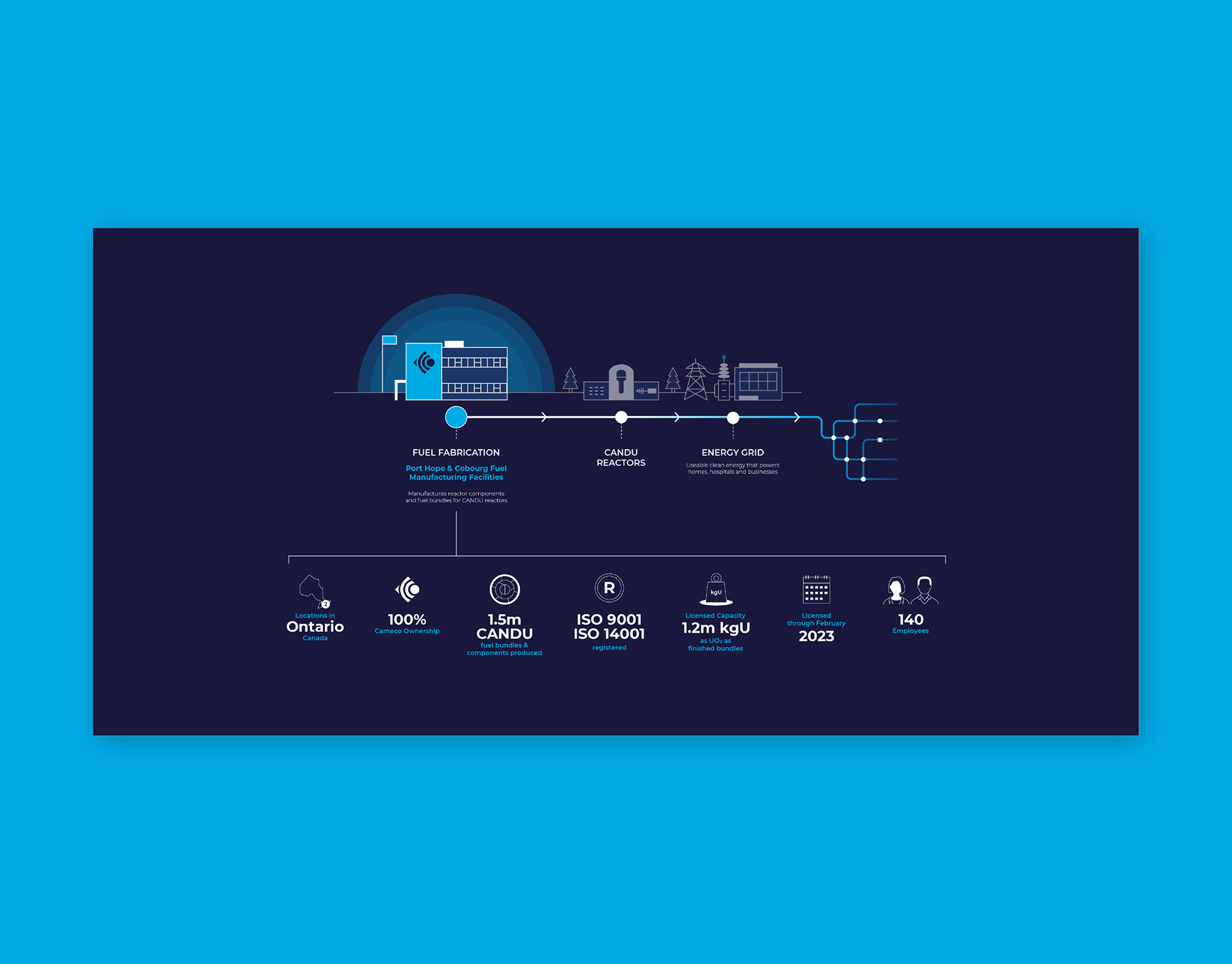
I created an infographic to show who Cameco Fuel Manufacturing is and what they do.
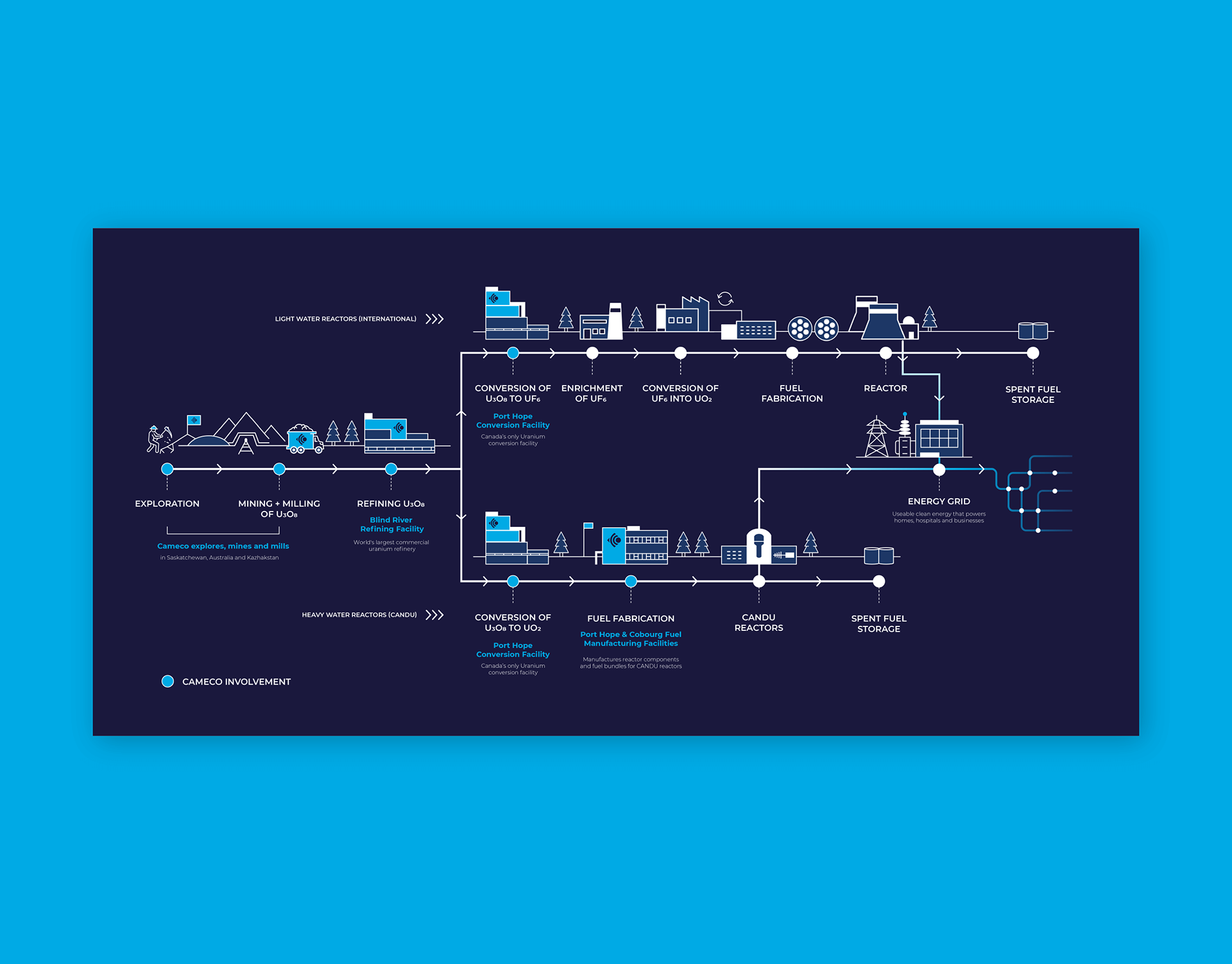
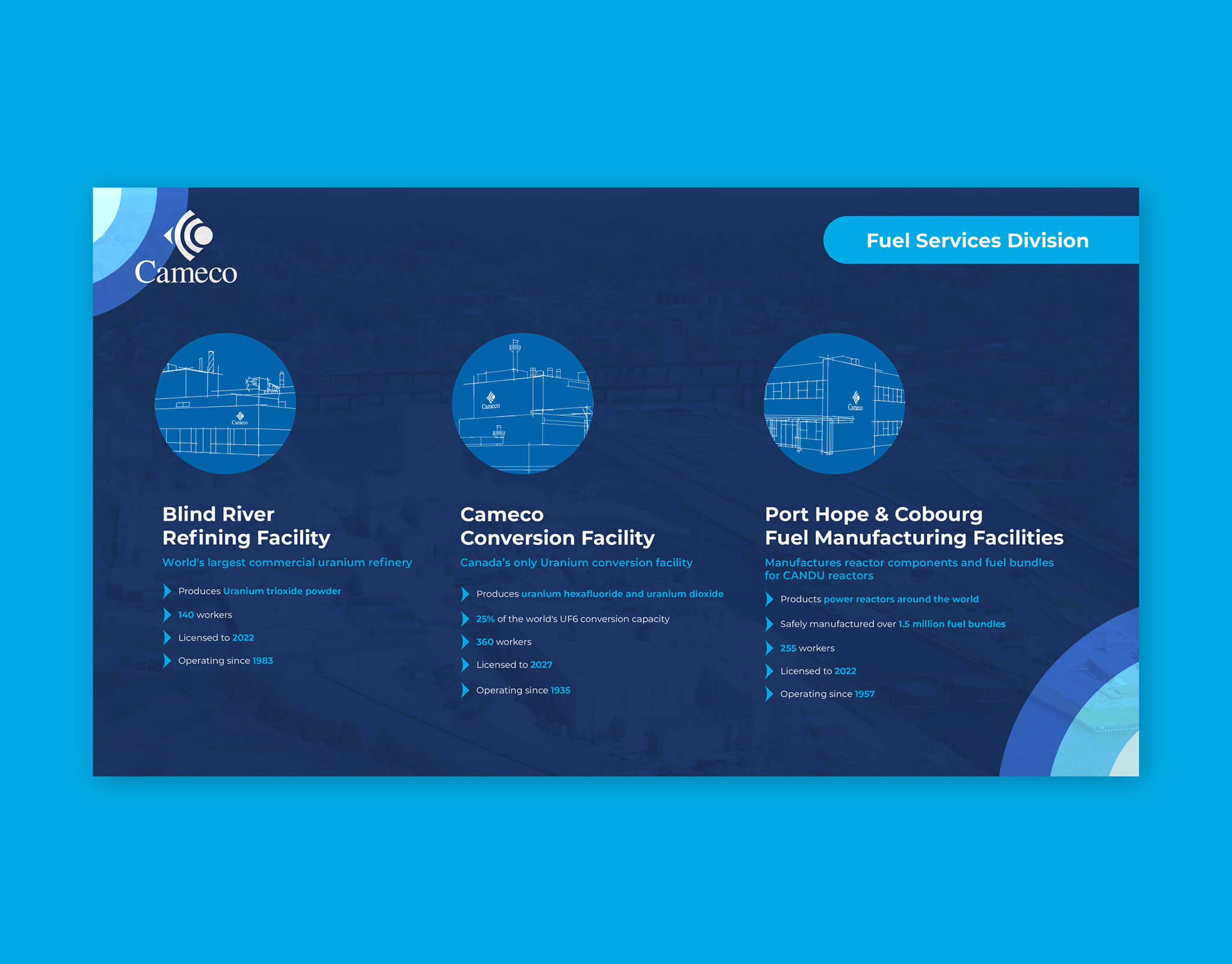
I created an infographic to visualize how Cameco is involved in the nuclear fuel cycle.
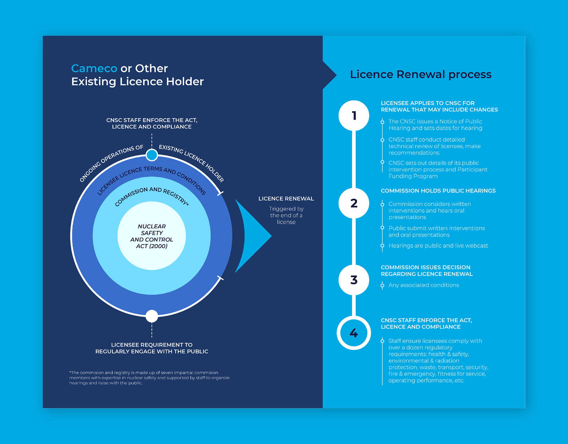
I made an infographic to visualize the Cameco licence renewal process.
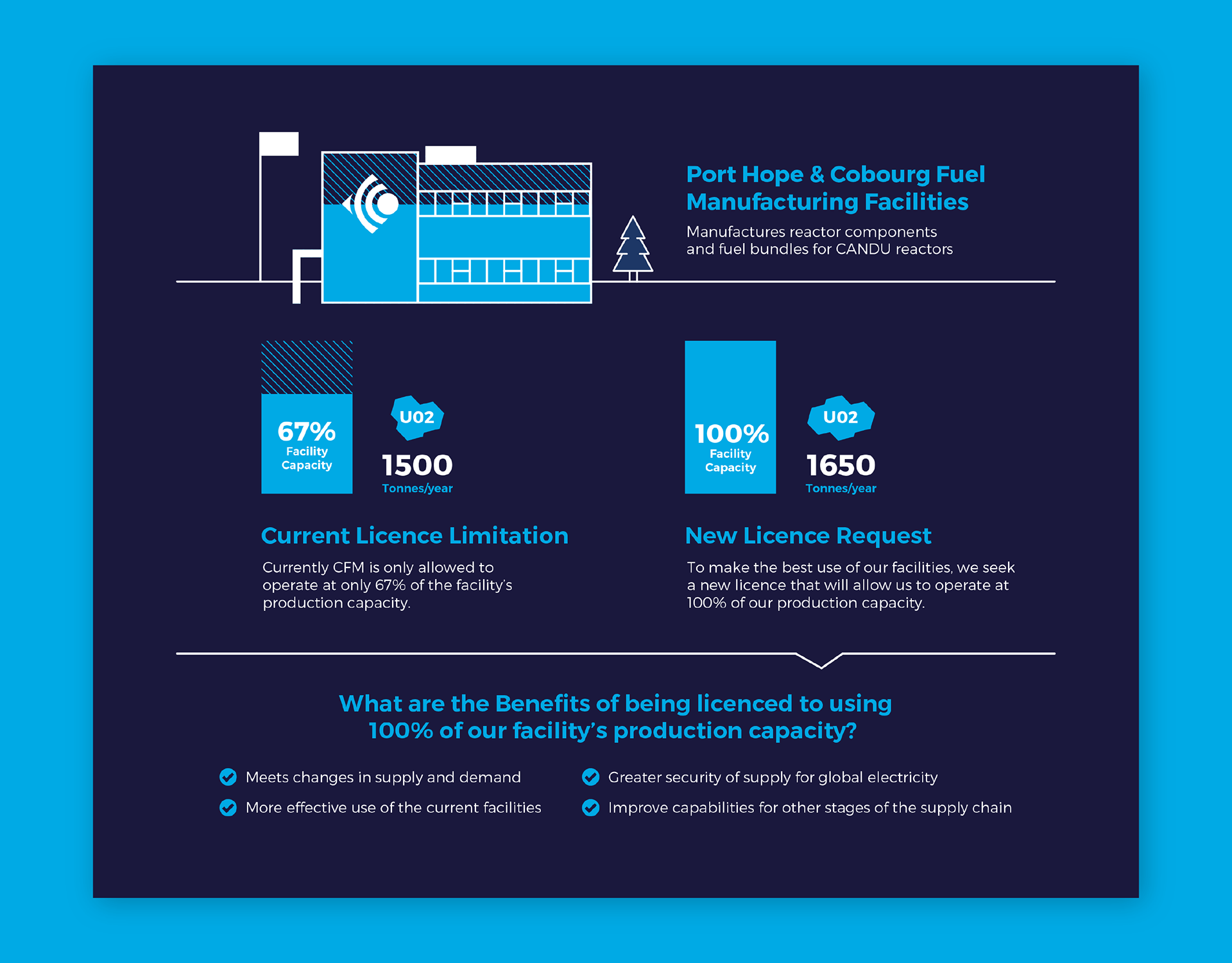
I created an infographic to show how the licence request would allow Cameco to operate at total capacity.
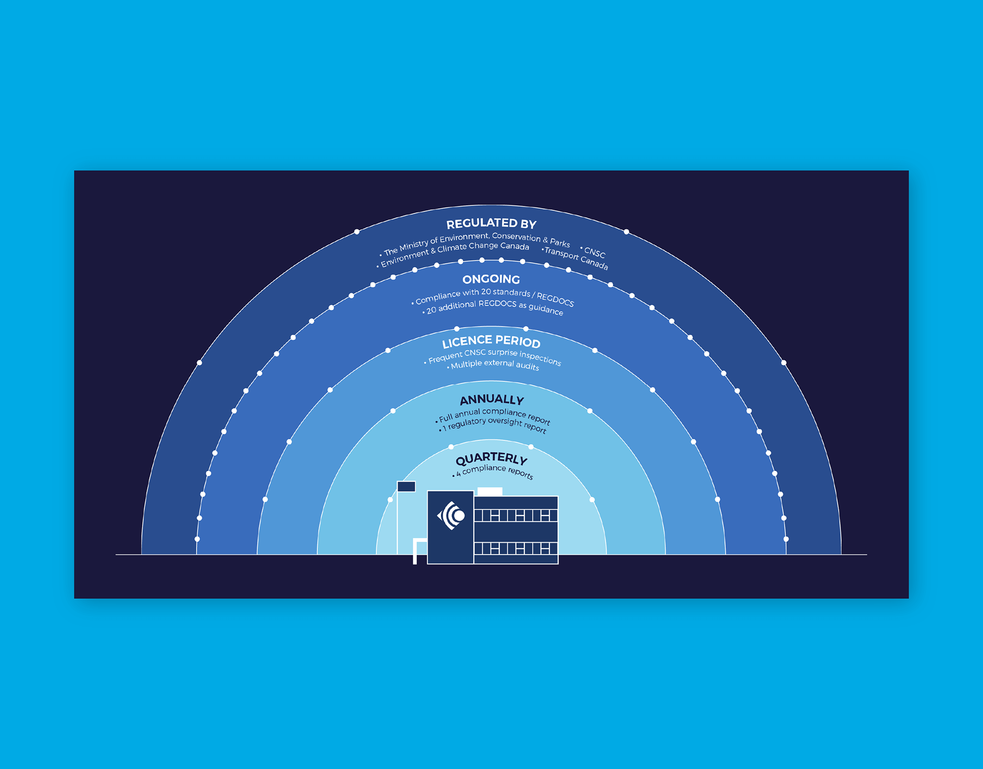
I made an infographic to visualize the Cameco regulation and compliance levels.
I created the slide layout for a Cameco presentation featuring the facility line drawings.