The challenge
The challenge was to design a cohesive visual identity for the InterpCan Conference (ICC). The board wanted to use the identity for in-person and online conferences that they alternated annually. The volunteers needed the design to be simple to use with what they had. It all had to work with the IC logo and colour palette. There was a need for the ability to change text for location, date and tagline as details changed each year. Also, accessibility was a priority to provide for a large national audience.
My role
As the graphic designer, I created the ICC identity from concept through iteration to design and execution. It included a logo design, an extended accessible colour palette, an abstract brand pattern and layouts. I ensured the style was adaptable to work annually and simple for the volunteers to export social media and website graphics.

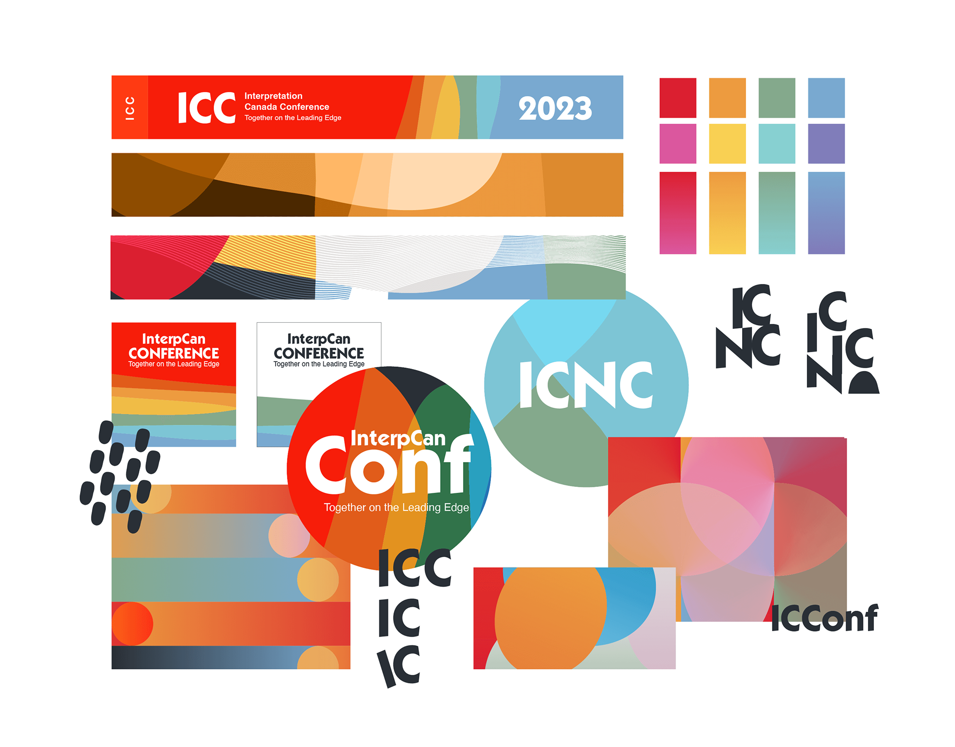
While making the brand identity, I experimented with colours, patterns, logos, and layouts.

The solution
To fulfill the needs of the IC board, I made a flexible conference identity that paired with the existing IC logo. Staying on-brand, I built the conference logo using the established brand typeface. Since the conference is national, I included an English and French version. I expanded the colour palette to offer choice and depth via tints and shades. The added colours passed Web Content Accessibility Guidelines (WCAG) with level AA (4.5:1) while keeping the palette bright. To adapt to the changing themes of the annual conference, I formed an abstract brand pattern that could be interpreted in many ways. The pattern could be cropped in different spots for variation each year. The round blob shapes of the current IC logo inspired the pattern. I provided direction on where to place the logo, text, and other essential elements to keep an acceptable contrast ratio. Then, I designed social media post templates and set up the template designs in Canva for volunteers to quickly make posts. I imported the patterns and shapes as SVG files to ensure volunteers could easily change colours in Canva.

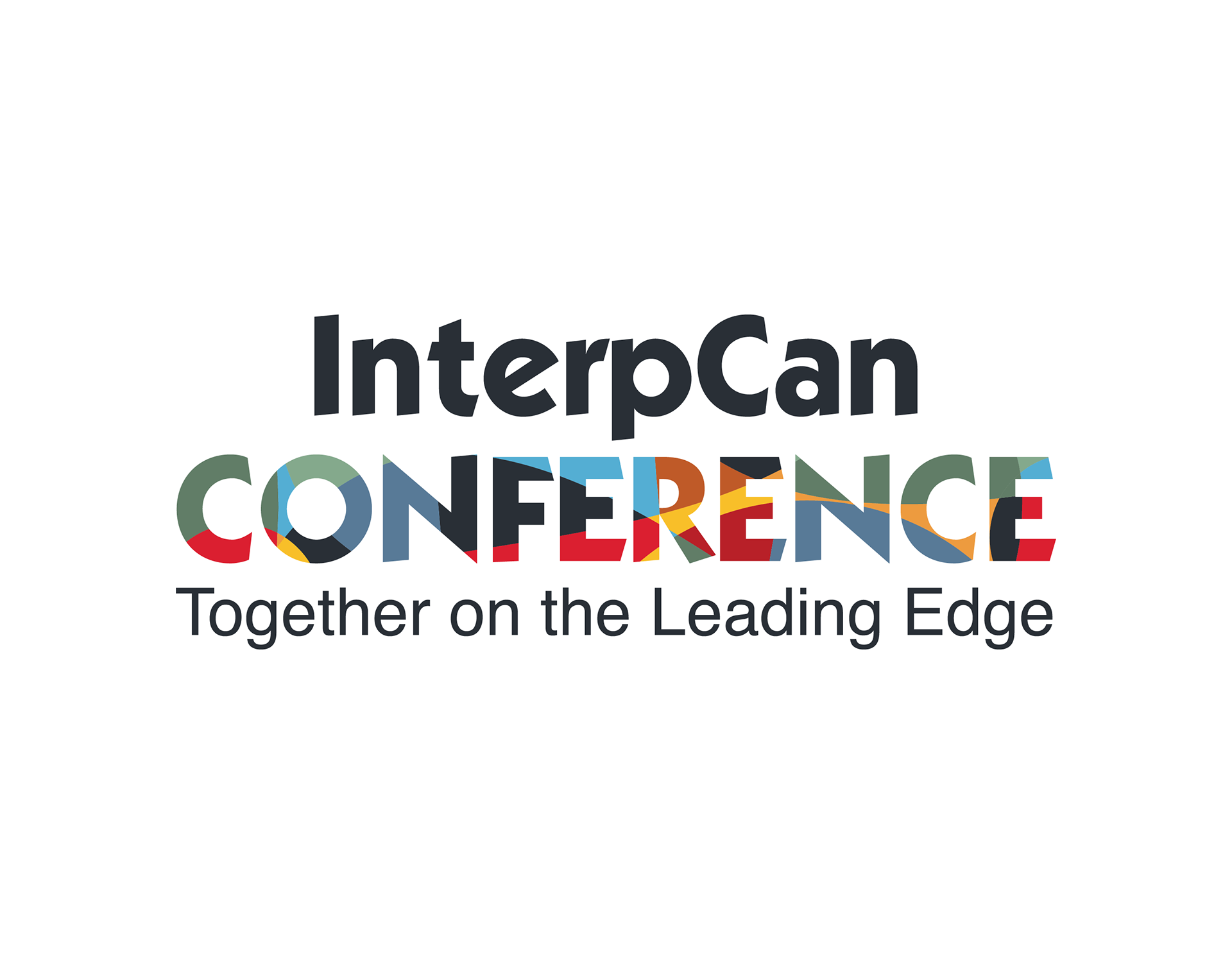
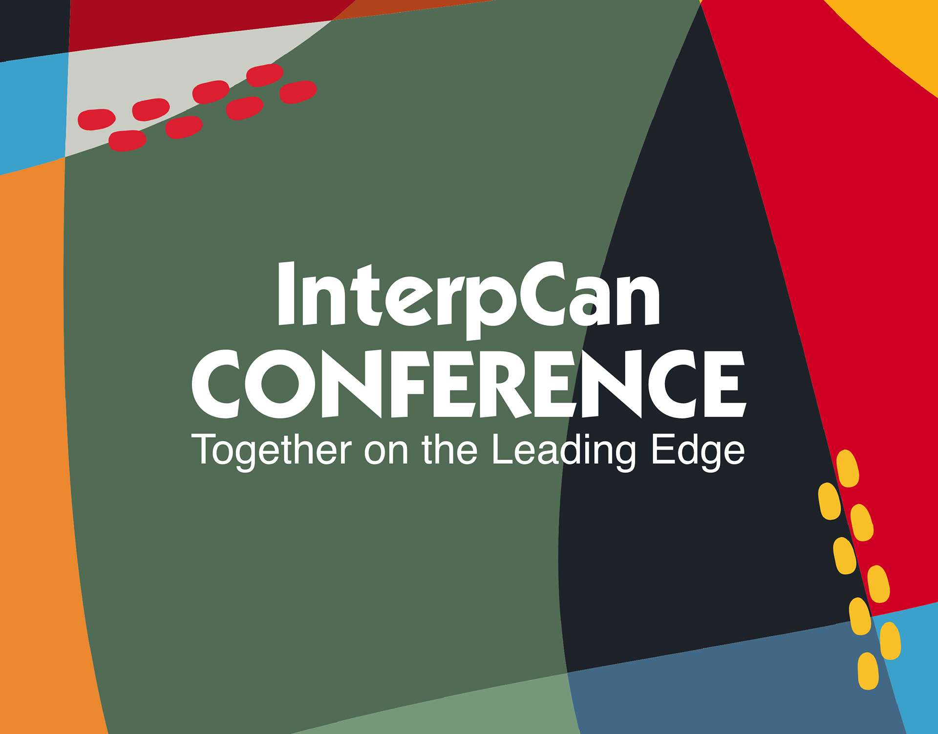
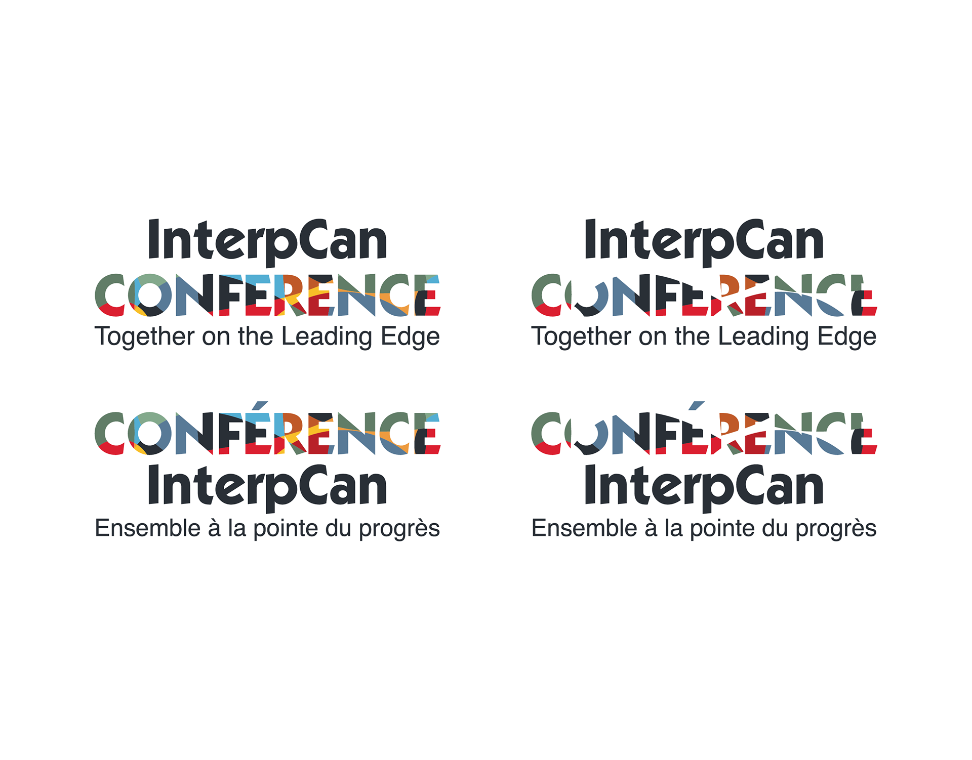
The ICC logo design with the conference theme title.

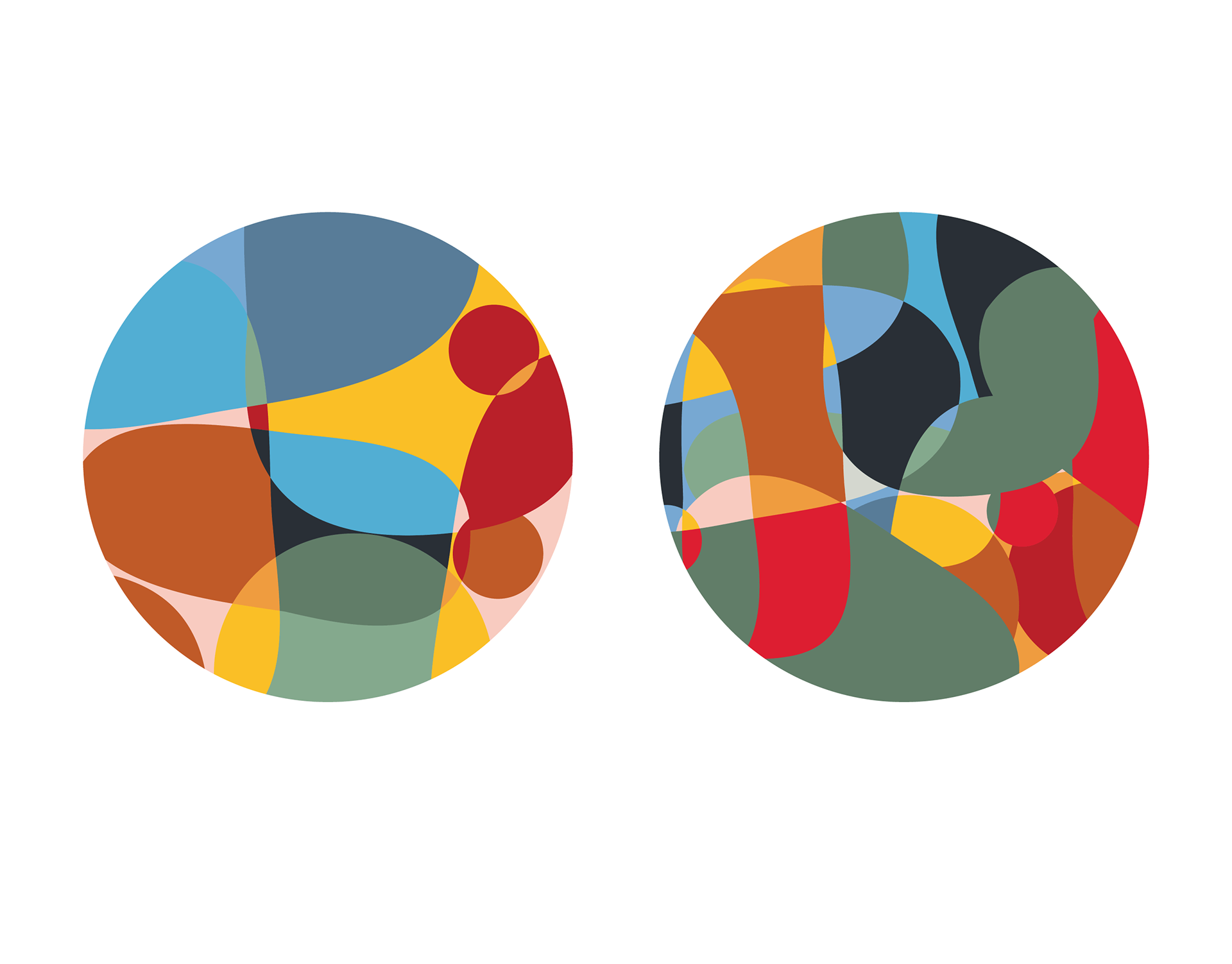
A simple pattern (left) and a complex pattern (right). The brand patterns work as a fill for the logo and a background in the layout.

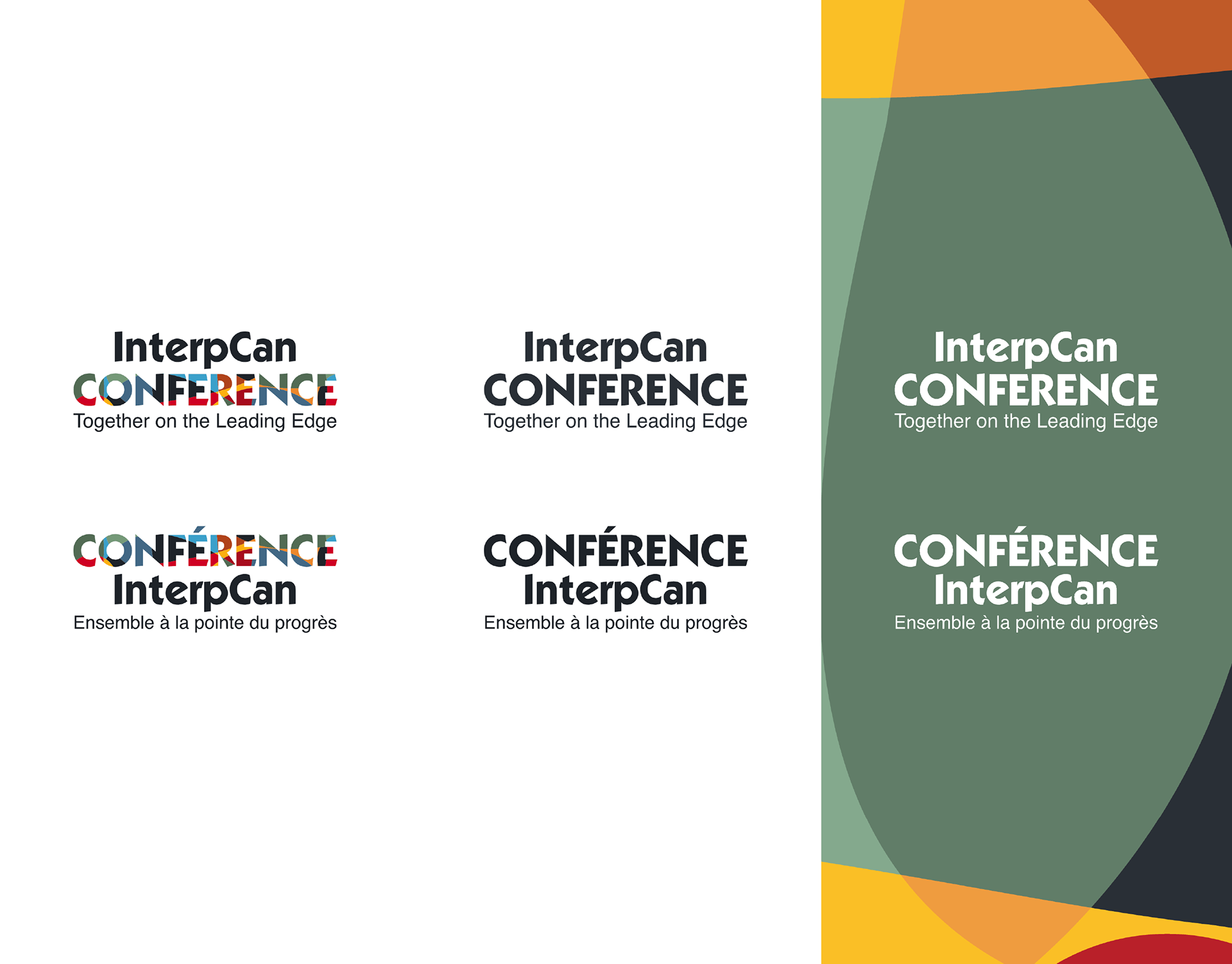
English and French versions of the ICC logo in full colour (left), one colour (middle), and reverse (right).

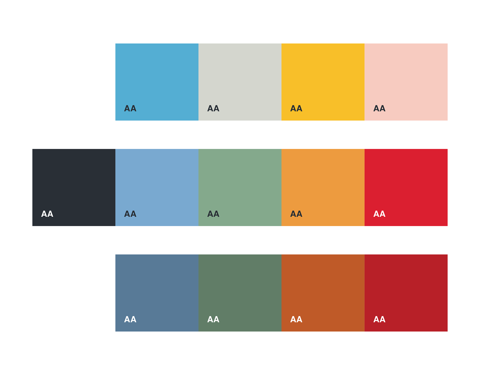
I expanded the five colours of the IC brand for more combinations with a WCAG AA (4.5:1) contrast ratio.

The logo is legible without the low-contrast colours, as shown by my simulation of not being able to see colours below the (4.5:1) contrast ratio.

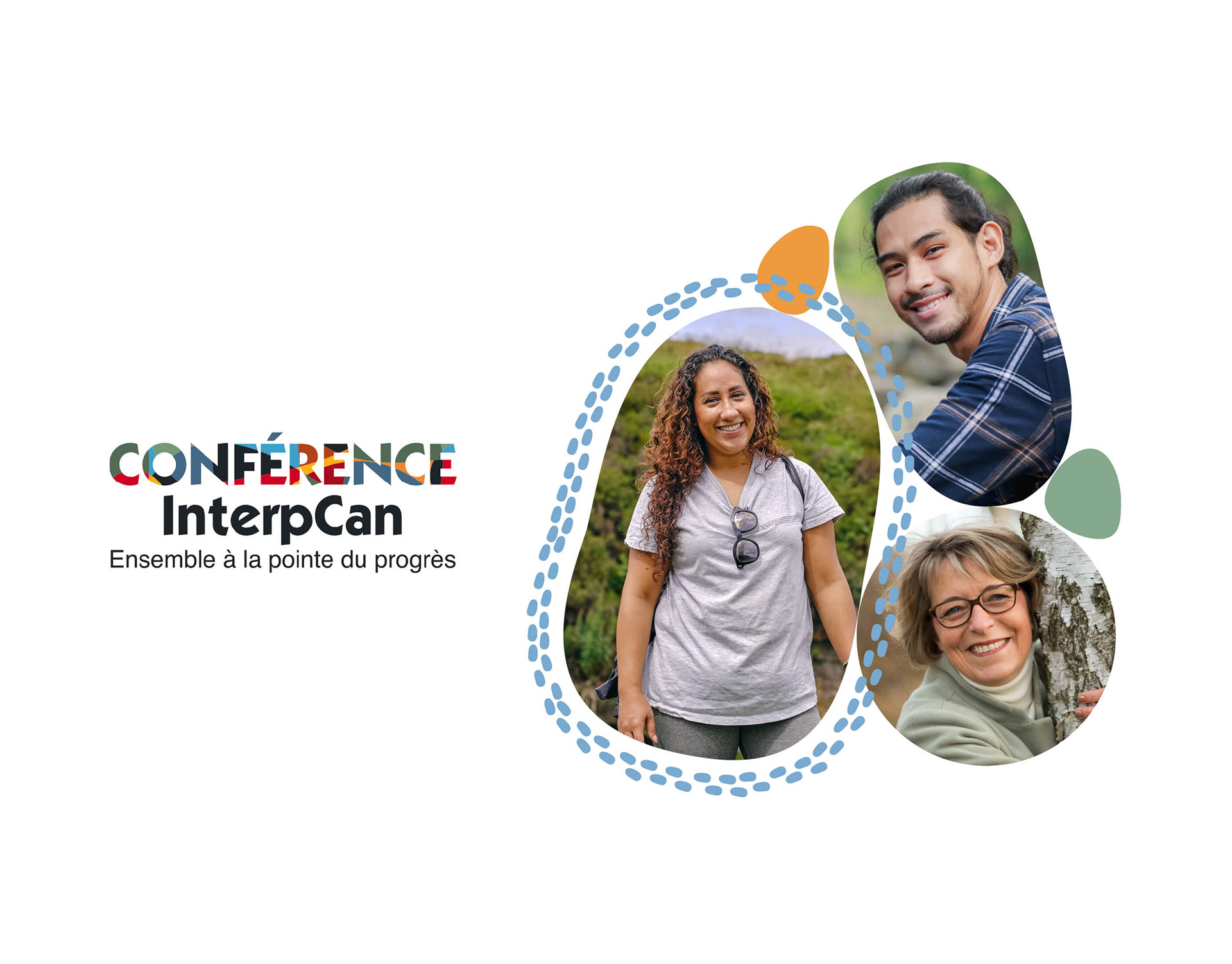
The identity layout features round blob shapes inspired by the IC logomark that work as containers for solid colour fills and imagery.

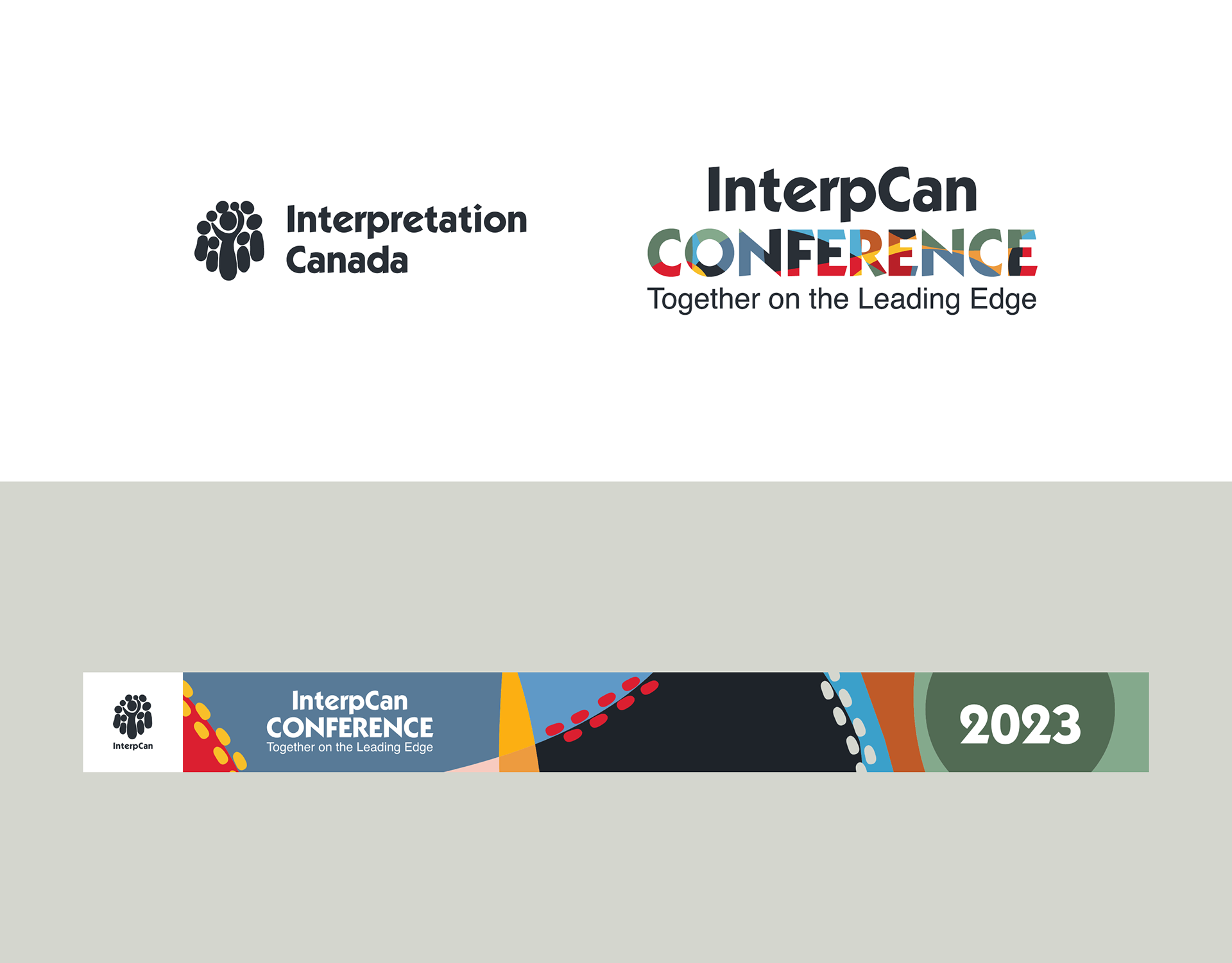
The IC logo (left) is paired with the new ICC logo (right) and the identity on a digital event banner (bottom).

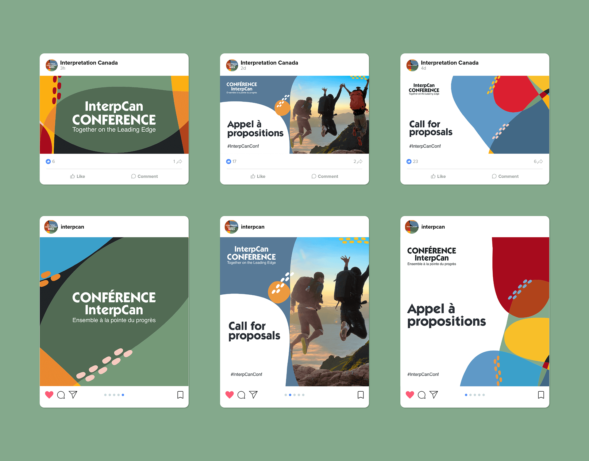
I designed Facebook and Instagram posts and converted them into templates for use in Canva by volunteers.

Other projects

Back to Top