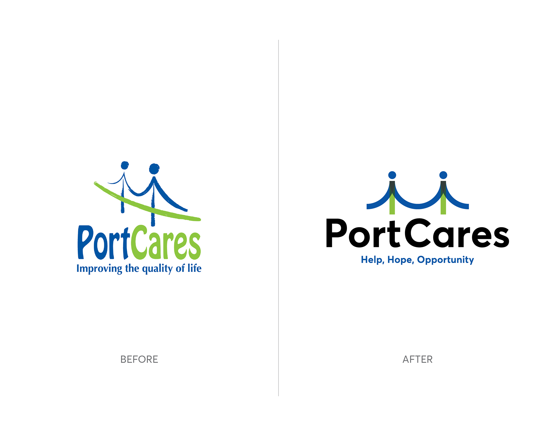
While keeping the green and blue of the existing logo (left), I created a modern, geometric design for the new PC logo (right).
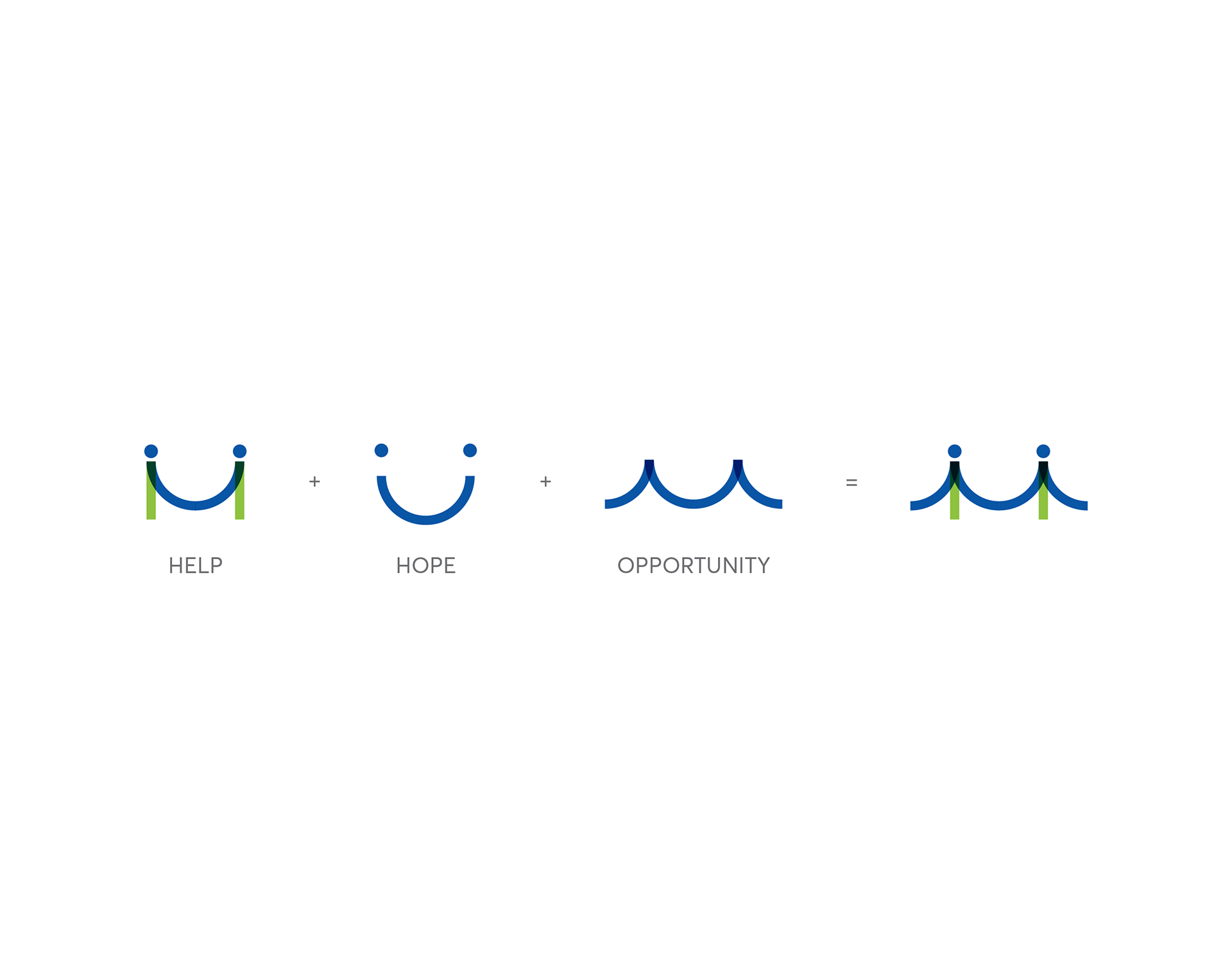
Unique elements that resemble all parts of the tagline: Help, Hope, Opportunity form the PC logomark.
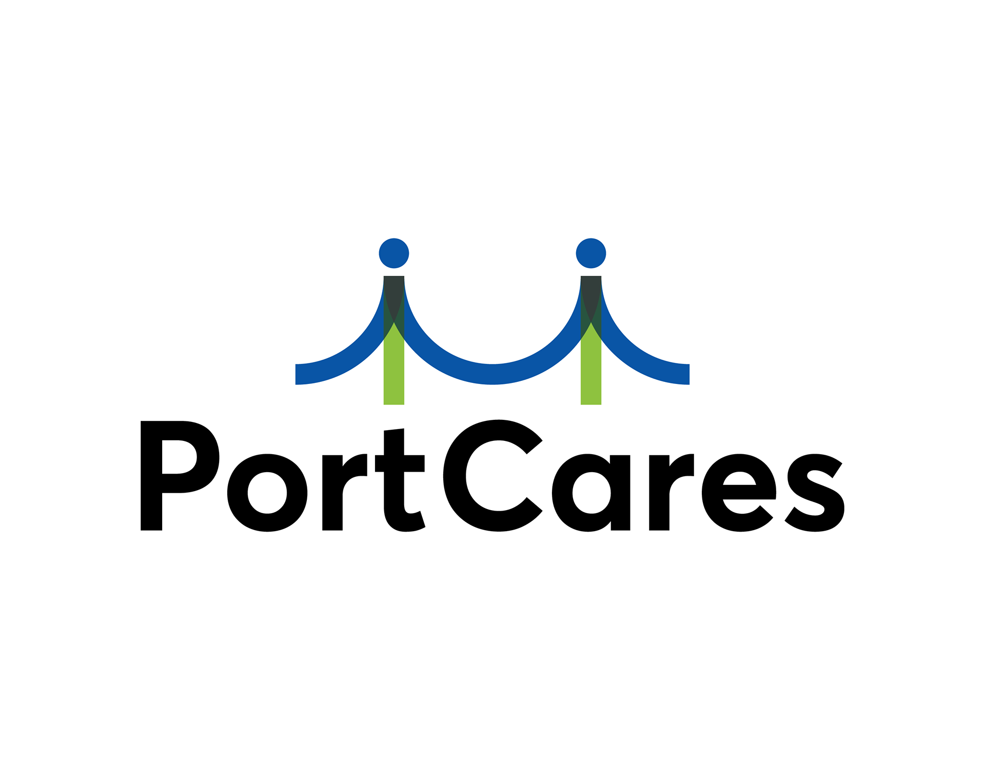
The new PC logo design without a tagline.
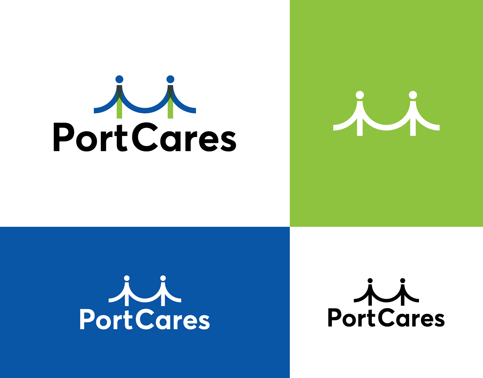
I created the PC logo to work in full colour, one colour, logomark and reverse.

I created an extended colour palette for the PC identity for more versatility.
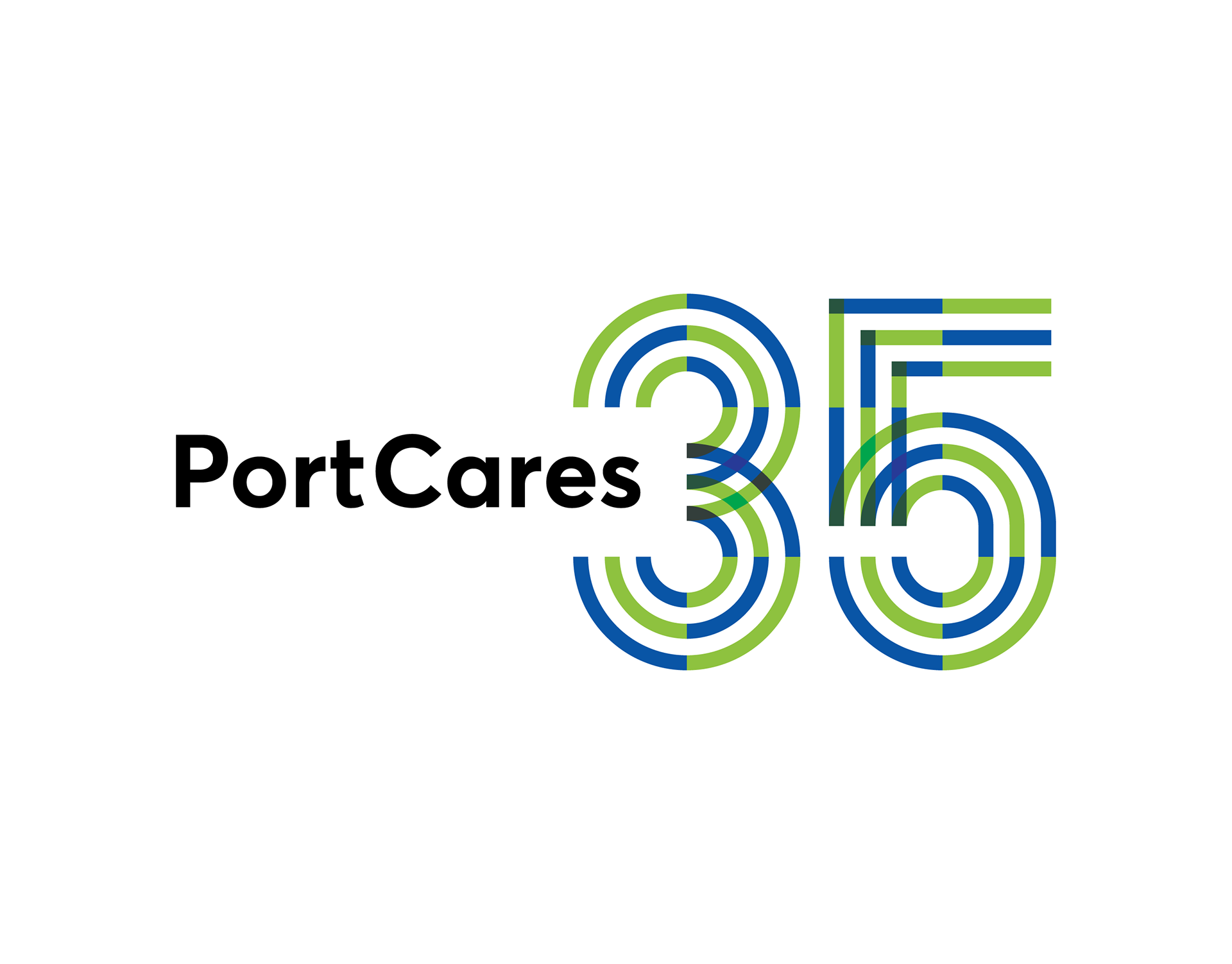
To celebrate 35 years, I created an anniversary logo for PC that follows the modular geometric aesthetic.

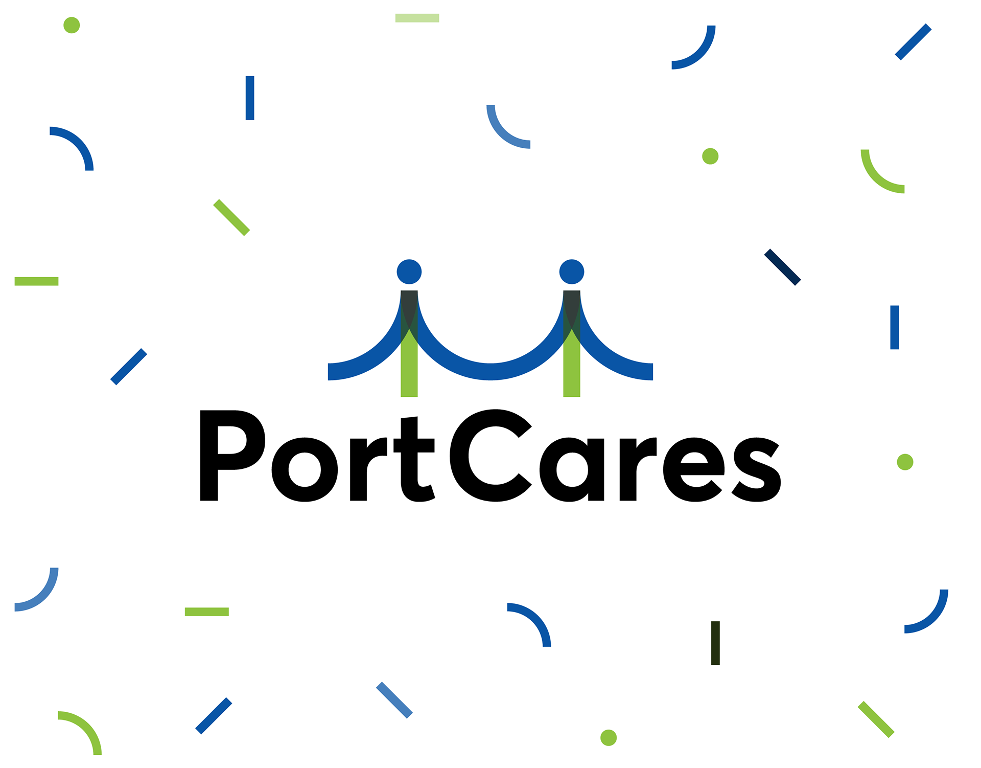
In layout design, simple circles and arcs create brand patterns for backgrounds and accents.
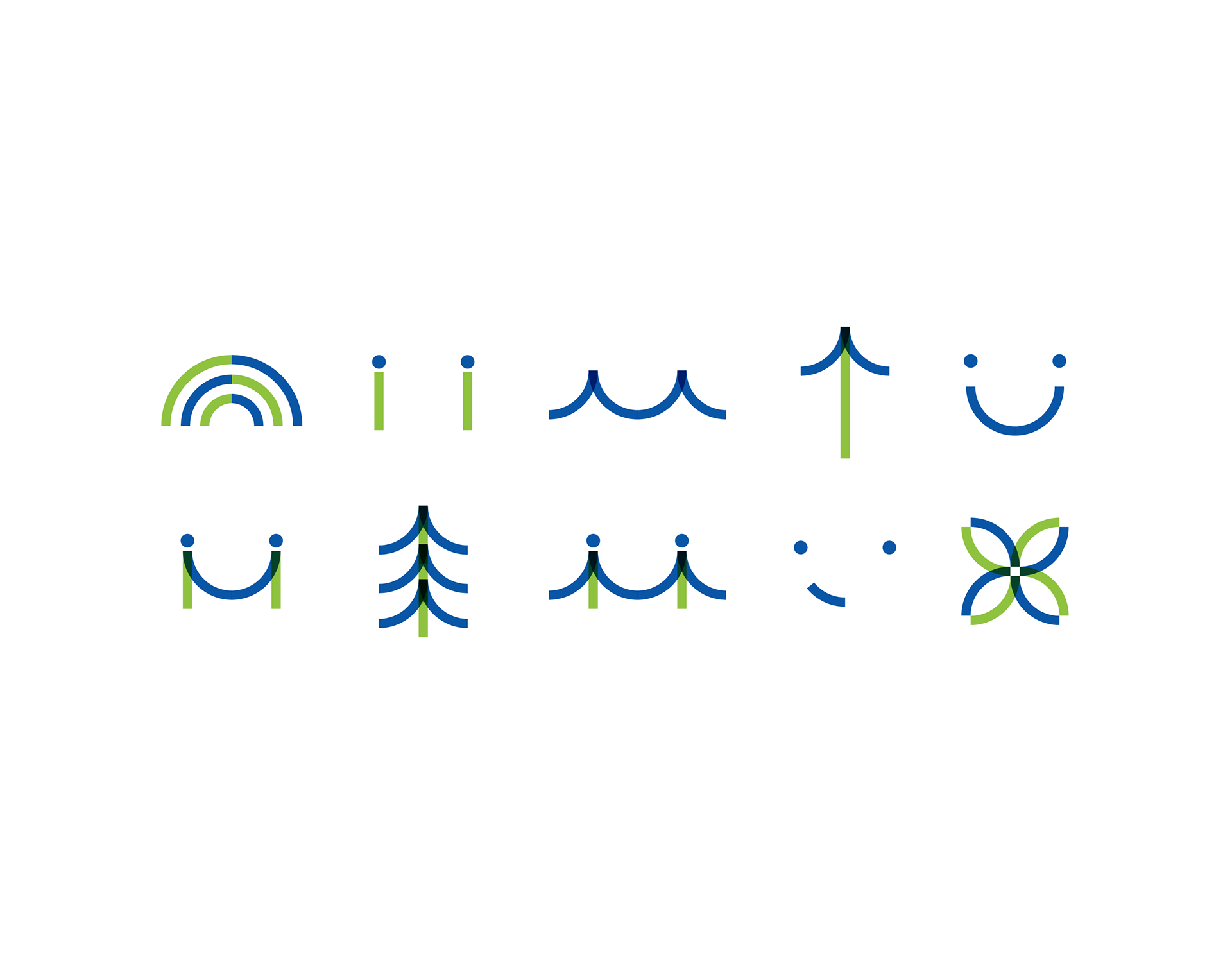
The PC logomark inspired the brand iconography that features simple green and blue overlapping and connecting lines and shapes.
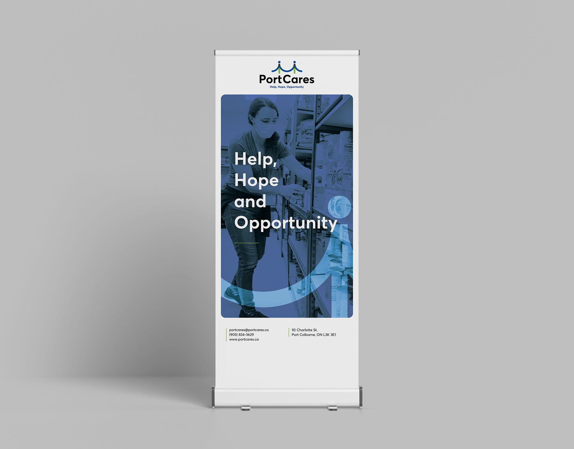
The logomark works in oversized graphic elements paired with photography, such as the print design of a pull-up banner.
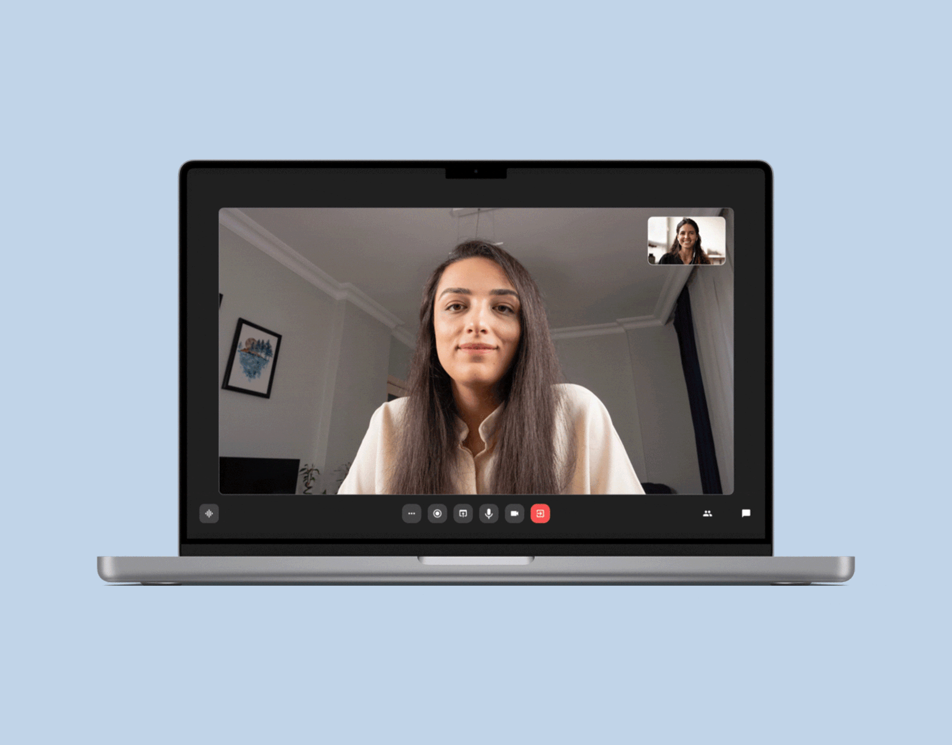
I created virtual meeting backgrounds for volunteers to use during video calls.
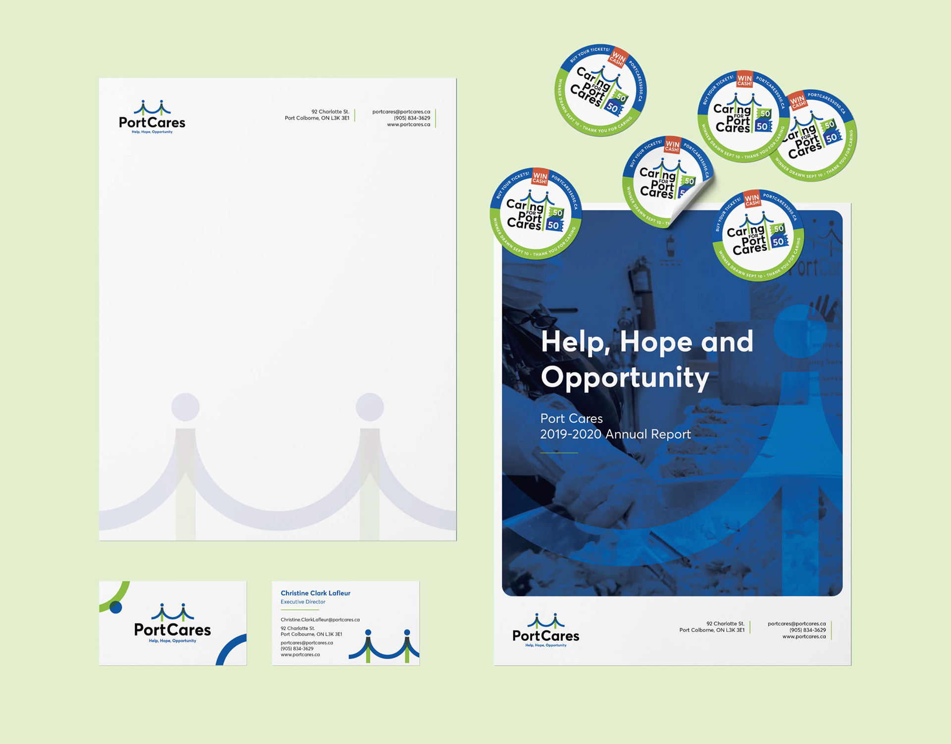
I applied the identity design to letterhead, business cards, round stickers for the 50/50 draw and an annual report cover.
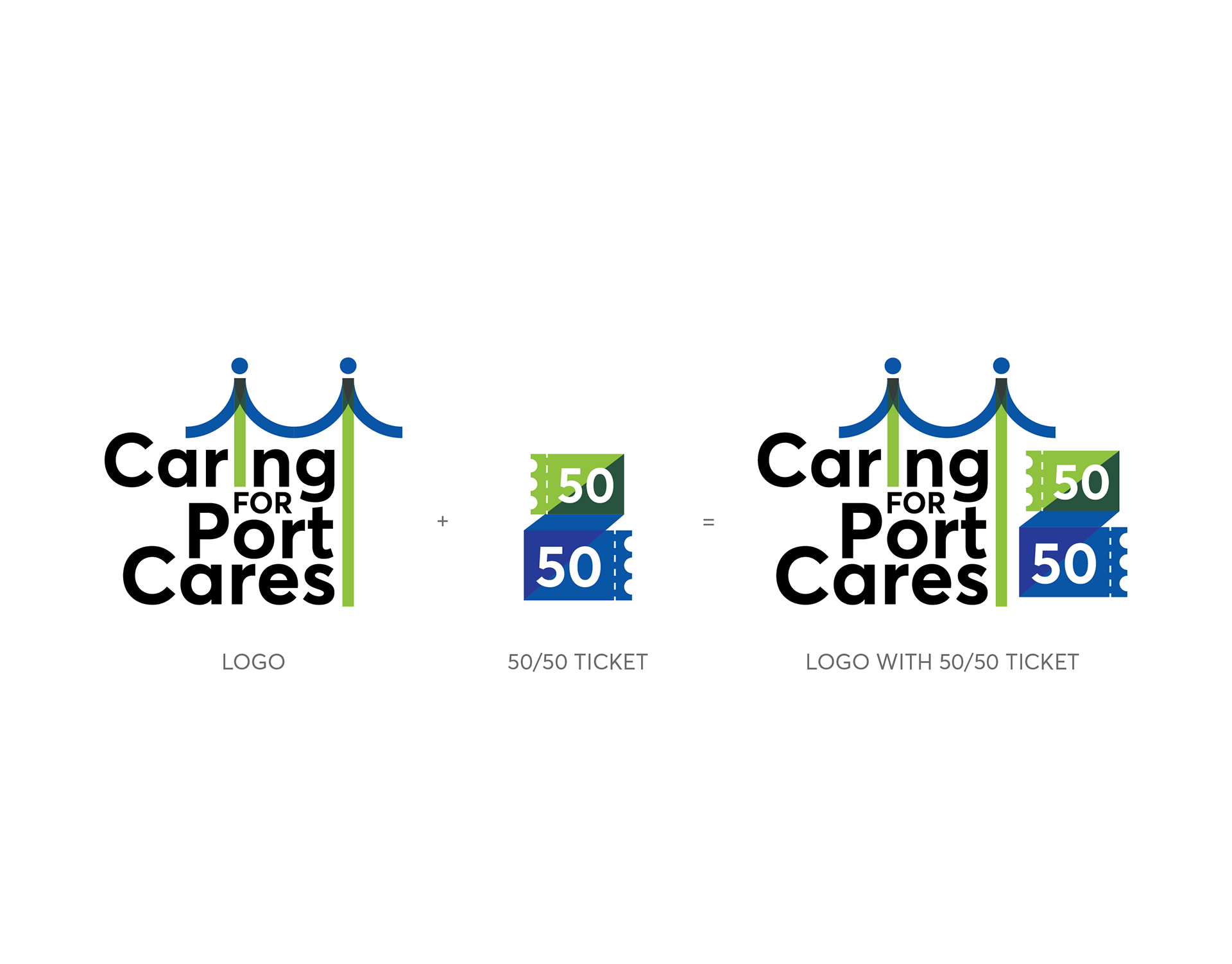
I created another logo for the 50/50 draw, Caring for Port Cares.
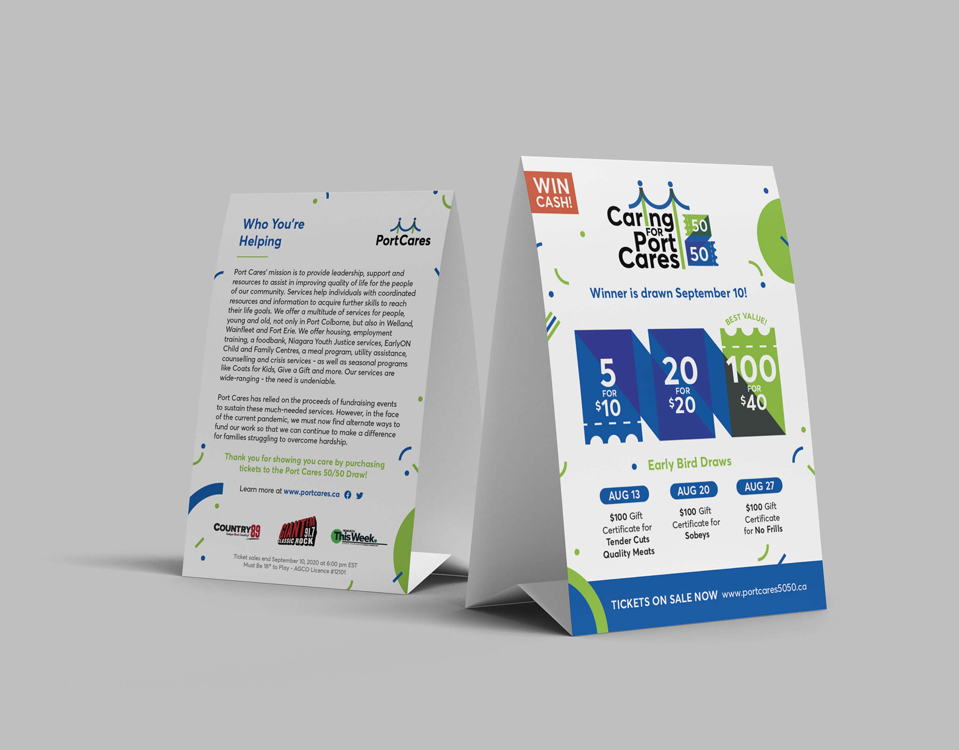
I designed a table tent card for the 50/50 draw with the logo and identity design.
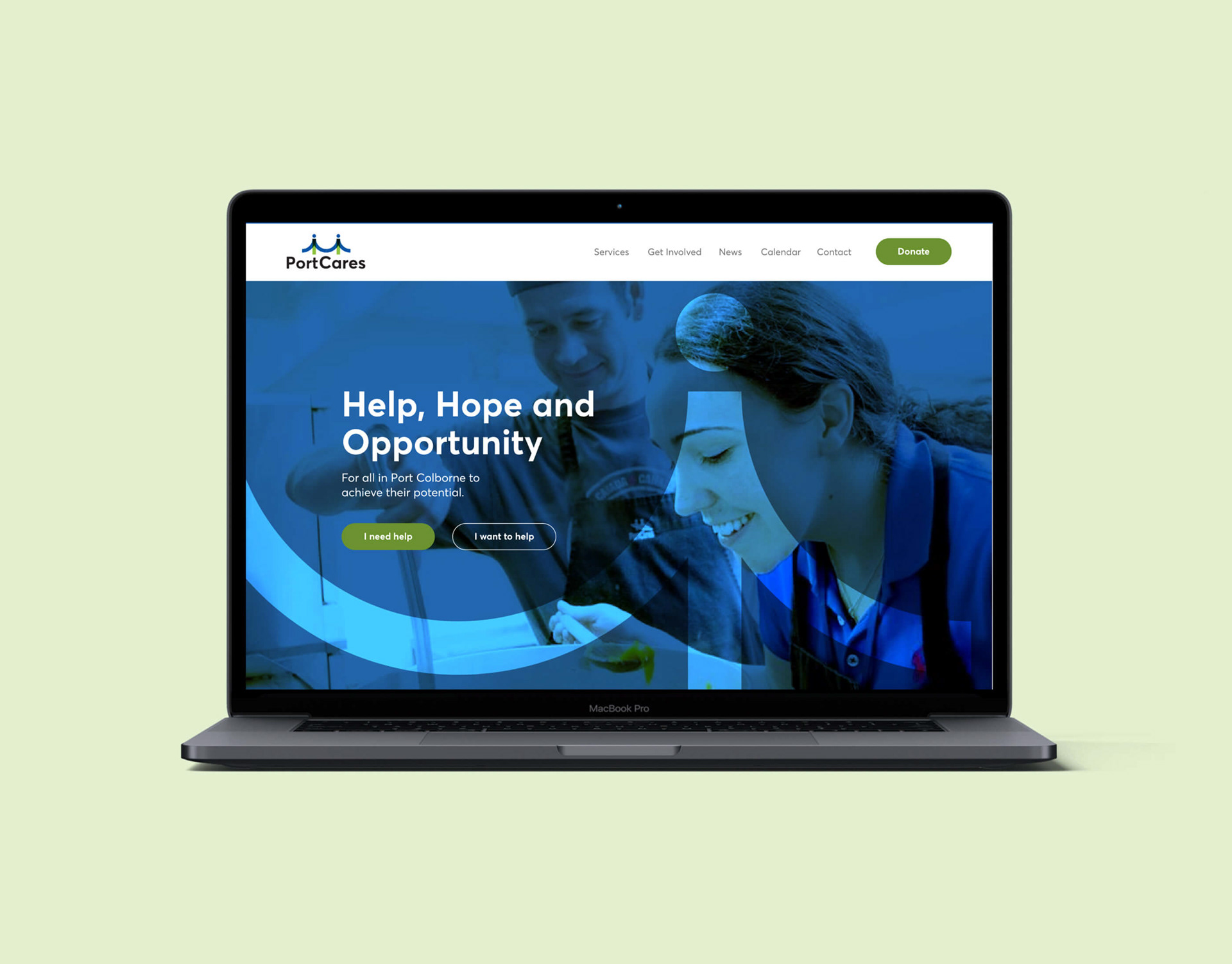
I wireframed the redesigned PC website in Adobe XD with the new identity and handed off the files to be developed in Webflow.