The challenge
The challenge was to create a logo for the NHE tagline that could be used on merchandise. The client wanted to direct attention to their new tagline on apparel while allowing the primary company logo to take a backseat. They weren't comfortable having their name advertised on all of the merchandise. This request presented a few challenges for the brand, like maintaining recognition and avoiding dilution. It also created a challenge of retaining hierarchy in the logo suite by not overpowering the company logo and alleviating confusion for past clients.
My role
As the graphic designer who worked with NHE on their brand strategy, I developed Explore Your Coastline (EYC) logo concepts and presented them with the logo suite to show cohesion.

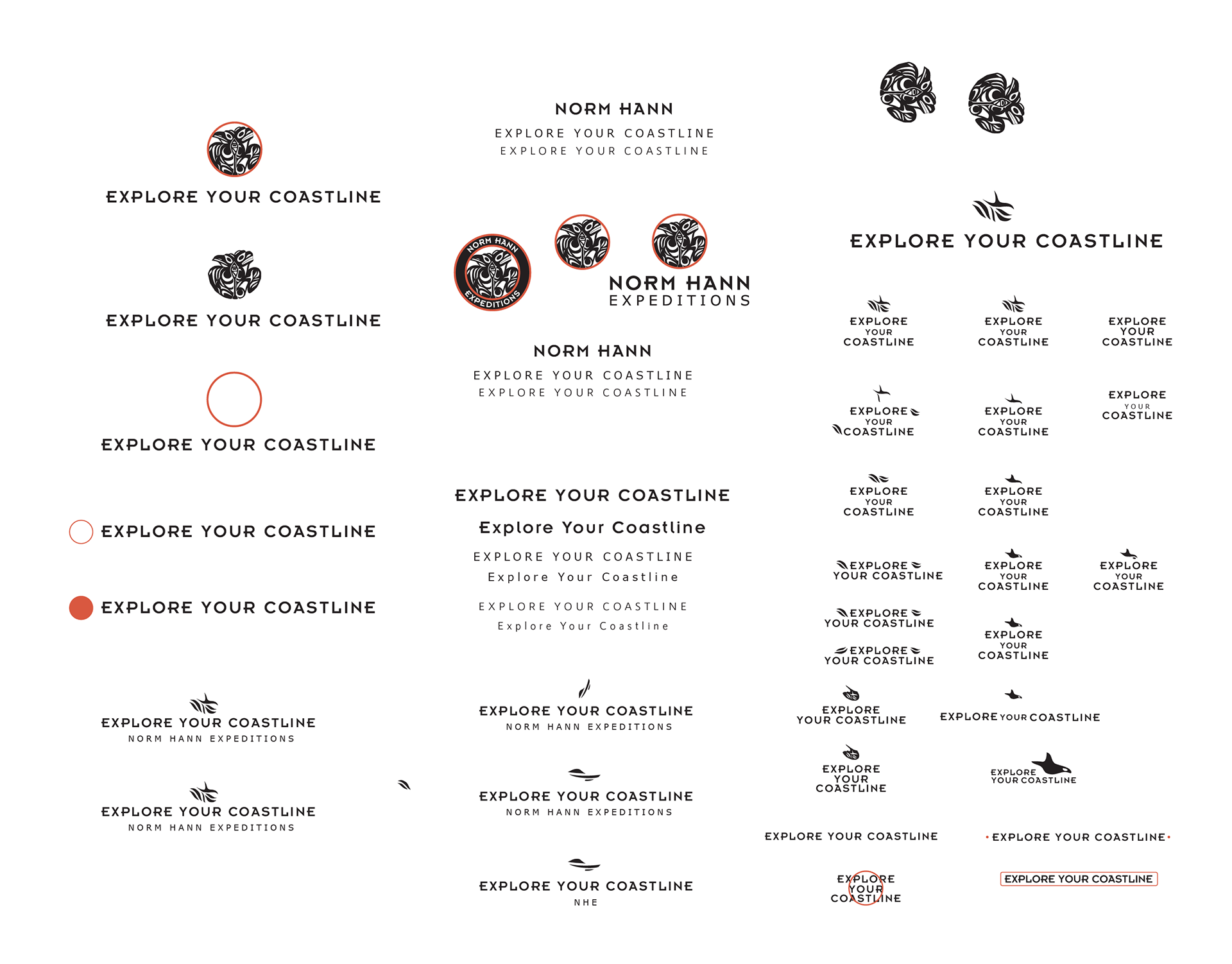
I iterated for the EYC logo by expanding upon the present visual attributes, like retaining the red circle from the NHE logo.

While working on the EYC logo, I tried adding NHE and Norm Hann Expeditions to the logotype and different typographic layouts.

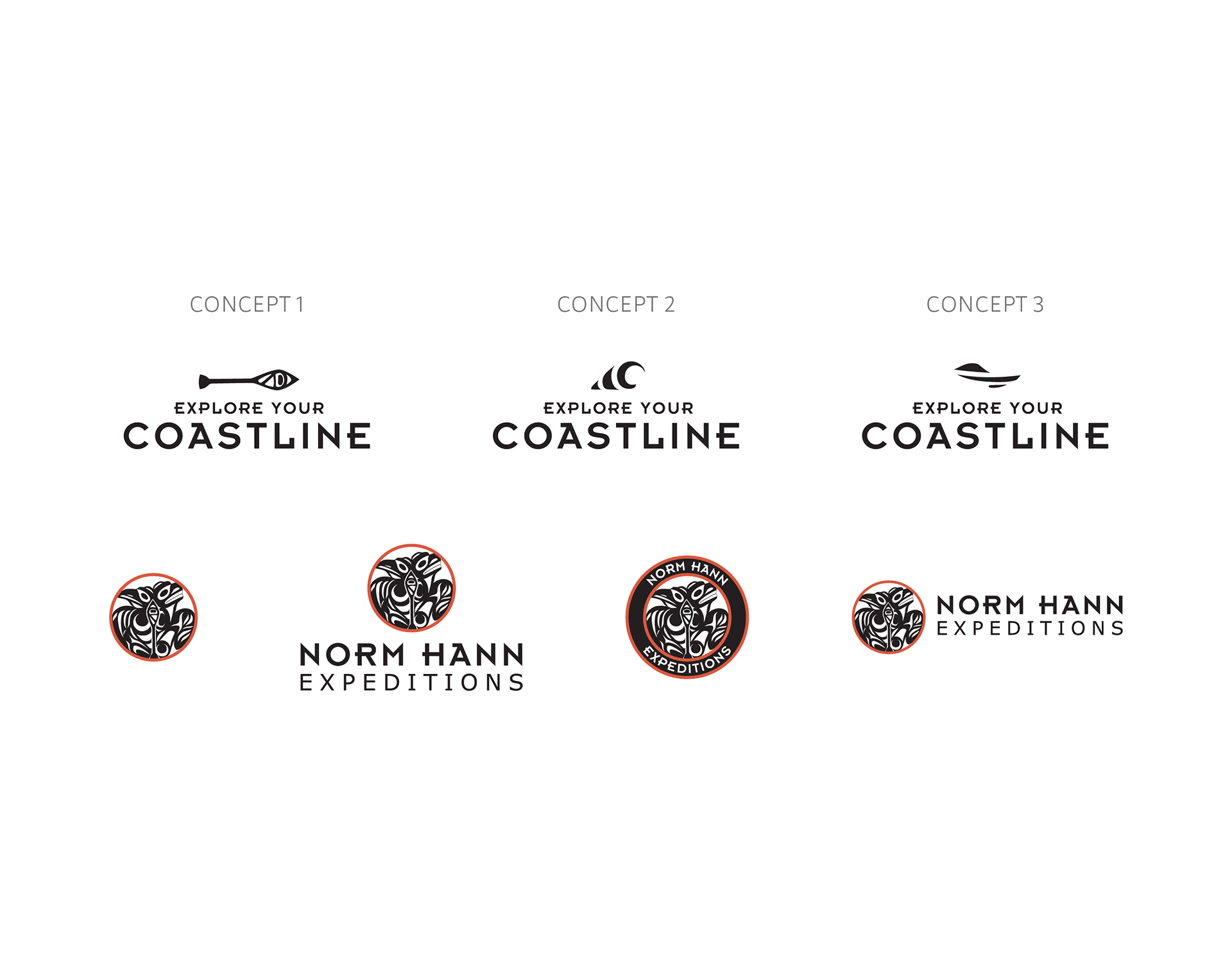
I presented three concepts for the EYC logo next to the NHE logo variations to show how they work together.

The solution
The solution I designed used the NHE brand colours, typeface and aesthetic. These constraints were essential to adhere to so I could avoid creating a competing identity or logo design confusion. I only made the EYC logo in a one-colour design to appear secondary to the full-colour primary company logo, which was the desired hierarchy. I used the brand typeface to retain recognition across the logo suite and to make the logos feel related. Lastly, I connected the NHE logomark design with the EYC design by looking within it to construct new symbols.

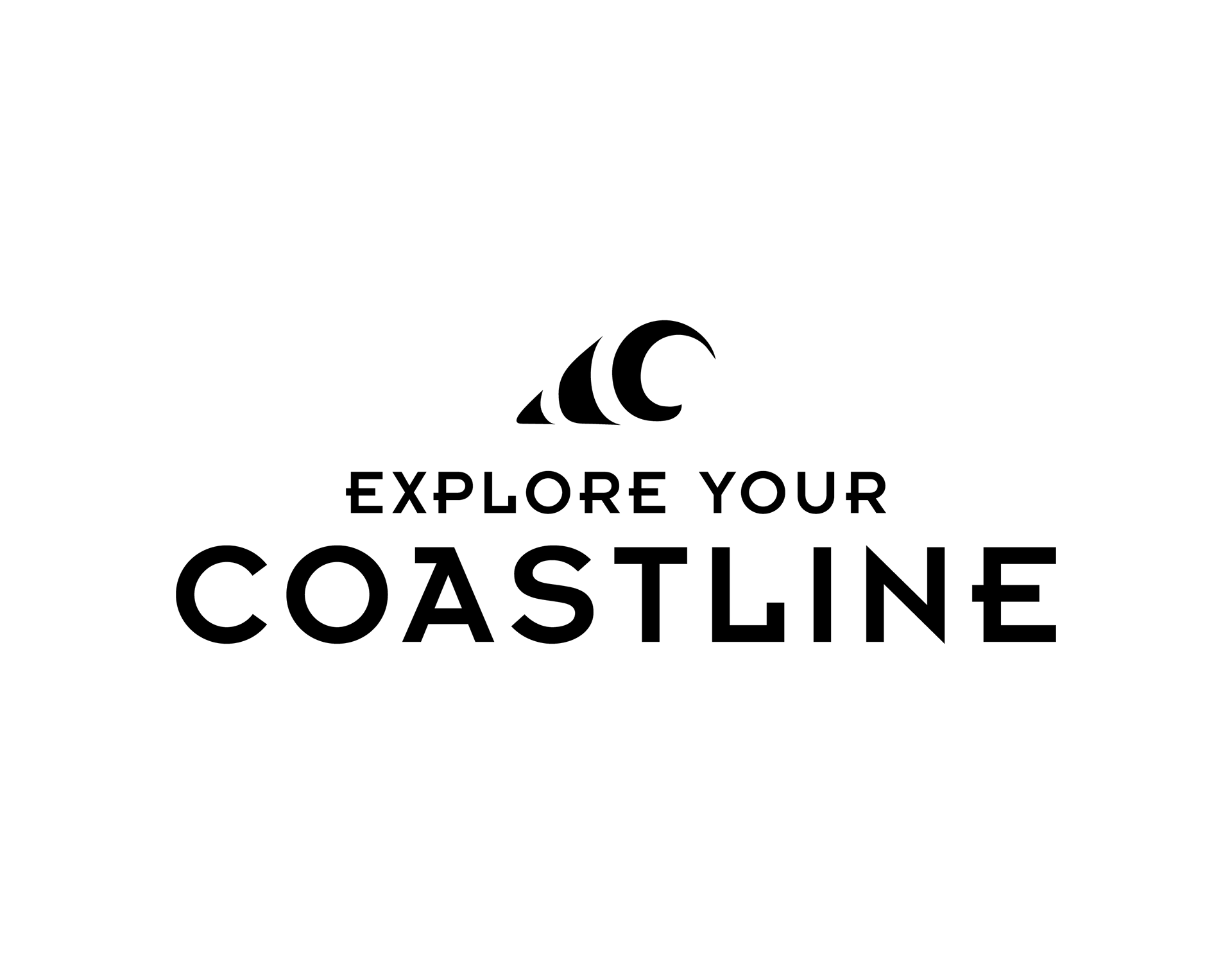
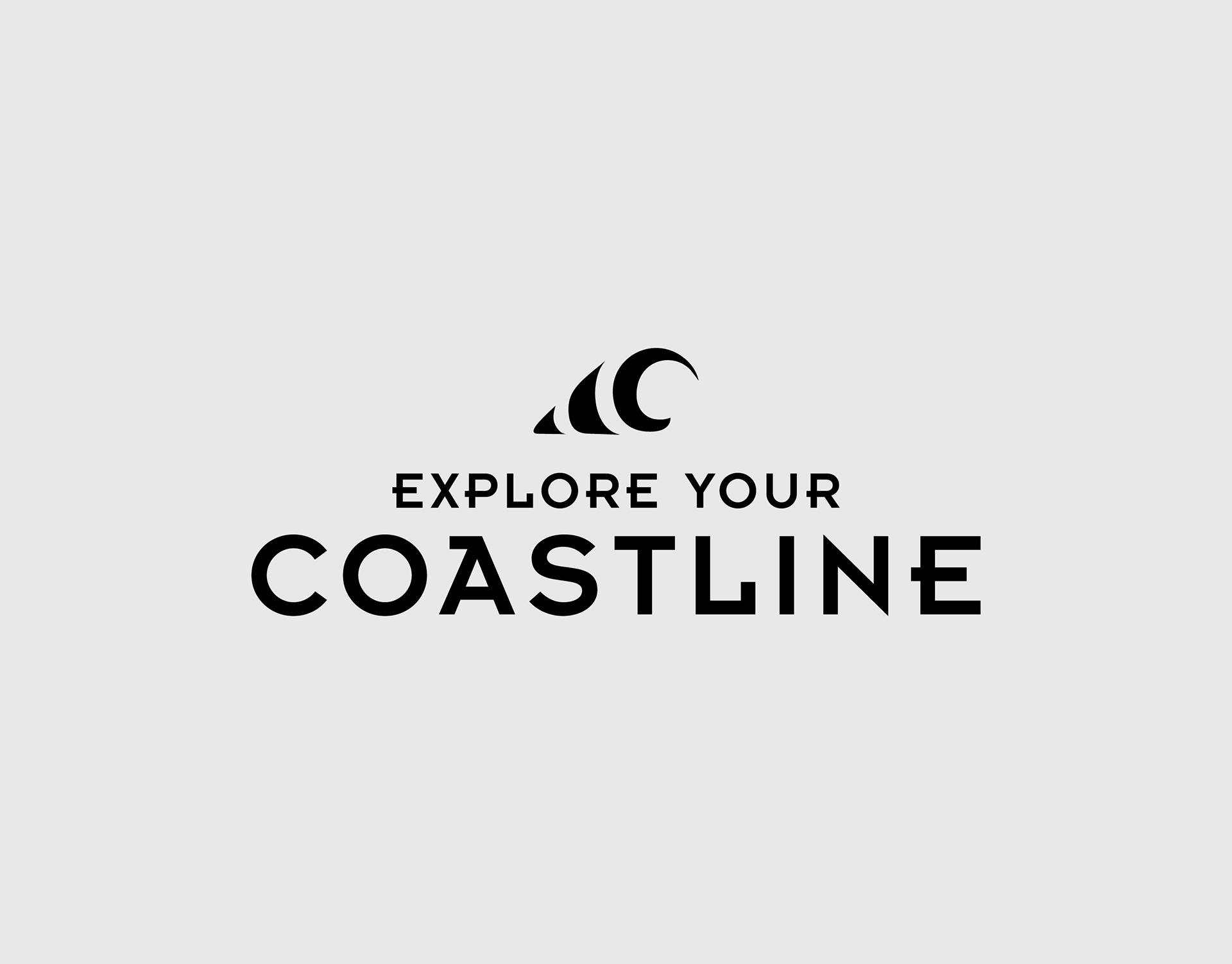
The chosen EYC logo resembles the west coast waves of Tofino, B.C., where NHE offers a paddle surf experience.

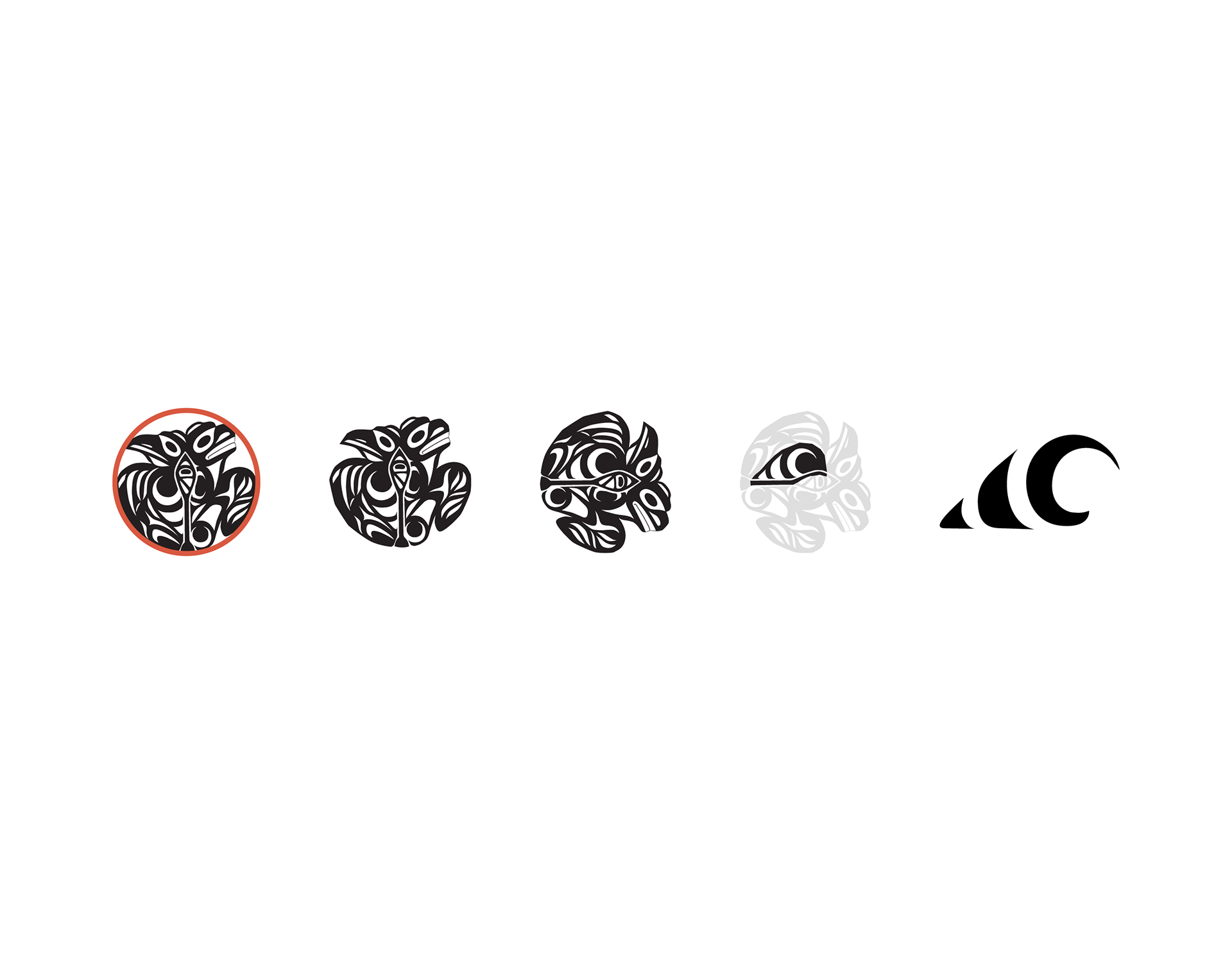
The cresting wave of the EYC logomark was hidden inside the NHE logomark in the negative space of the raven's wing.

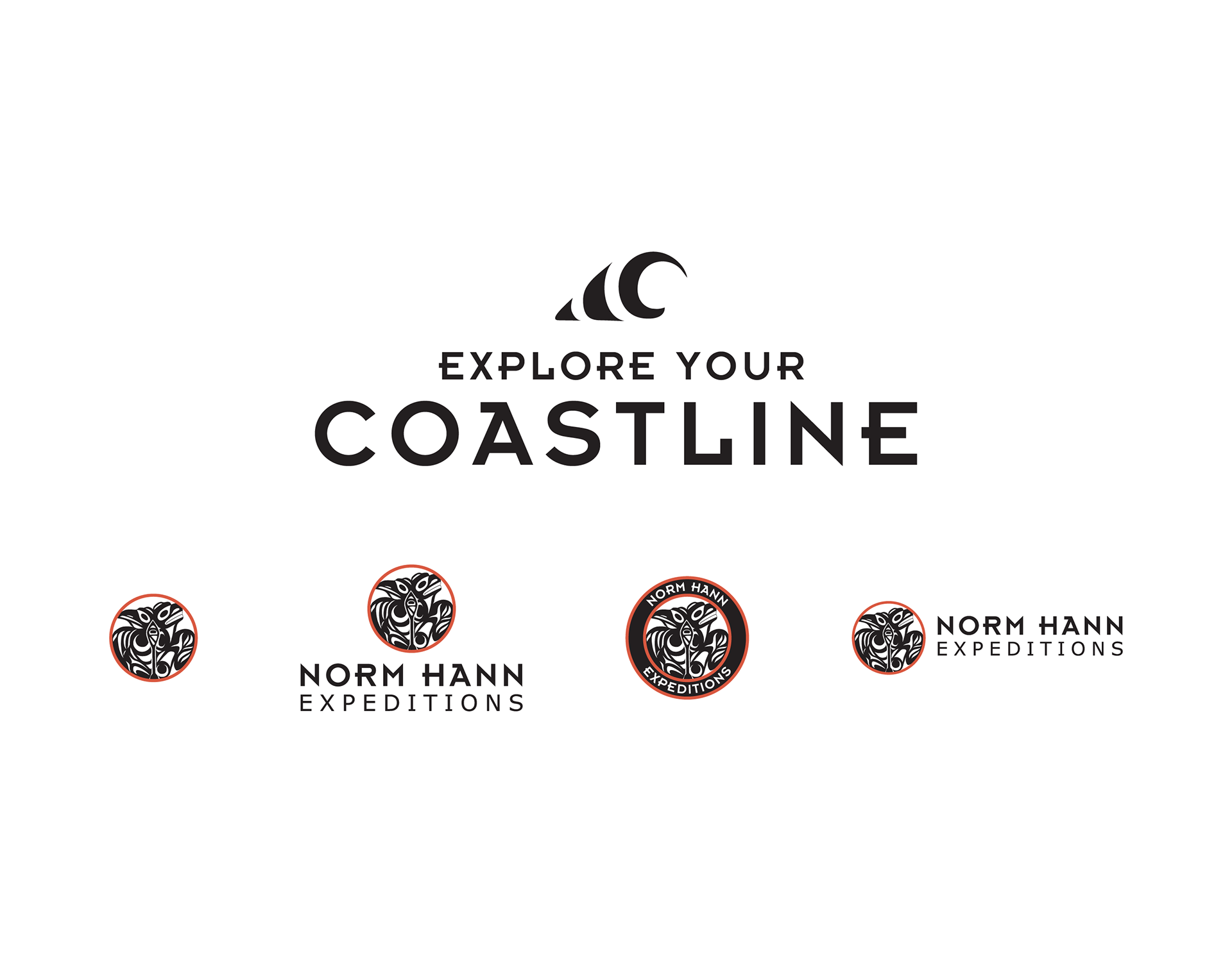
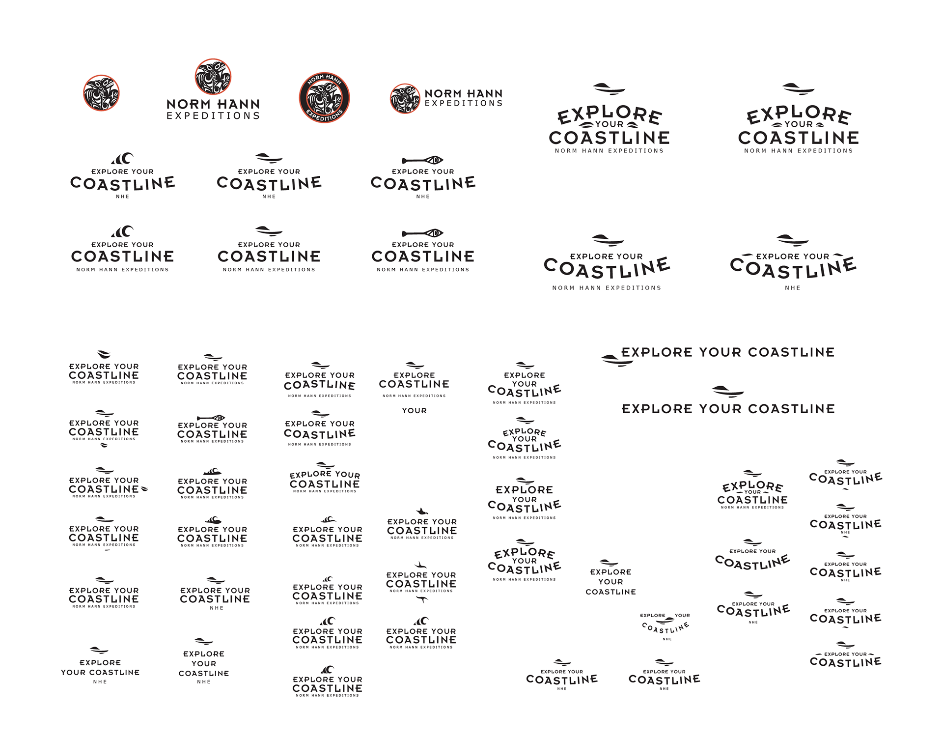
The EYC logo is presented with the suite of NHE logos to show how they work together.

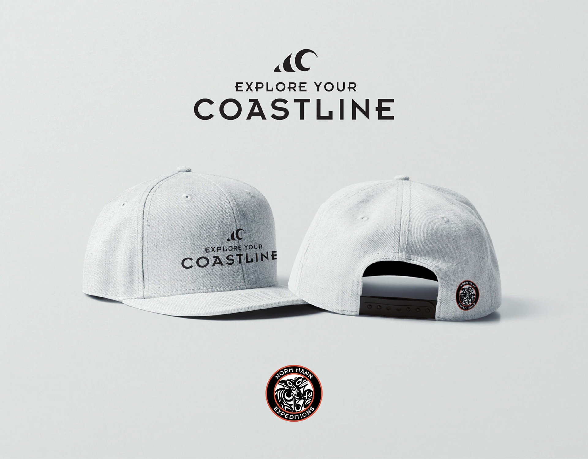
I presented the EYC concepts on merchandise to show how the NHE logo could be present but not the centre of attention.

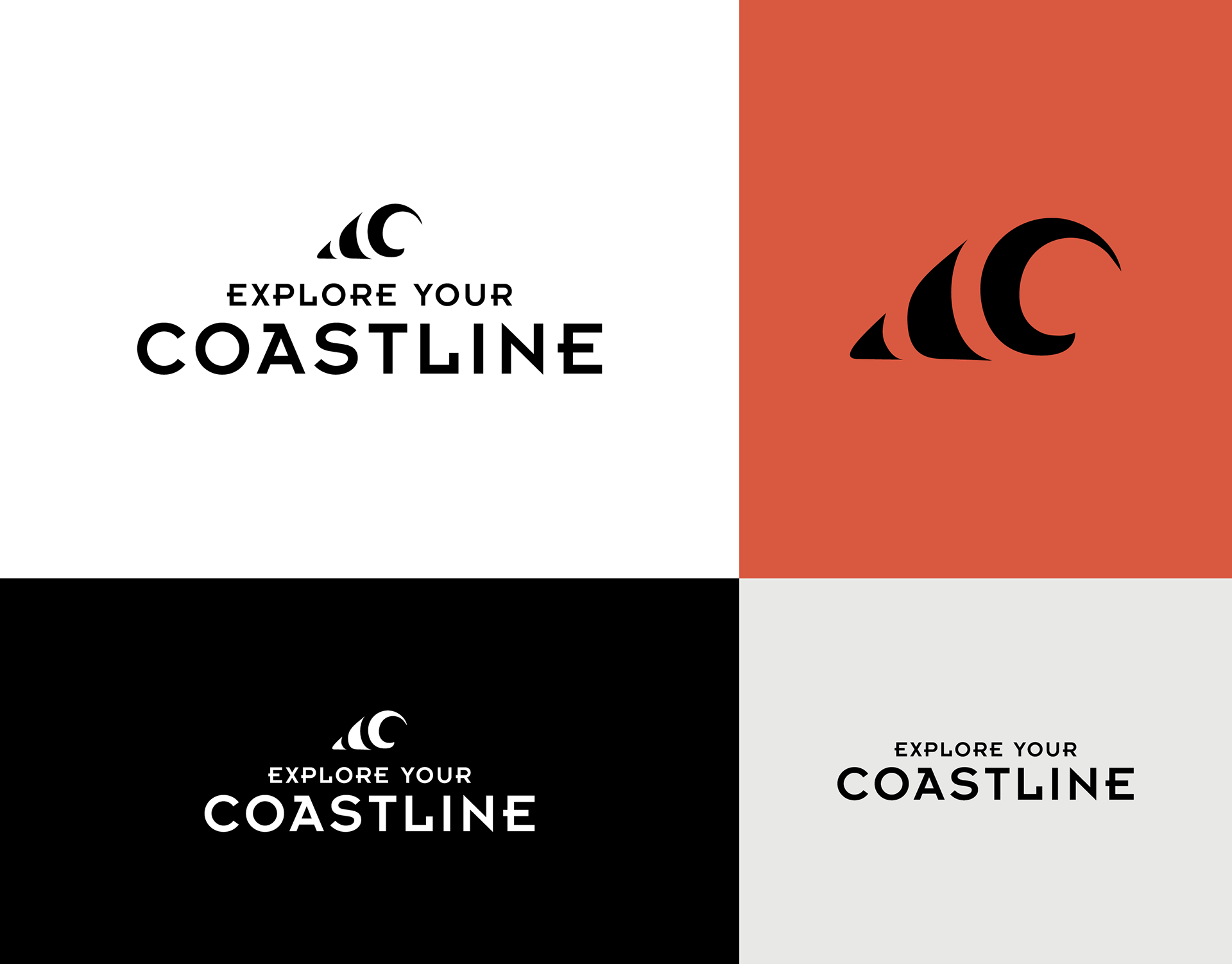
The EYC logo in one-colour, reverse, logomark and logotype.

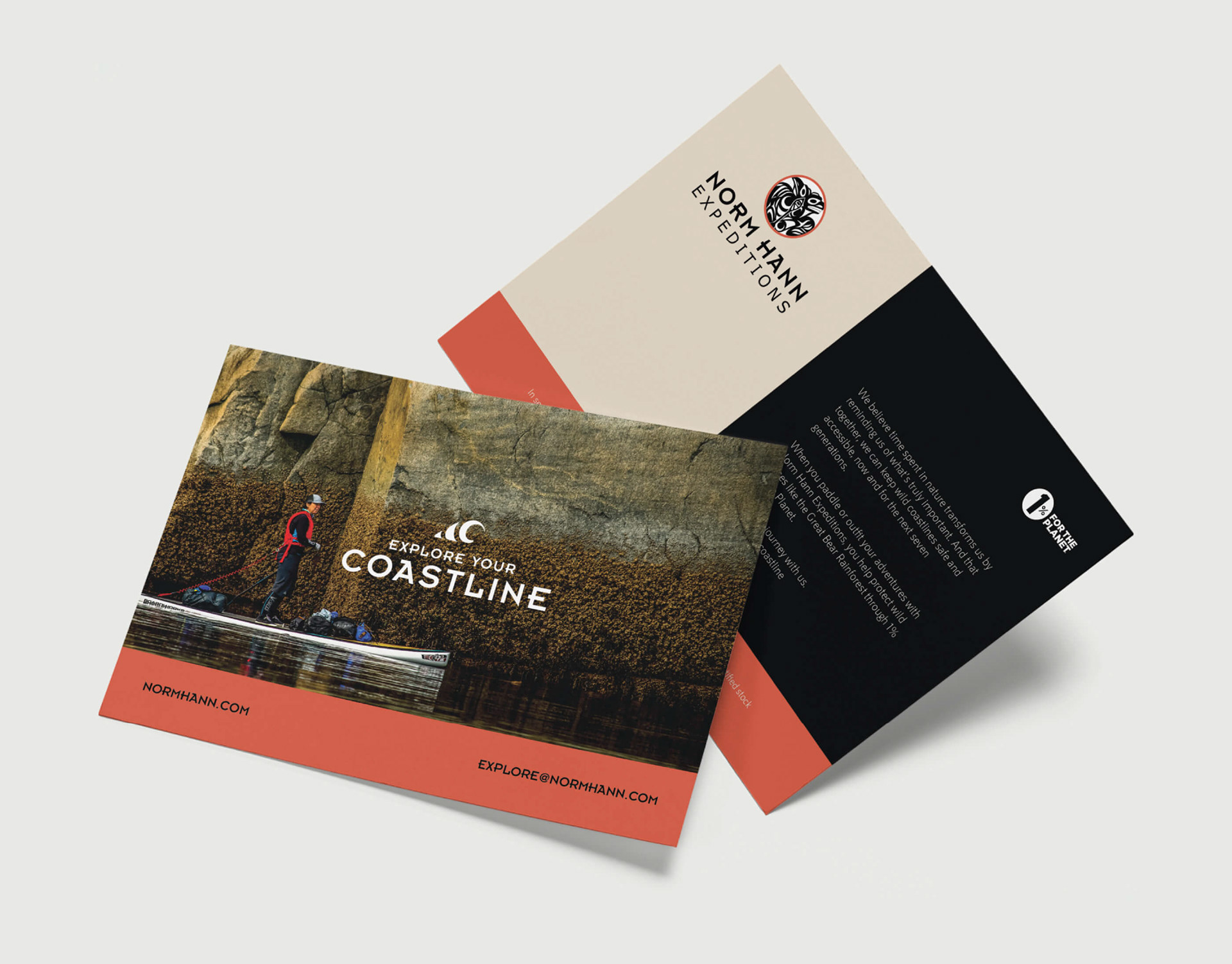
I designed an NHE merchandise card that featured the EYC logo.

Other projects

Back to Top